


The Loves I Have Known: In Conversation with Louise Mandumbwa
Louise Mandumbwa contends with her diasporic experience in her multimedia practice. Lara Xenia speaks with the artist about her botanical research, material exploration, and intergenerational knowledge.

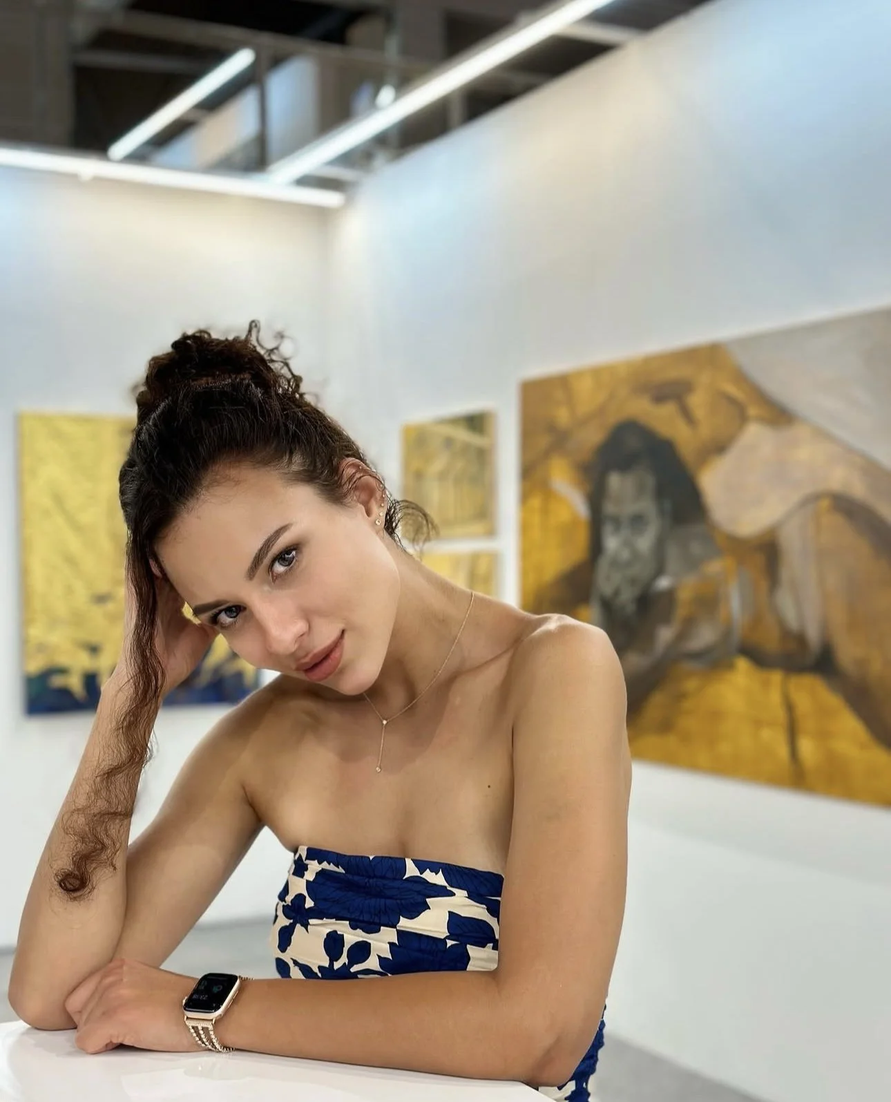
Figure 1: Installation view of The Loves I Have Known, 2025, paper, canvas, graphite, ink and charcoal, 60 x 46.5 inches (152.4 x 118.11 cm). Photo: courtesy the artist, Pat Garcia, and Zeshan Ahmed © Louise Mandumbwa
Lara Xenia: What was the first piece of art you've ever stared at?
Louise Mandumbwa: I grew up in a really small town that didn't have big cultural museums or institutions, so a lot of my first interactions with artworks were through ones I’d find online or in the pages of books. It wasn't until I was a young adult, like 18 or 19, that I experienced one of those seminal works in person. In the Crystal Bridges Museum in Northwest Arkansas, I turned the corner in the contemporary wing and was met by a Barkley Hendricks painting. Four figures in white, and a lady that had a little afro. It was an image I'd revisited often. Seeing it in person stopped me in my tracks as a work I had been struck by as a younger person, now directly in front of me.
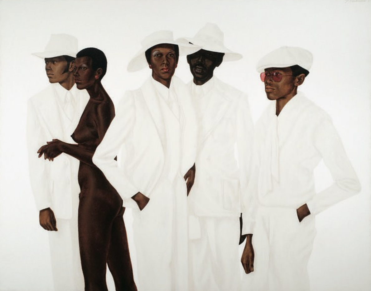
Figure 2: Barkley Hendricks, What’s Going On, 1974, oil, acrylic, and magna on cotton canvas, 65 ¾ x 83 ¾ inches (167 x 212.7 cm). Photo: courtesy the Estate of Barkley Hendricks
LX: I love Hendricks. Was that the first time you went to a museum here? How did it compare to the museums and art spaces you had access to before?
LM: It was. I came to the U.S. specifically for my higher education when I was 18, and was fortunate that I had the opportunity to visit major art institutions in my few years here. Prior, I had spent most of my years in Francistown, Botswana. It was a sweet, nondescript town, which I called home. What Francistown didn’t have in abundance, however, was a robust collection of formal art institutions.
LX: Is that partially what incentivized you to study here in the States?
LM: Oh definitely. I set my sights on art school in the U.S. at 18. I dreamt of attending SCAD, but I soon learned that scholarships for international students were scarce. Family friends in Arkansas offered guidance and a home near a local community college. Thanks to their generosity, I came here and earned an Associate’s degree in Graphic Design. I later transferred to the University of Central Arkansas, where I completed a BFA in Painting and discovered printmaking. It profoundly transformed the way I think about process, repetition, and material. After graduating, I interned at a gallery, then moved to Virginia to focus on my portfolio and graduate school applications. I was accepted into my dream program, moved to New Haven in 2022, and graduated in 2024. Each stage of that path continues to shape the way I approach my work.
LX: Your portraits are stunningly detailed, and it’s quite a departure from your recent body of work. Where is it situated in your practice?
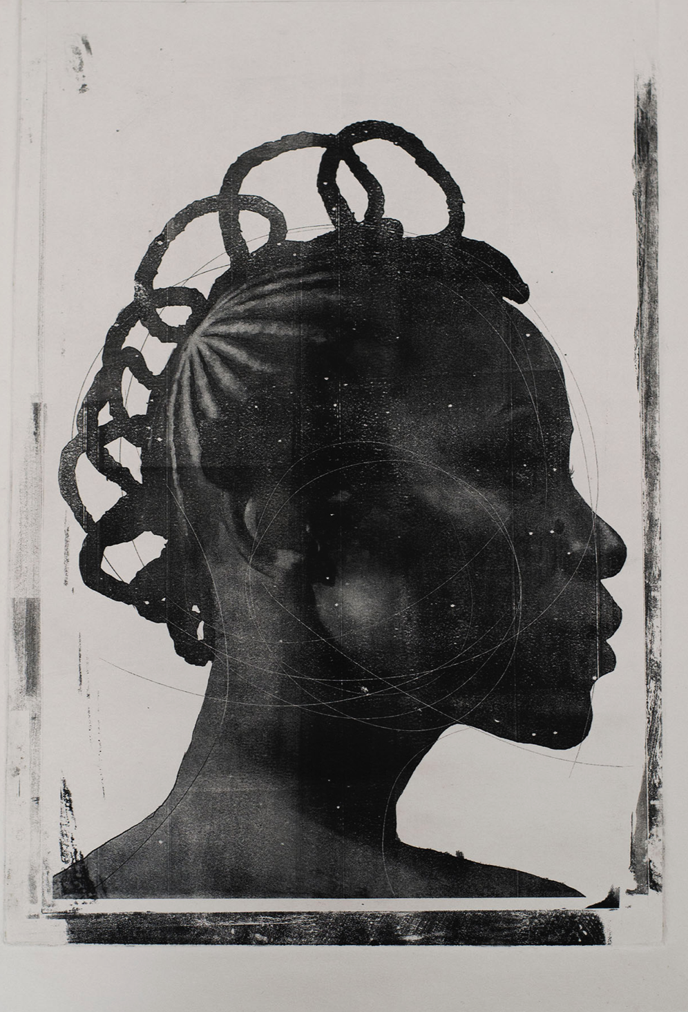
Figure 3: Louise Mandumbwa, Good Immigrant, proto plate print, 2019, 17 x 11 inches (43.18 x 27.94 cm). Photo: courtesy the artist © Louise Mandumbwa
LM: My early practice was focused on technical execution. Being too shy to ask others to sit for me, I turned to the work of photographers I felt were making compelling work, using some of those images as references for pieces that helped me refine my visual voice. The muse for this work was a South African artist, Kwena Baloyi. Throughout that exploration I progressively became interested in how ranging mediums handled control, chance, and repetition differently. Painting always offered a sense of precision and intention, and printmaking refused that control. The unpredictability of the process revealed something I couldn’t achieve through painting alone.
I discovered pronto plate lithography, which uses polyester sheets instead of stone. Unlike traditional litho, the plate deteriorates quickly, producing only a few prints before the image begins to break down. Each pull erases a little more information. That material decay and erosion became a metaphor for memory itself and its unpredictability in fading. We don’t choose what we forget, and we rarely notice when the image begins to disappear. This process allowed me to explore absence and loss not as failures but as forms of meaning, when what is missing carries as much weight as what remains.
In many ways it was through the discoveries of this process that my work began to focus more on memory and a perspective shaped by my experience as the daughter, and granddaughter of immigrants. When I started photographing people close to me, I realized that the totality I sought in painting did not align with how memory actually works. I was aware of gaps in my own family history; how stories were half-told or lost. Memory, at least as I’ve experienced it, is often fleeting, fragmentary and pieced together to make up an approximation.
LX: I’m especially drawn to the multi-faceted, trace-like elements in your work. Were the figures in your portraits based on people you were personally connected with at the time?
LM: Absolutely. People often asked where I was from when I first moved to the U.S. and I noticed that my answers were never about geography or infrastructure, but about the people I knew. I understood places through the people who shaped them for me. In my early work, around 18 or 19, I began painting portraits based on photographs I had taken myself. Each work was tied to a personal story.

Figure 4: Louise Mandumbwa, Jacob, 2021, charcoal on paper, 30 x 22 inches (76.2 x 55.88 cm). Photo: courtesy the artist © Louise Mandumbwa
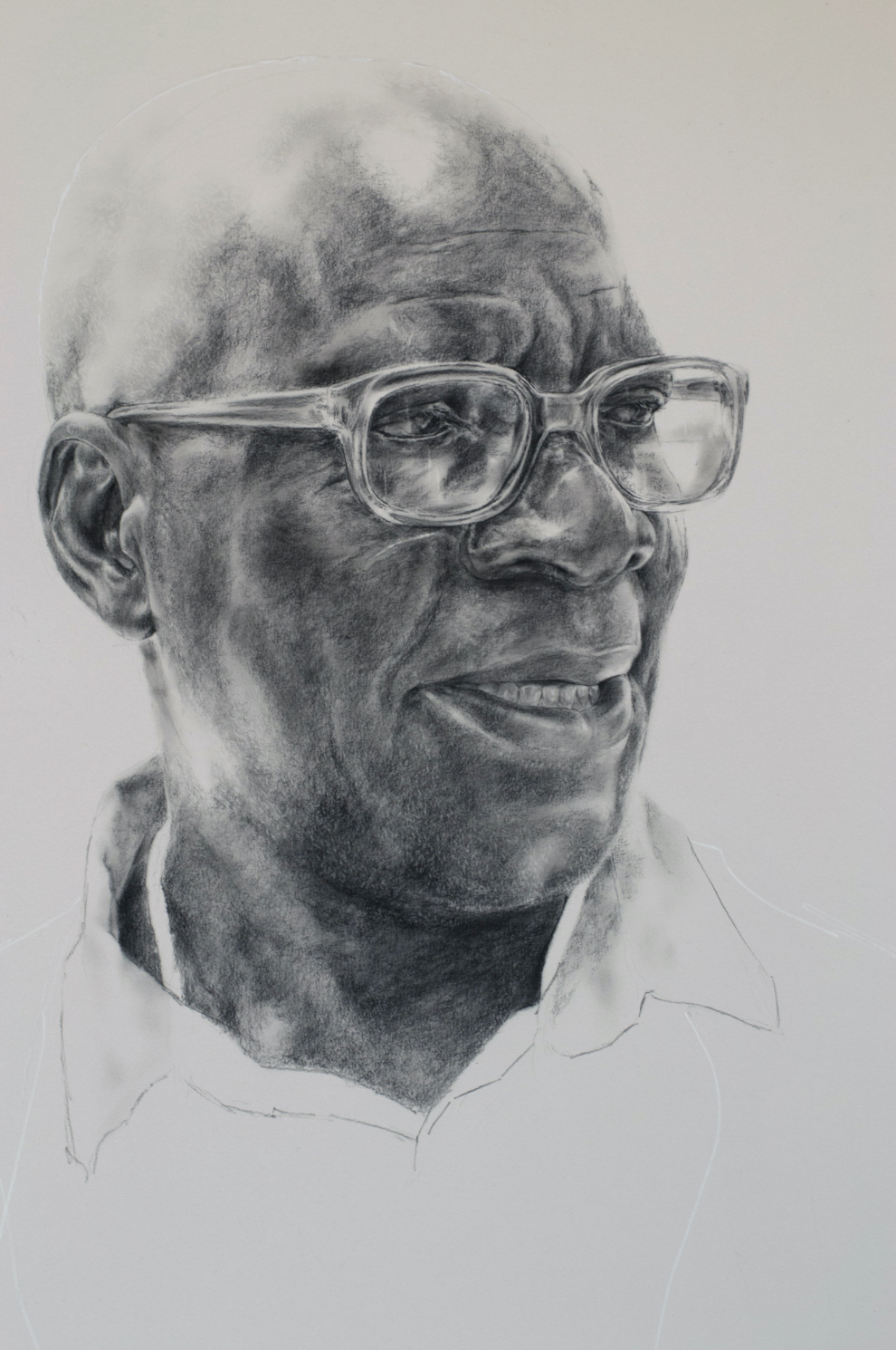
Figure 5: Louise Mandumbwa, Rre Dodzi, 2021, charcoal on paper, 30 x 22 inches (76.2 x 55.88 cm). Photo: courtesy the artist © Louise Mandumbwa
One portrait shows Jacob, the security guard at my high school, who greeted me every morning for six years, and another depicts an older man named Rre Dodzi or Mr. Dodzi, who watched me grow up in my childhood neighborhood. Those early portraits became an archive of belonging, and a way to map my home through human connection. I have never had a strong recall for faces, but through painting and drawing, I found that I remembered them more clearly. These drawings became a way to commit their presence to memory and to show people where I’m from.
LX: Fascinating. What led you to pursue making works about sugarcane?
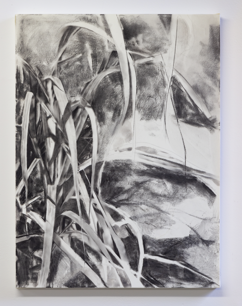
Figure 6: Installation view of They stole the sweet away, 2023, charcoal on paper; 24 x 18 inches (60.96 x 45.72 cm). Photo: courtesy the artist and Pat Garcia
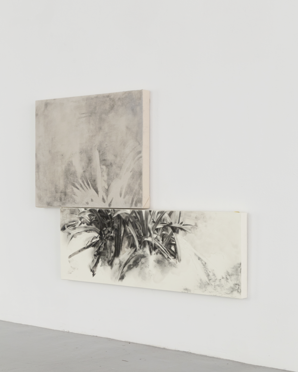
Figure 7: Configuration 1, 2023, paper, canvas, acrylic, and charcoal, 24 x 18 inches (60.96 x 45.72 cm); 36 x 12 inches (91.44 x 30.48 cm). Photo: courtesy the artist and Zeshan Ahmed
LM: In grad school, I began rethinking how I mapped relationships. I’d always understood “places” through the relational, but wanted to make touch points that allow others to enter the work without needing my full personal history. That led me to think about the gardens I grew up around, like my grandmother’s home, which had sugarcane, guavas, and plants that she’d tend to. I began to see gardens as parallels to relationships; always in flux or nurtured and maintained overtime. My grandmother’s and mother’s gardens were constantly changing, but certain trees remained, and reflected their degree of care.
Those early portraits became an archive of belonging, and a way to map my home through human connection.
Figure 8: Installation view of Configuration 1C, 2023, paper, canvas and charcoal, 24 x 18 inches (60.96 x 45.72 cm); 36 x 12 inches (91.44 x 30.48 cm). Photo: courtesy the artist and Pat Garcia
When I no longer had access to the people who shaped those memories, I found a similar sense of connection in plants that existed elsewhere. Sugarcane grows in many regions, as does yucca or cassava. Encountering them revealed how plants also trace histories of movement. I learned that cassava, which I had always associated with the Congo where my grandmother grew up, was introduced there by the Portuguese because of its resilience to drought. I was fascinated by how plants like cassava and Bougainvillea appeared across continents, and quietly mapped diasporic movement. Their presence is not about invasion, but about contact, exchange, and transformation. These plants hold the intertwined histories of place, migration, and adaption, much like the people who care for them.
LX: That's so interesting. Do you usually combine yucca with other plants in these works? What inspired you to layer these elements, and what is the text embedded above it?
LM: Much of the text begins as annotations made directly on my paintings and drawings. I used to write on the surface itself, then copy the text into a field journal before erasing it. The writing often takes the form of short poetics and fragments that respond to what I’m thinking about while I work. Now, I write on transparent sticky notes that I place in my journal. The clear paper mirrors the studio process, and layers text and image in a way that feels both visible and ephemeral. The fragmentation in my work grew out of realizing that I was trying to capture something total in a painting and always falling short. I began to see that failure as more honest. Memory itself is partial; some things are recalled through language, and others are through image, color, or material association. By bringing those fragments together, like what can be named clearly, what can only be felt, I try to create a visual language that reflects how memory actually lives in the body. It is less about precision and more about assembling what remains, by allowing language, image, and material to speak to one another.
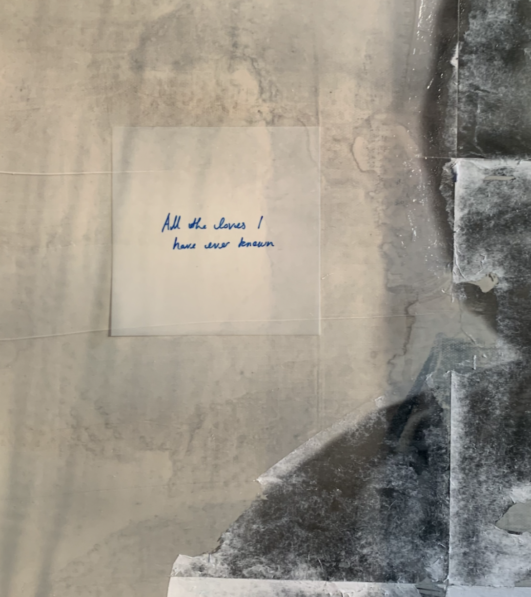
Figure 9: Untitled [detail], 2023, paper, canvas and charcoal, liquid graphite, 36 x 30 inches (91.44 x 76.2 cm). Photo: courtesy the artist
LX: I’m interested in how you fragment elements across the canvas and combine different surfaces within one composition like wood or other supports. The variation in surface gives the work a tactility, and its own rhythm and weight.
LM: Materially, I was thinking about home, and what it means when it’s not a physical structure. I had been challenged that my work rarely depicted an interior space, as something that could be visually read as “home.” I resisted that, because I believe you can be dispossessed of a building in a way you cannot be dispossessed of a relationship. I began to explore how material could point toward that idea. I used concrete, wood, glass, and eventually Plexiglas, which would not shatter. I also worked with aluminium and steel, which are used to construct homes in Zambia, Botswana, and much of Sub-Saharan Africa. I wanted to bring that vocabulary of materials into my work, even if the image itself did not depict a house. For me, these materials carry the presence of home through its material vocabulary, with its texture, resilience, and weight, even when the form itself is absent.
Their presence is not about invasion, but about contact, exchange, and transformation. These plants hold the intertwined histories of place, migration, and adaption, much like the people who care for them.
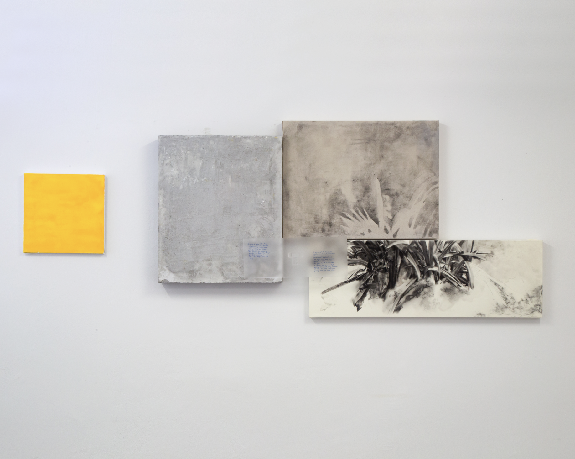
Figure 8: Louise Mandumbwa, Configuration 1, 2023, paper, canvas, concrete, plexiglass, acrylic, gouache and charcoal, 12 x 12 inches (30.48 x 30.48 cm); 22.5 x 19 inches (57.15 x 48.26 cm); 16 x 6 inches (40.64 x 15.24 cm); 24 x 18 inches (60.96 x 45.72 cm); 36 x 12 inches (91.44 x 30.48 cm). Photo: courtesy the artist and Pat Garcia
LX: I’m really interested in how you fragment the composition and layer the plants in the foreground then echo their remnants in the background, as if they exist in another space. You also use yellow often. Is that hue somehow reminiscent of home for you or does it carry a particular connection for you?
I try to create a visual language that reflects how memory actually lives in the body.
LM: That’s exactly it! I had been writing about what home might feel like, look like if it had a color, a taste, or a texture. I wanted to think more critically about my relationship with color, rather than just working from photographs. In my notes, I wrote about the time of day when I would come home and stand in my mother’s garden. I would close my eyes and feel the light shifting as the sun set. Because we lived near the tropics, the sunsets were long and warm, and filled with yellows and oranges that seemed to filter through my eyelids. When I think of home, that light is what returns to me. If home had a color, it would be that warm, glowing yellow that lingers just before dusk.
LX: It’s cool that you vary the scale and height of the works. It definitely changes how the viewer relates to them and walks through space.
LM: Yes, and with the botanical pieces, I’m interested in placing them at the height of their real world referent, swaying overhead, or close to the ground. It’s not a literal replication, but I want viewers to experience the work in the spatial register where it exists in nature.
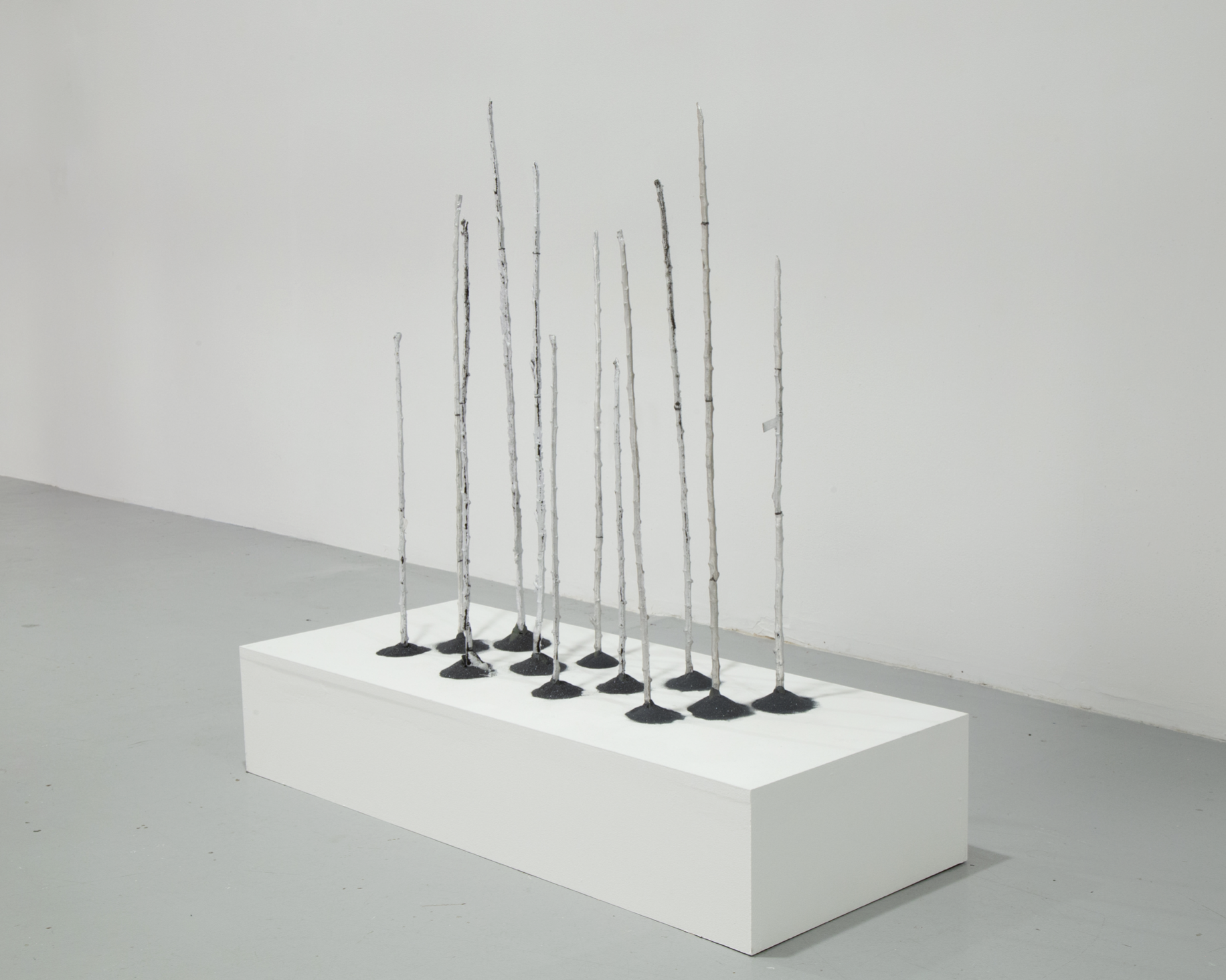
Figure 11: Louise Mandumbwa, Something to Hold Onto, 2024, cast aluminum and carborundum, dimensions variable. Photo: courtesy the artist and Pat Garcia © Louise Mandumbwa
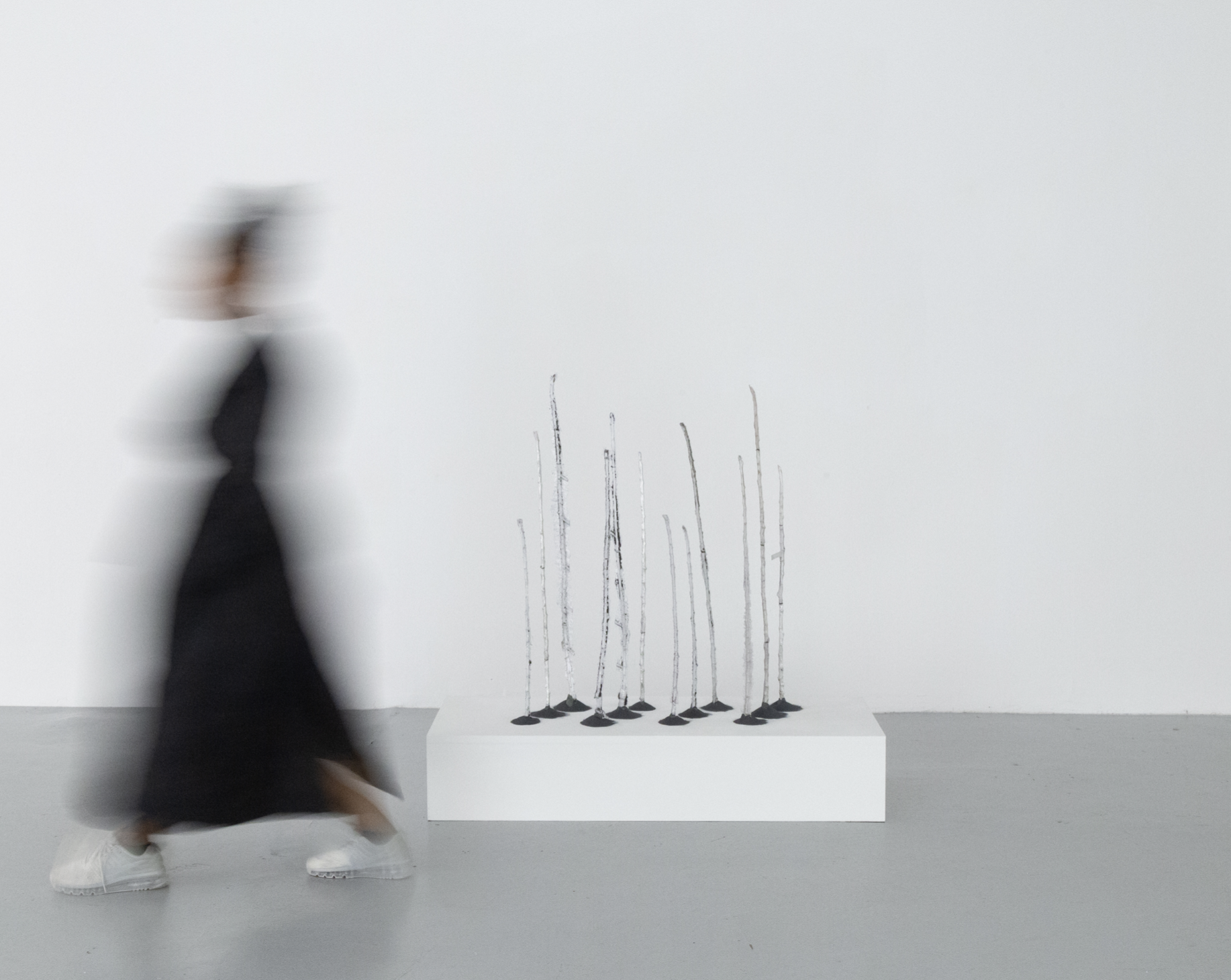
Figure 12: Louise Mandumbwa, Something to Hold Onto, 2024, cast aluminum and carborundum, dimensions variable. Photo: courtesy the artist and Pat Garcia © Louise Mandumbwa
LX: I also wanted to ask about these barren tree-like forms. Is that actual soil in the piece, or a material meant to emulate it?
LM: It is meant to emulate soil. The material itself is carborundum, which in printmaking is used to reset a lithographic stone by removing an image. It has a texture similar to sandpaper in powdered form. I was drawn to it because it holds a kind of material memory, shifting an image from something perceivable back to pure matter. The sticks are cast aluminium. Between my first and second year of graduate school, I visited my father's hometown near the Angolan border in northern Zambia, Chavuma, a place I had never been before. What struck me most was the prevalence of yucca, a plant I had always associated with my grandmother and with the Congo. My family’s roots extend into Angola as well, and yucca is part of daily life there. Because I was already making drawings of plants, I began to imagine an archival garden. I collected cuttings of yucca from my grandmother’s home, casting them in aluminium, and created the first iteration of what I hope will grow into a more expansive living archive.
LX: That’s beautiful. How did this one come about? [Gestures to painting]
LM: Towards the end of my graduate program, I began wondering what happens when a person’s likeness becomes imperceptible, or begins to dissolve. Around the same time, I was asked whether I had considered making a self-portrait, and how I felt about representing myself in that way. That really opened up a new line of thinking for me. I believe it’s called The loves I have known.

Figure 13: Louise Mandumbwa, The loves I have ever known [detail], 2024, paper, canvas, graphite, ink and charcoal, 60 x 46.5 inches (152.4 x 118.11 cm). Photo: courtesy the artist © Louise Mandumbwa

Figure 14: Louise Mandumbwa, The loves I have known, 2024, paper, canvas, graphite, ink and charcoal, 60 x 46.5 inches (152.4 x 118.11 cm). Photo: courtesy the artist, Pat Garcia, and Zeshan Ahmed © Louise Mandumbwa
I have been writing about embodied memories and the idea that what you need to know about me may not be my likeness at all, but the things I love. I think about the sweetness of sugarcane and the memory of my hands at work and wanted to create a self-portrait that leaned into that, where the clearest element is not my face but the sugarcane I have written about so often. I am also working on an artist’s book that gathers these texts and fragments of writing. Many of my works share titles with the poems or essays that accompany them, to offer another entry point into the visual pieces. In this particular work, the figure is me, but I am almost invisible. What remains visible is the sugarcane, the foundational memory from my grandmother’s yard. By seeing that, rather than my face, you might understand something more essential about who I am.
The post-it you see there says, “What is possible in the illegible image? What exists in the gaps of the archive? In the failed transcription?”
LX: I didn’t initially realize the figure was actually you [laughs]. Why did you choose a three-quarter view that turns the gaze away from the viewer?
LM: I feel comfortable looking directly at the viewer, but early in my practice I made several front-facing portraits and later found the experience of seeing them together in a gallery unsettling. I felt like being stared at from every direction. That moment made me reconsider the gaze in my work. I began to think more intentionally about how awareness and intimacy operate between the subject and the viewer. The three-quarter and profile poses allow for a sense of interiority, and a space that feels more reflective than direct. I still love the intimacy of a frontal gaze but I now prefer when that closeness emerges through the viewer’s act of searching rather than through immediate eye contact.
What is possible in the illegible image? What exists in the gaps of the archive? In the failed transcription?
LX: I like that your face isn’t immediately visible in the piece. At first, I viewed the figure as almost statuesque. How did you achieve that beautiful blurred effect?
LM: I have been interested in collapsing mediums and letting printmaking, drawing, and painting overlap. The base of the work is a print made with materials that blur those boundaries, like liquid graphite, liquid charcoal, and silkscreen mediums. These combinations allow me to paint and print with what would usually be used to draw. In this piece, I layered paper over the canvas surface, pressed fragments of poetry onto it, and then rubbed them away by hand. The gesture created both erasure and felt revelatory like a record of my touch. I kept thinking about how we come to know the world. As children, we learn through our senses, through the feeling of things, and later language begins to narrow that way of knowing. Working with my hands allows me to return to that tactile understanding and let meaning show through touch rather than through language alone.
LX: As you describe the work, I can almost sense the sound and movement of the leaves, as if you had combed your hand through it. Do you have a robust archive at home of family photos to draw upon?
LM: I think my interest in archives comes from the lack of an abundance of documentation of my family’s history of migration. My parents moved from Zambia to Botswana, and my grandparents moved from the Congo and Angola to Zambia. With every migration, pieces of our story were lost. Even within one town, my family moved several times, and with each successive shift gaps widened or were created anew. There were very few family photographs, and each time I asked about one, I was met with a best guess of which relative might have it. Over time, I realized I was trying to build an archive for myself, to fill in what was missing. Language has also shaped this distance.
I only speak English, and my last living grandparent does not. Our conversations always require a third person, which reminds me of how much is untranslatable. Some meanings can never be fully carried over, no matter how carefully they are explained. That awareness deepened my interest in tactility. I know my grandmother less through her words than through the texture of her world, like the taste of her cooking, the things her hands made, the garden she nurtured…she once knitted and crocheted constantly, so her tenderness communicated entirely through touch. During the pandemic, when she was unwell and I was far away, I began to think about what I could still hold of her. I realized that my work grows from that same impulse of wanting to honor what remains when language fails, and trace love and memory through what is felt rather than spoken.
LX: Is Tell Me Something True a depiction of you with your grandma?
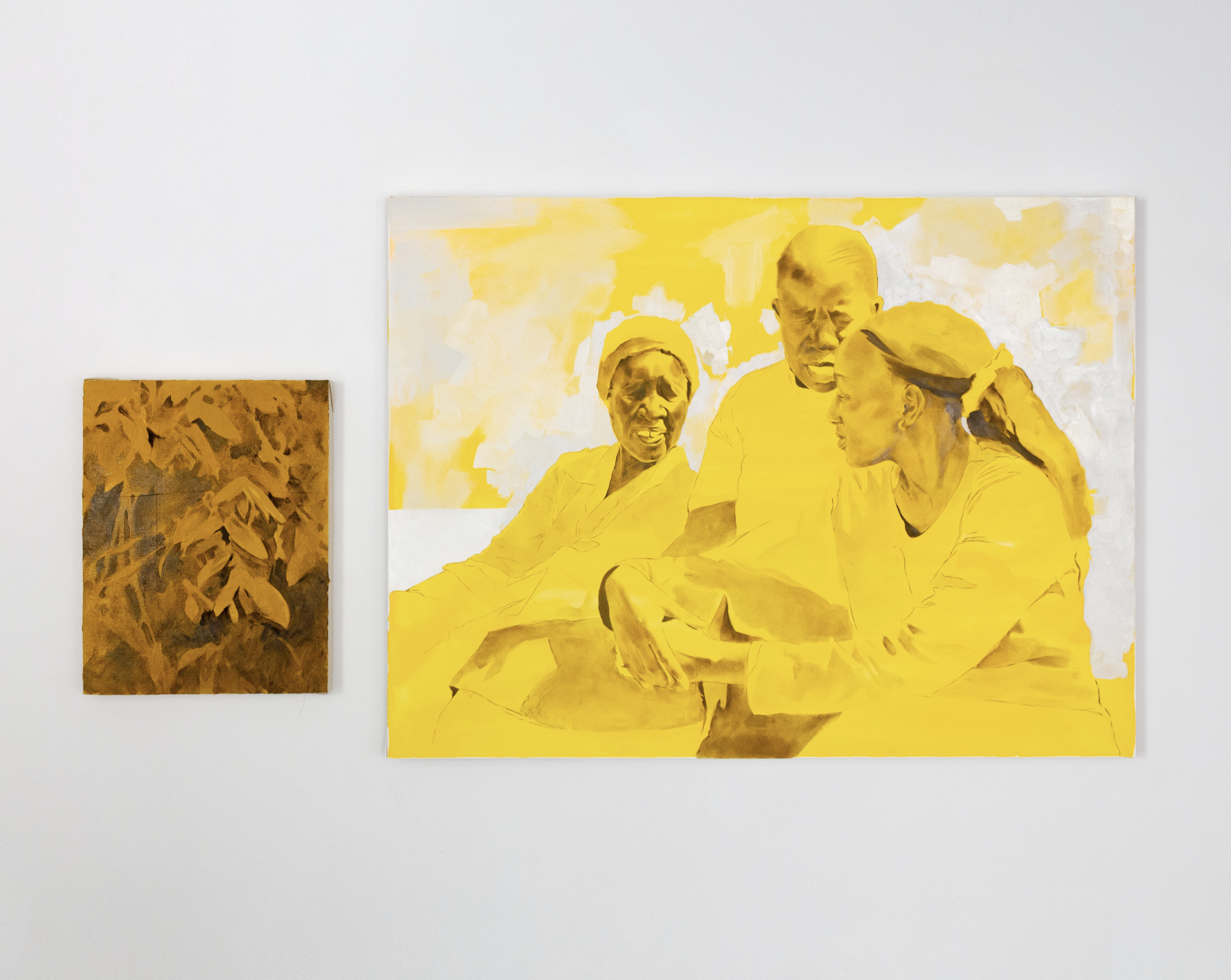
Figure 14: Louise Mandumbwa, Tell me something true, 2024, acrylic and oil on canvas, gouache and oil on paper, 20 x 16 inches (36 x 48 cm). Photo: courtesy the artist, Pat Garcia, and Zeshan Ahmed © Louise Mandumbwa
LM: This painting is of my younger sister with two of my great aunts. It was taken during the trip when we visited my father’s home village. That visit felt like finding pieces of an answer I had been searching for. My father left the village when he was about ten and did not return until he was in his forties. When we visited together in 2023, he shared stories I had grown up hearing, but my great aunts, Margaret and Nama, remembered them differently. Their recollections recontextualized everything. I realized that my understanding of this place had been built on secondhand memories recounted decades later. That trip also revealed something about my own name.
The botanical piece beside the photograph refers to my maiden name, Mandumbwa, which I learned comes from the Ndumbwa tree, native to that region. The word itself, Mandumbwa, refers to the fruit of that tree. My family settled near the groove where those trees grew, and the name became tied to the land. For me, that discovery elucidates how a name can serve as a kind of map for locating both family histories and belonging within a landscape.
LX: That’s so interesting. I love how deeply you engage with theory and the natural world. It’s rare to see. The botanical research in your work is such a beautiful entry point, especially in relation to trade and movement. I’m also curious about your work End Notes.
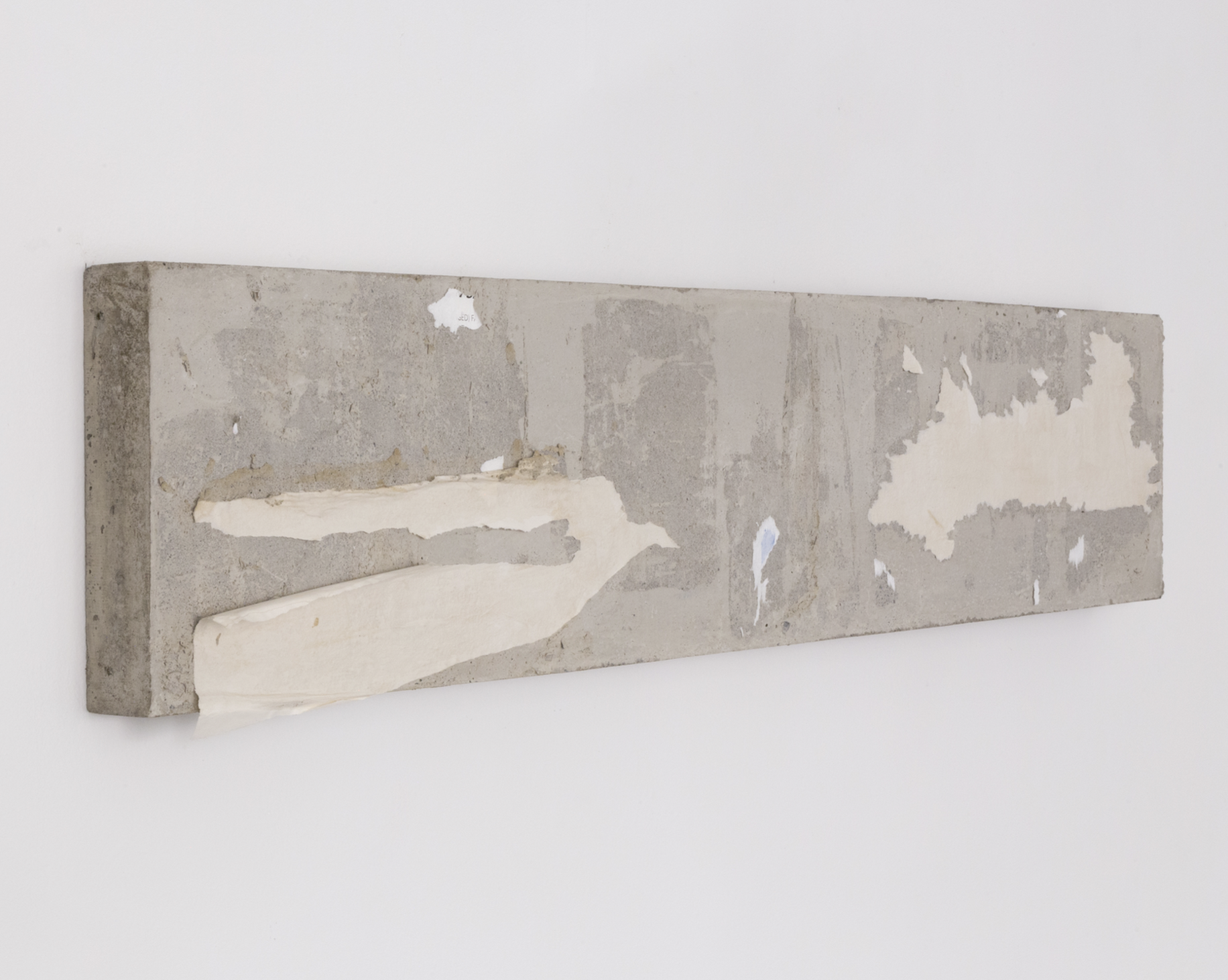
Figure 15: Louise Mandumbwa, End notes, 2024, concrete, wheat paste and newsprint, 14 x 66 x 3 inches (35.56 x 167.64 x 7.62 cm). Photo: courtesy the artist, Pat Garcia, and Zeshan Ahmed © Louise Mandumbwa
LM: End Notes is a cast concrete work that grew from my interest in how information circulates across different places. In the United States, zine culture carries a sense of accessibility and exchange. In southern Africa, that same impulse often takes shape through printed pages wheat-pasted on concrete walls outside homes and shops, where they weather, layer, and form an informal public archive. I wanted to create an artist book that felt rooted in that context. I learned letterpress printing, traditional bookbinding techniques and looked at self publishing methods, but concrete felt closer to the material reality of how ideas move where I am from. I cast a heavy slab, applied fragments of my poetry to its surface, and then weathered the paper away. What remains are only traces like page numbers, faint marks, and remnants of language. The piece slows the act of reading and asks what knowledge might live in what has been erased.
LX: How heavy is it, and how did you manage to hang that piece?
LM: With difficulty [laughs]. The piece is about four-and-a-half inches deep, with an empty cavity in the back and an inset forty-five-degree French cleat inside. I wanted the piece installed slightly lower than the rest of the paintings, since it is called End Notes and was meant to feel a little offset. During installation, we discovered the wall was uneven and it turned out to be a false wall. We finally had to move it to another spot at midnight. By the end, I just said, “If it’s on the wall, I’m happy.” That exhausting experience added to the work honestly [laughter].
LX: As an “end note” question, if you could imagine your ideal solo show, what would it look like, or where would it be?
LM: I’ve imagined an exhibition built around iteration and memory. There’s a work I made called All Artist Proofs that features many small faces, some of which are clear, some of which are blurred, and some are almost gone. I love the idea of showing two related works in different rooms, where each holds part of the image. You would have to carry the memory of one as you walk to the next, piecing them together in your mind. My dream show would ask the viewer not just to look, but to remember and to connect the fragments kind of like breadcrumbs. I imagine one room as a living garden filled with sugarcane, yucca, and plants from different places I’ve called home, like a hybrid garden of memory and geography. There’d be an artist book with page numbers or fragments that guide you toward other parts of the exhibition.
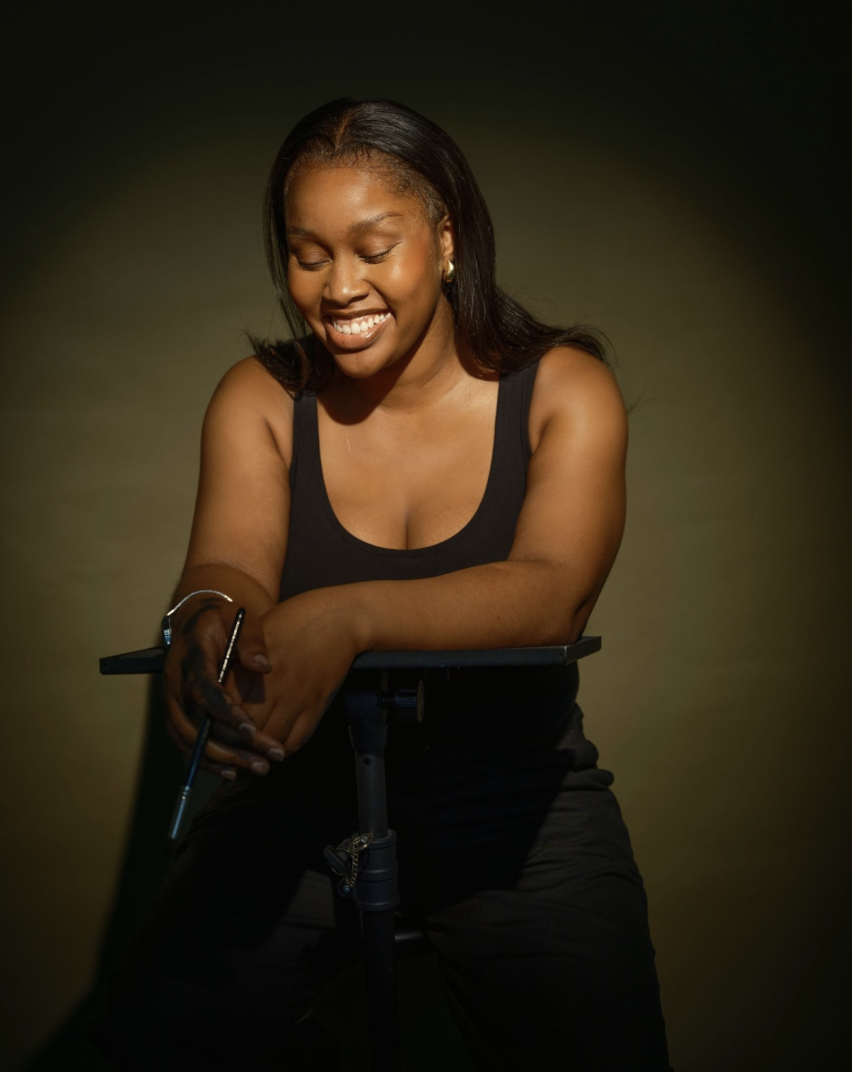
Photo: Arielle Gray
Louise Mandumbwa
Louise Mandumbwa (born 1996, Francistown, Botswana) is an artist working in painting, printmaking and drawing to explore ideations of home, figurative and botanical works. Her practice is a counter mapping endeavor examining the ranging registers or memory through material exploration, the illegible image and failed translation. An immigrant artist her works revisits sites of both familial and diasporic history to and appends them with affect and the anecdotal. Mandumbwa holds an MFA in Painting and Printmaking from Yale university as well as a BFA in Painting from the University of Central Arkansas. Her work has been included in recent group exhibitions at Sakhile&Me (Frankfurt, DE, 2025), Chili Art Projects (London, UK 2024), Spurs Gallery (Beijing, CN), David Castillo (Miami, FL), The Wright Museum (Detroit, MI) and Yossi Milo (New York, NY). She was a 2024 recipient of agrant from the Elizabeth Greenshield foundation and the Elizabeth Canfield Hicks award from Yale University. She has completed residencies at the Skowhegan School of Painting and Sculpture (2024), The Sam and Adele Golden Foundation for the Arts (New Berlin, NY 2022) and Visual Arts at Chautauqua Institution (Chautauqua, NY 2019) and Louise lives and works in New Haven, CT.
Instagram: @louise_mandumbwa

The In-Between Moments: In Conversation with Nadia Younes
Throughout her multimedia practice, Nadia Younes offers glimpses into construction sites and liminal spaces to investigate themes of displacement and instability. Younes speaks with Lara Xenia about her family history, love for junkyards, and her material explorations.

Figure 1: Nadia Younes, Distilled Emptiness, 2024, oil on panel, 48 x 48 inches (121.92 x 121.92 cm). Photo: courtesy the artist © Nadia Younes
Lara Xenia: What’s a core memory of a place from your childhood?
Nadia Younes: One of my strongest memories is from the coast of Mauritania. My parents had a tough time there, and I was so young that I only remember bits and pieces. The clearest memory I have is of the dirt roads covered in seashells. I once picked one up, and a cascade of tiny shells spilled out. For a while, I actually thought that's how babies were born [laughter].
LX: That’s so sweet. I didn’t realize you spent time in Mauritania when you were little.
NY: Yes, I moved around a lot as a child. I was born in Nazareth, but when I was three, we moved to Mali, then to Mauritania and Jordan. Once we returned to Israel when I was five-and-a-half, I started learning Hebrew. Let me give you some family history…

Figure 2: Nadia Younes, Nature of Matter, 2022, oil on panel, 8 x 6 feet (243.84 x 182.88 cm). Photo: courtesy the artist © Nadia Younes
In 1947, my grandma was born in Ashkelon (historically known as al-Majdal/Asqalan) in what is now Israel. A year later, the 1948 Arab–Israeli War (al-Nakba/War of Independence) broke out, and her family was deported to Sinai, so she moved to Cairo. My dad was born there as the youngest of six children. Unfortunately, my grandfather died young, so my grandma had to move with her six children to Gaza, where she was at the mercy of her family. On the ground floor of the house she lived in, she ran a small convenience store selling cigarettes, juices, and snacks, on a route used mainly by the Israeli army from a nearby base and by settlers from Gush Katif.
I’ve been to the West Bank, Palestinian territories, and Jordan, but never to Gaza, because after I was born it was after the two intifadas, and the border was closed…you needed very special permits to get in or out.

Figure 3: Nadia Younes, Past Observation Process, 2022, 8 × 6 inches (20.32 × 15.24 cm). Photo: courtesy the artist © Nadia Younes

Figure 4: Nadia Younes, What’s Missing, 2023, oil and inkjet on paper, 35 x 34 inches (88.9 x 86.36 cm). Photo: courtesy the artist © Nadia Younes
LX: Oh wow, so your family was based in Gaza?
NY: Yes, my grandmother and her six children were still living there. In the mid-1980s, a U.S.-based real estate group approached her several times to buy the house and shop, saying the location was strategic for the military and nearby settlements. They even offered her Israeli citizenship. She initially rejected the offer, but then she acquiesced when the Gaza authorities pressured her to close the shop since many of her customers were Israelis. As a young widow raising six kids on her own in a tough environment, she eventually had no choice but to leave. When my dad was about sixteen, they packed up quietly one night and left and he ended up moving to Nazareth.
In the late 1990s, my mother, Tatiana, came to Israel as a tourist from Kronstadt, which is a small naval island near St. Petersburg. She had a hard time in Russia after the Soviet Union fell. My parents met at a nightclub in Nazareth. Her father struggled with alcoholism, and her mother, Liudmila, was very supportive, but they had lived through times of boiling their own shoes for broth.
LX: That’s really crazy. Would you say displacement and family traumas actively inform your creative process, or do you notice these influences more in retrospect?

Figure 5: Nadia Younes, Emptiness as a Verb No. 3, 2025, oil on panel, 12 x 9 inches (30.48 x 22.86 cm). Photo: courtesy the artist © Nadia Younes
NY: That's a great question. When I was younger, I turned to painting and crafts as a safe haven from my turbulent childhood, and mainly made self-portraits. I later shifted to depicting construction sites and industrial spaces, which I see as systems of neglect that raise questions about physical bodies, access, and restrictions. Moving from country to country without any stability made these spaces feel permanent to me because no matter where I went, there was always construction and broken architecture.
Over time, I realized that most of life unfolds in the in-between moments, rather than in cathartic ones. I’d notice an air duct on the street and see it as an entity in itself or a truism. I try to employ trompe l’oeil effects and realism to destabilize viewers’ assumptions by connecting to sites that feel like “no man’s land,” where the ground seems pulled from under me. I like the agency that materials possess, like when materials start looking back at you or the object becomes the subject.
LX: Your approach to architecture is fascinating. What informed Nostalgia for the Nonexistent and Nostalgia for the Missing?
Over time, I realized that most of life unfolds in the in-between moments, rather than in cathartic ones.

Figure 6: Nadia Younes, Nostalgia for the Nonexistent, 2024, oil on panel, 36 x 24 inches (91.44 x 69.96 cm). Photo: courtesy the artist © Nadia Younes

Figure 7: Nadia Younes, Nostalgia for the Missing, 2024, oil on panel, 36 x 24 inches (91.44 x 60.94 cm). Photo: courtesy the artist © Nadia Younes
NY: As someone who lived in Israel for a while, I immediately recognized the architectural codes of the region when Sergey Kadochnikov, my best friend and collaborator from Jerusalem, shared the image with me. It was quite poetic to paint a site I never physically occupied, and to test how memory, fantasy, and distance could produce its own language. I honestly felt compelled to paint his photographs after moving away from our shared life and creative partnership.
LX: That’s so fruitful to have a friendship like that. So your air ducts embody bodies?

Figure 8: Nadia Younes, Nowhere, 2024, oil on panel, 8 x 6 inches (15.24 x 20.32 cm). Photo: courtesy the artist © Nadia Younes
NY: Yes, or something that’s unfamiliar. When I deal with construction sites and industrial areas, usually I see them as a universal code for temporality, access, social hierarchies, and gender roles, since construction sites are usually dominated by men or by me and my studio apprentice.
I love going to the metal junkyard in New Haven [smiles]. Sometimes I honestly prefer to go there rather than the museum to get more inspiration. I just feel alive there [laughter]! I’m intrigued by the transactional dynamics of how as two women my apprentice and I have to adjust to being allowed in those spaces to get what we need from the junkyard.
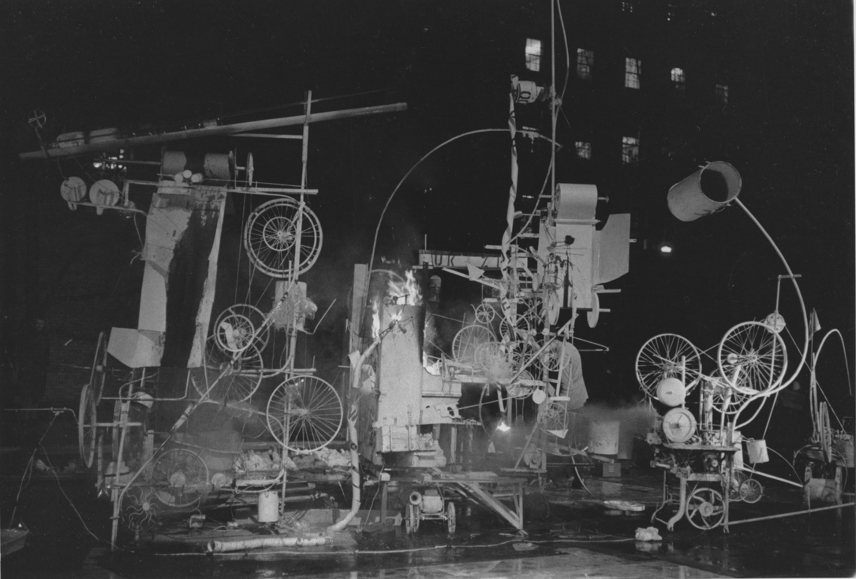
Figure 9: Jean Tinguely, Installation view of the exhibition Homage to New York: A self-constructing and self-destroying work of art conceived and built by Jean Tinguely, March 17, 1960. Photographic archive. The Museum of Modern Art Archives, New York, New York (IN661.1). Video footage: courtesy © Museum Tinguely, Basel, Switzerland, https://www.youtube.com/watch?v=6dgGu2w3Qvo
LX: I like that you like literal detritus. That kind of reminds me of how Jean Tinguely salvaged bicycles and scraps from Newark’s junkyard to create Homage to New York. He showcased his “suicidal sculpture” in MoMA’s garden in March 1960 and the fire department had to put it out after it burst into flames.
NY: I could totally see myself doing that [laughter].
LX: What’s the story behind the work with scrawled writing on the walls?

Figure 10: Nadia Younes, Ouroboros (Novembers), 2024, oil, charcoal and paper on panel, 72 x 48 inches (182.88 x 121.92 cm). Photo: courtesy the artist © Nadia Younes
NY: I made this painting in November 2023 when I was grieving my dog’s passing, my mom’s relapse into alcoholism, and the outbreak of war, so I chose to expose the panel and mark it with charcoal and pencil as I wrestled with my thoughts. I was dealing with an eating disorder and a sudden loss of control. Even small differences, like food labels switching from grams to “per serving” felt disorienting.
I’d often stare out the window at a nail in the frame and the empty blue sky beyond to ground myself, and in that same corner, I had taped a church pamphlet I once picked up that said, “Why must I suffer?” I wrote it largescale across the gallery wall in large charcoal next to complement this work. I often return to the image of the ouroboros, the snake that eats its own tail, bringing itself to life and killing itself in a never-ending cycle.
LX: Oh, I’m sorry you went through that. It's interesting that you chose ouroboros as a reference too. Were those dark times prompted more by your external environment that shaped it?
NY: It was absolutely circumstantial because in my heart, I believe that there is a lot of love in the world, and a lot of beautiful reciprocity. We can choose to surround ourselves with kindness and compassion daily. Looking at it now, a lot of my work deals with pain…I don't think that I paint happy subjects…[laughs]
LX: Do your thesis sculptures grapple with that? Take me through your process.
Figure 11: Nadia Younes, Another Fine Portal Mess, 2025, mixed media, 45 x 45 inches (114.3 x 114.3 cm). Photo: courtesy the artist © Nadia Younes

Figure 12: Nadia Younes, Another Fine Portal Mess (detail), 2025, mixed media, 45 x 45 inches (114.3 x 114.3 cm). Photo: courtesy the artist © Nadia Younes
NY: I see those two works in tandem with one another. For those works, I wondered what it meant to carry something with you when you’re uprooted, so that inspired both works.
Another Fine Portal Mess was a failed attempt to cast Compression Field. For Another Fine Portal Mess, I first used a trash bag coated with tar as a mold and tried using five gallons (so 102.5 pounds) of resin to make it. When I used a heat gun to get a globby effect, it grew too heavy, sank, and leaked, revealing the black layer underneath. The fumes were so strong the safety office cleared out my studio and banned me for three days because it was super toxic. I’m not proud of it, but it shows how volatile my process can be. Back in Israel, I worked with melting lead and plastic tarps. They respond to touch and pressure in a way metals like aluminium or steel can’t because it has a low temperature, and when it melts, it's shiny.
LX: Lead? Like Caravaggio lead? Nadia, that’s insane! [Laughter] Also, how heavy is this thing?
NY: About 50–60 pounds. Two people need to lift it. Yale’s department nearly barred me from showing it in the thesis show because of toxicity concerns, but by the thesis show Another Portal Mess had already stopped off-gassing, and Compression Field was produced safely, even as it kept resisting and leaking onto the floor of the gallery. For me, though, the instability and volatility of these works is essential. I’m drawn to objects that behave as if they have a life and desire of their own.
Compression Field a successful attempt. I wanted the bag to conjure a body, a womb, or a vessel that couldn’t hold its contents within. I cast it using resin in a large industrial chemical bin using sand and water. The water acted as a placeholder for the resin, and displaced it into a kiddie pool as I poured. I lined a trash can with a trash bag as a makeshift mold and worked around sand reserved for pewter. When I pulled it from the mold, it seemed to have shaped itself [laughs].
I wanted the bag to conjure a body, a womb, or a vessel that couldn’t hold its contents within.
Resin doesn’t react well to moisture, so the environment was hostile from the start. I think constantly about temperature and conditions, and about how to make metal and other stubborn materials feel warm, responsive, and almost living materials. The result felt less like control and more like a negotiation with the material. I then filled the interior with flexible metal conduits salvaged outside the Jewish Life Center’s construction site at Yale. It still had fragments of the wall and its residue felt poetic, like a system trying and failing to contain its past or history.
LX: That’s really cool. The way you connect belonging, volatility, and transience to self-understanding is moving. What was that vision?
NY: Compression Field emerged from a visceral childhood memory of carrying glass bottles of Heineken for my mother in a black bodega bag while my dad was at work. When I tried to ration her beer, she lost control, so I called the police, expecting protection, but they only questioned who sold the alcohol to a child. In the end, the blame fell on me.

Figure 13: Nadia Younes, Compression Field, 2025, resin, FMC, wall chunks, rusty chain, 30 x 20 x 20 inches (76.2 x 50.8 x 50.8 cm). Photo: courtesy the artist © Nadia Younes. For additional documentation please visit: https://nadia-younes.com/work/mfa-thesis-yale-school-of-art
That moment revealed how fragile support systems can be and characterized functional and dysfunctional systems. As a kid you believe you have choice, but that illusion leaves you carrying a responsibility for things beyond your control. So both works are a response to that rupture.
LX: It seems like you like that dichotomy.
NY: I really do seek it. I enjoy being in that tension.
LX: Which artists have inspired you?
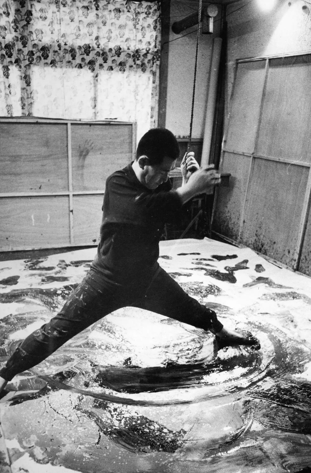
Figure 14: Kazuo Shiraga in his studio, 1960. Photo: courtesy Amagasaki Cultural Center and The New York Times. Image source: https://www.nytimes.com/2015/03/02/arts/international/art-world-rediscovers-kazuo-shiraga.html
NY: I think a lot about Kazuo Shiraga, the Japanese Gutai artist. I first saw his work at MoMA in 2021, soon after coming to New York. I love the tension between the delicacy of the papers and the weight of the paint and the raw evidence of the body in his work. I also think about Sylvia Plath in relation to that a lot and really resonated with The Bell Jar for its portrayal of depression and the way she framed an autobiographical story as a novel.
LX: Oh, I love the Gutai group and that’s on my book list. Is there anything you want to be known by?
That moment revealed how fragile support systems can be and characterized functional and dysfunctional systems.
NY: As an artist of my time, yes. I want to open the possibility that a lot of truths can exist simultaneously, and that in terms of our existence, we exist and therefore we suffer. I think about it as universal. I want to relate to the viewers and to people on an emotional level.
LX: What’s something that you live by?

Figure 15: Nadia Younes, Phantom Fragments, 2022, oil and charcoal on panel, 8 x 11 feet (243.84 x 335.28 cm). Photo: courtesy the artist © Nadia Younes
NY: J. Cole is one of my favorite artists, and he has a line I love: “Sometimes you gotta step away, do some living, let time provide a new prescription.” I feel that deeply because I feel like everything in life has a price.
Nadia Younes
Nadia Younes is an interdisciplinary artist working across painting, sculpture, installation, video, and writing. Born in Nazareth to a Palestinian refugee father and a Soviet immigrant mother, she moved between Israel, Mali, Mauritania, Jordan, and Russia. This transitory upbringing shaped her sensitivity to displacement, instability, and overlooked spatial systems, concerns that are central to her practice.
Her work explores tensions between surface and structure, access and refusal, containment and collapse. Drawing from industrial materials and urban demolition sites, she merges classical painting methods with cast resin, paint skins, flexible metal conduit, and other construction remnants. She treats these materials as bearing the memory of bodies in flux, reflecting systems of labor, gender, and survival. Multilingual in English, Arabic, Hebrew, and Russian, Younes approaches materials as she does language: as codes that can be bent, fractured, and reassembled.
Recent presentations include PowerLine at Perrotin, New York (2025), a public video screening with ZAZ10TS in Times Square (2024), and the solo exhibition Elusive Territories at The Study at Yale (2024). Select works include Interference Pattern, a mirrored environment featuring a suspended car and circulating liquids; Site of Failure, a kinetic installation composed of acrylic paint skins; Compression Field, a 450-pound resin sculpture embedded with demolition debris; and Second Lesson in Boundaries, a trompe-l’œil oil painting that reflects surveillance and fencing systems in Israel and the West Bank.
She holds an MFA in Painting and Printmaking from the Yale School of Art and a BFA from the Bezalel Academy of Arts and Design in Jerusalem. Her training includes scientific glassblowing, lithography, marble carving, and classical studies at the Imperial Academy in St. Petersburg. Younes has served as a graduate assistant at the Yale School of Art, taught at Bezalel, and engaged in community-based initiatives. She received support from residencies such as the Vermont Studio Center and ISPMFA, and was the recipient of the Winsor & Newton Award for Excellence in Painting. She is currently based between New Haven and New York.

Nightvision: In Conversation with Z.T. Nguyễn
Z.T. Nguyễn speaks with Lara Xenia about how insects, queer theory, and revolutions inform his rigorous drawing practice.
Figure 1: Z.T. Nguyễn, A sort of delicious terror (detail), graphite, colored pencil, and acrylic on letter-sized sheets of paper, 83 x 73 inches (unframed) (210 x 185.42 cm [unframed]). Photo: courtesy the artist, Perrotin Gallery, and Guillaume Ziccarelli © Z.T. Nguyễn and Perrotin
Lara Xenia: What is “home” for you?
Z.T. Nguyễn: I'm actually in a temporary living situation right now, with my parents. I do feel comfortable here since I'm around my family members, but knowing it won't last makes me feel more like a visitor, like I'm untethered and floating…not just in terms of where I'm living, but also my community, my belongings, not having a studio while I'm here. So maybe “home" for me is something that’s steady under my feet. It doesn't necessarily need to be a place, but something that’s reliable and rooted.
LX: I'm really interested in how you configure forms in space and cropped bodies within your compositions. What got you interested in figurative works?
ZTN: Representing the body—mostly my own body—has always been a pretty natural inclination for me in my work. I'm very aware of my body language and physical sensations in public spaces because they’re indicative of my social surroundings. How am I being perceived and how am I perceiving other people right now? The answers manifest in my stomach, on my skin, in the way I speak and make eye contact. I think this bodily social awareness is heightened by the fact that I'm queer and not white. That's definitely something I instinctively pay a lot of attention to, having grown up in a rural community that had very few other people like me.
Figure 2: Z.T. Nguyễn, Waiting, graphite and acrylic on letter-sized sheets of paper, 42.25 x 32.25 inches (107.32 x 81.92 cm). Photo: courtesy the artist © Z.T. Nguyễn
So the cropped or fractured body is sort of my way of zeroing in on the physical sensations that emerge from otherness. I think there's something about incompleteness that I'm interested in, too. Like, the incompleteness of identity, of history, or even the incompleteness of my grasp on the Vietnamese language, which is what I speak with my family in a really fragmented manner.
LX: I love that. Are you first gen American as well?
ZTN: I’m part of the first generation in my family to be born here, yes. But my parents came here when they were kids, so they’re quite American…I don't have a lot of the same burdens that other young Asian Americans have, like needing to translate conversations and documents for my relatives. Still though, my family's histories as refugees and their experiences with displacement and marginalization in places like Oklahoma, Florida, and Maryland are deeply important to me.
LX: I see. And what about insects? How did your moth drawings first come about?
ZTN: The moth motifs are part of a more general interest I've had for a while in nocturnality and the nighttime, but they’re actually a way for me to think about my family, too. Most of the moths I draw are based on a group known as “Asian American moon moths,” which includes the Luna Moth and is part of a larger moth family called Saturniids. I was originally drawn to them because of their classification as “Asian American,” which is used by entomologists to describe their geographic range from Afghanistan and the Indian Subcontinent eastward, all the way to the Americas. But a key feature of these moths—the thing that led me to draw them so much in my work—is that they lose functionality of their digestive systems after they pupate. Rather than eating and nourishing themselves, their sole purpose in their final, most beautiful stage of life is to mate and provide for the next generation. And after just a few days as fully-formed moths, they die.

Figure 3: Z.T. Nguyễn, Moth, graphite and wall paint on letter-sized sheets of paper, 16.25 x 8 inches (41.28 x 20.32 cm). Photo: courtesy the artist © Z.T. Nguyễn
LX: In what part did that feel like your family?
ZTN: The sacrifice in having no other option but to provide for the next generation. Luckily my family members are indeed able to eat, and have fully-functioning digestive systems, for now [laughs]. But I think that the biology of these moths feels analogous to my parents’ and grandparents’ values and how I interpret their struggles in the US. Moths are primarily active in the night, which is a larger theme in my practice, as I mentioned. The night, for me, has a lot to do with waiting and transformation and the potential energy that builds before change occurs. In my piece Moth, which I did in the fall of 2023, I cut a drawing of the night sky into the silhouette of a moth. There's something about the briefness of an Asian American moon moth’s lifespan versus the ancientness of stars that appeals to me. What does it mean to compress these giant, almost incomprehensible cosmic objects in the night sky—most of which are larger and sometimes older than our own solar system's sun—down into the shape of something as simple and short-lived as a moth? I think it speaks to the infinitude I see in my family members and even in myself.
LX: And what about the mosquitoes that often show up in your work? Are those related to your family, too?
The night, for me, has a lot to do with waiting and transformation and the potential energy that builds before change occurs.
ZTN: To a degree, yes. Mosquitoes are also nocturnal like moths, which is a big reason why I tend to draw them. But unlike moths, especially large and beautiful Asian American moon moths like the Luna Moth, mosquitoes are basically universally despised [laughs]. The first drawing I made at Yale in 2023 was called Dandelion, and it had these mosquitoes in it that were menacingly large and chunky, flying around two pairs of feet and a dandelion that had lost all its seeds and petals. I was thinking about the floor and how it's often overlooked or considered dirty, but how it's also the plane that supports our bodies. I was also thinking a lot about weeds and overgrowth. Even though there's a lot of beauty to be found in that space, the mosquitoes were there as a sort of threat. I’m really interested in the precarity of mosquitoes, and how they might disrupt the otherwise tranquil register of an image. That precarity certainly resonates with me when I think about my family's history, and mosquitoes themselves also have a direct reference to heat and the tropics.

Figure 4: Z.T. Nguyễn, Dandelion, graphite and wall paint on letter-sized sheets of paper, 68.75 x 26 inches (174.63 x 66.04 cm). Photo: courtesy the artist © Z.T. Nguyễn
My mom is from Laos and my dad is from Vietnam, so I also think a lot about the tropics as an alternate modality. The ways that heat, humidity, infertile soil, and challenging topographies force people to abandon ways of living that are standard in temperate regions, which often include countries in the Global North. That environmentally-forced turn away from colonial norms is really inspiring to me. Like land itself rejects colonization. There's a lot we can learn from it. That being said, I've never lived in either Laos or Vietnam myself, but motifs like mosquitoes, which are often associated with heat and the tropics, are reminders that I'm still deeply invested in where my family is from.
LX: I can see how they evoke heat.
ZTN: Yeah. Here in North America, mosquitoes are only really out on summer nights, which kinda feels really queer to me. Or more specifically, gay [laughs]. I was taking this class called Queer Strategies at Yale, which is typically offered every fall in the School of Art; a few of us called it “gay class” as a joke [laughs]. And I talked about mosquitoes a lot during that class, actually. Beyond the “summer nights" thing, mosquitoes are also associated with disease, they suck on bodily fluids, they're mostly invisible until you spot them up close, they're widely regarded as pests, and many people actually want them vanquished from the face of the planet despite them being vital to ecosystems in basically every biome they occupy. Sounds pretty gay to me [laughs]! But in all seriousness, I don't want to use them as an anthropomorphic symbol or anything because mosquitoes are also responsible for more human deaths than any other animal… Again, I'd say it's more about the precarity that they evoke. There was a lot of queer theory we read in Queer Strategies that complemented this pretty well, too.
That precarity [of mosquitos] certainly resonates with me when I think about my family's history, and mosquitoes themselves also have a direct reference to heat and the tropics.
LX: I love queer theory. Did you read any Whitney Chadwick or Richard Meyer?
ZTN: Not for the class, but on my own, yeah! From the Queer Strategies reading list there was Ursula K. Le Guin's Author of the Acacia Seeds, Gregg Bordowitz's Questions, and Eva Hayward's Spiderwomen, which were all particularly impactful on me. Outside of that class, though, another faculty member brought to my attention this poem by John Donne called The Flea. In the poem, two lovers can only meet through a flea that bites both of them, so their blood could mingle inside of its body. She thought it was relevant to my mosquito drawings, especially Dandelion, and I agreed. I was really struck by it and have continued to think about it a lot—that gross but also sweet and tragic sentiment. It was really interesting to me. It felt in sync with the weird affective mode that I was wanting to work with, and it still resonates with me now.
LXM: Could you tell me about Mosquito Star?

Figure 5: Z.T. Nguyễn, Mosquito Star, graphite and wall paint on letter-sized sheets of paper, 32 x 31.5 inches (81.8 x 80.01 cm). Photo: courtesy the artist © Z.T. Nguyễn
ZTN: Sure! I've already talked about mosquitoes, so I guess I can talk about the star as a separate motif. There are two types of stars I frequently return to in my work: the naturalistic star, which I used in Moth, and then the five-pointed star, which is a representation of the naturalistic star, but an oversimplification of it. It's like cutting down a real star—like, an ancient, celestial entity—into a simple, easily reproduced shape that's mostly found in human political contexts. I'm really interested in that oversimplification as it pertains to politics.
Mosquitoes fly around pretty randomly, without any sense of order or synchronization; so, for them to form up into a five-pointed star like the one in Mosquito Star would be, like, really unusual and unlikely. So, I’d say this work is really about the unnerving and precarious nature of human politics. This kind of star is also a big part of the Vietnamese flag, so I’ve also thought a lot about this work in relation to the circumstances of modern Vietnam's formation, which was an immensely violent part of history, largely because of French and Japanese colonialism but also more famously because of US intervention and escalation. So I think Mosquito Star, and my use of five-pointed stars in general, could be understood as a sort of a critique of the extreme measures that powerful countries took in order to assert control and influence in Vietnam during that time of revolution. This year, 2025, marks the 50th anniversary of the end of the US Wars in Southeast Asia, including the Vietnam War, which is still a point of extreme sensitivity for a lot of people.
LX: It’s really brave that you’re even approaching this in your art. Artists are always exploring themselves, sometimes subconsciously, through what they absorb day to day. As a child of immigrants, I think grappling with that history is especially powerful because you’re trying to tap into your family’s narrative.
ZTN: Thank you. Yeah, and the five-pointed star is not unique to Vietnam, either. These stars are on a lot of flags: the US, Morocco, Pakistan, China, Honduras, Somalia, Myanmar, Cuba. The list goes on and on and on. And so that oversimplification that the shape does to naturalistic stars—that emphasis on the unnatural, sharp-edged mechanics of human politics—it's a reminder that it's really something that’s happened globally, not just in Vietnamese political history. And what’s more is that history is still ongoing today, too. Like, in the US, Southeast Asian refugees are still being specifically targeted and deported by the masses, which has been quietly going on for almost two decades now, and no one seems to be aware of how deeply it’s been disrupting our communities. And it's only, like, one of many loose strings from the wars that were left untied. It just makes me think about how many political injustices are still very much ongoing and still unfolding today all over the world, whether or not they're considered “over,” you know?
LX: Do you think of that temporality at all within your work?
ZTN: Definitely. I'd even say temporality in general is another kind of subject matter or motif for me, just like bodies or insects or the night, since a lot of the paper surfaces I draw on are folded and can be carried in a pocket or a bag. I like the idea of a drawing being carried by me—or by anyone, really—over the course of time, across various locations and periods of someone's life. Sometimes I have my friends hold onto drawings or pieces of paper that I haven't drawn onto yet. But when I carry them with me, I take them out, unfold them, look at them for a while, I hang them on the wall, and then I refold them back up before moving them somewhere else. They're like keepsakes or talismans, kind of. Or maybe curses, depending on the drawing [laughs]. But every time they get folded, that history—that time that I spent with them—it gets permanently recorded on their surfaces.
LX: Do you want the eventual owner of the work to be able to carry it in their pocket, the way someone might keep a photo of a loved one in a wallet? Is that a way of keeping it “close to home”?
ZTN: If they buy it unframed, I usually tell collectors that they can do as they wish with the drawings. The folding and carrying is part of the creation of the work, which has the potential to continue for as long as I have possession of it. But once someone buys an unframed work, they can choose to continue that process or keep it as it is. But I like that idea of folding and portability as having some kind of relation to “home.” Come to think of it, maybe I should add that to my answer to your first question [laughs]! So, “home” for me is also what we carry with us across time and geographies, the things that continuously witness our changes and transformations. I guess the idea of “home" being decidedly separate from a geographic location makes real sense, too, in the context of my practice and family history. The folded sheet of paper, for me, evokes documents—especially refugee documents like the asylum forms or identification papers that my parents and grandparents might’ve carried with them. I'm interested in the fold as indicative of something that’s necessary to hold onto for safekeeping, yet at the same time it's not precious or holy enough to preserve in perfect condition. That’s where the folds in my drawings come from, really: thinking about putting away an important document and taking it back out as needed, over and over and over and over. Most of the drawings are even built from document-sized sheets, like I'm working with the materiality of the immigration system itself.
The folded sheet of paper, for me, evokes documents—especially refugee documents like the asylum forms or identification papers that my parents and grandparents might’ve carried with them […] That’s where the folds in my drawings come from, really: thinking about putting away an important document and taking it back out as needed, over and over and over and over.
LX: The fact that one paper could be indicative of if someone’s a citizen of a place or not is still conceptually insane to me, even on a humanity front.
ZTN: Yeah, like somebody's humanity and value being reduced down to nothing more than an 8.5 x 11. It really is a violent thing to classify people into categories and bits of data that determine their livelihood, their health, safety, and where they can live. At the same time, though, the sheet of paper is also used for a plethora of other purposes that might not be associated with violence at all! Like, love letters and recipes and books. So the real culprit here, I think, is standardization and the things that come with it: regulation, bureaucracy, and control.
LX: Tell me about Starlit.
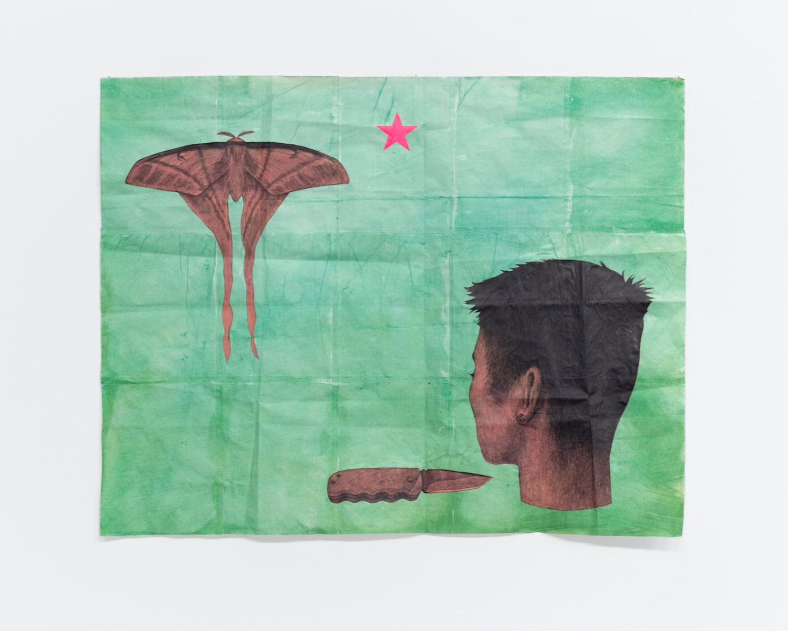
Figure 6: Z.T. Nguyễn, Starlit, graphite and acrylic on letter-sized sheets of paper, 40.5 x 32 inches (102.87 x 81.28 cm). Photo: courtesy the art and Pat Garcia © Z.T. Nguyễn and Pat Garcia
ZTN: So this piece is probably the start of the transition from my earlier work at Yale—which makes up most of what we've already talked about so far—to where my ideas are at now. It consists of a few motifs we've already discussed: folded paper, a five-pointed star, and an Asian American moon moth—specifically, a Pink Spirit Moth, which is indigenous to Laos and Vietnam. What's newer here is the pocket knife, which is based on the one my father carries, the severed head, and heavily saturated color. The head might be related to the cropped bodies we talked about towards the beginning, but I think it's really its own thing. When I draw heads without bodies, they aren't necessarily dead or decapitated, since I imagine them still capable of seeing, hearing, thinking, and speaking, but incapable of moving. That tension, that powerlessness or helplessness, definitely has political origins for me.
I made Starlit during the summer of 2024, following a peak in widespread student-led political movements on campus during my time at Yale, which was met with police violence and aggressive retaliation from the university's administration. The same was happening on university campuses across the US and throughout the world. I participated in these movements firsthand, helped to organize them, witnessed the university's response in real time, all while seeing multiple genocides that were happening—that are still happening—on social media and press coverage… and it all really profoundly impacted me. These administrative and militarized systems, whether people are working within or directly against them, are just so much bigger than any of us individually. That sense of scale and of being small in the face of something vast—that's what the severed head is to me. It's a political motif. The knife, too, with its sharpness and inherent danger as a weapon, is kind of like the mosquito and tied to precarity. But what I don't want for this work is for it to defend inaction. I think, if anything, making this work encouraged me to think more on ways to take action, to seek out collective power because of my powerlessness as an individual. I think of this piece as a snapshot of a particular emotional and political moment that deeply affected me.
The works that I made after Starlit—from that summer until now—share these political influences and lean more into the nocturnal or nighttime theme I mentioned earlier in our conversation. A number of these works ended up becoming my thesis at Yale, and most were included in my first solo show, Facts Are Bigger in the Dark, which was shown at island this past summer, which is a gallery in New York's Chinatown.

Figure 7: Z.T. Nguyễn, Cat and Mosquitoes, graphite and acrylic on letter-sized sheets of paper, 40.5 x 32 inches (102.87 x 81.28 cm). Photo: courtesy the artist and Pat Garcia © Z.T. Nguyễn and Pat Garcia
LX: How did the show's nocturnal theme relate to politics?
ZTN: I think it's metaphorical or allegorical for revolutionary potential, but I'm not always interested in depicting that explicitly in my work; I'm more interested in harnessing what that potential feels like, and what inspires it. I started describing the night as a way of exploring the psychological space between stasis and change. Even if the works don’t look like night, they all live there in that transitional space. The darkness of night makes it hard to see clearly, and that demands different ways of moving through the world. That's why a lot of the animals that appear in my work are nocturnal—from moths and mosquitoes to cats. I almost always choose animals based on what helps them to navigate the night and survive. Moths have powdered wing textures that can make their flight silent and disrupt a bat's echolocation. For cats, it's their nocturnal vision and stalking. But since human figures were the real anchor of the show, sometimes they even took on these qualities to make it through the night, like a person who could turn their head all the way around like an owl. I'm really interested in human activities that happen regularly, or even exclusively, under the cover of the night’s darkness: parties, sex, drugs, crime, but also dissent, resistance, escape, and even witchcraft or communication with demons and spirits. I think witches are revolutionary beings. I haven't referenced witchcraft directly in my work, since I'm unfortunately not a witch myself, but I find them fascinating. On the other hand, I do have experiences with ghosts, and so does my family.
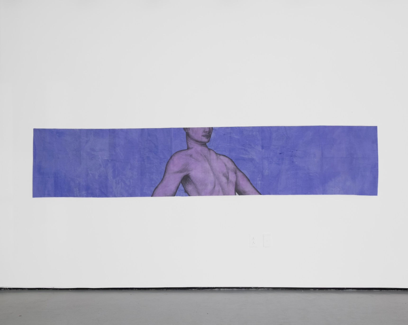
Figure 8: Z.T. Nguyễn, Neck, graphite and acrylic on letter-sized sheets of paper, 26 x 130 inches (66.04 x 330.2 cm). Photo: courtesy the artist and Pat Garcia © Z.T. Nguyễn and Pat Garcia
LX: Is your family superstitious?
ZTN: A bit, yes. We definitely believe in ghosts, at the very least. My parents and I were just talking about this last night, actually, and sharing ghost stories, bringing up people we know who are true mediums. I personally am not a medium by any means, but when I lived in Providence as an undergrad at RISD, I definitely had my fair share of ghost encounters. We also talked a bit about bùa ngải, which is a type of evil sorcery in Vietnam that involves curses, blood rituals, and mind control.
I'm really interested in human activities that happen regularly, or even exclusively, under the cover of the night’s darkness: parties, sex, drugs, crime, but also dissent, resistance, escape, and even witchcraft or communication with demons and spirits.
LX: Why did you choose to anchor the body and why did you choose these particular hues for your show?
ZTN: I think the body felt pretty natural of a choice for me. I talked about it a bit towards the beginning of our conversation, but most of the bodies I draw are my own. They're depictions of my physical sensations that come from experiences of otherness, which have largely informed my political engagements and interests. My colors, on the other hand, were chosen based on their proximity to or their distance from the color red. I was reading Anne Carson's Autobiography of Red and Eros the Bittersweet while making a lot of this work. The latter uses examples of Sappho’s poetry to explain that desire requires a space, a distance, between the desirer and the desired in order to exist. That space is comparable to the nighttime for me, because it’s a liminal zone between stasis and change. I started associating that space with red, thanks to Autobiography of Red, but also because of forces like lust, anger, or ecstasy which feel both like the color red and frustratingly liminal to me. When I chose colors for the drawings that eventually were included in the show, it was always about their relationship to red, to that emotional space. Purple and indigo felt like a few steps away from it; orange was closer, but standing on edge nearby; and pink was a muted, softer version of it, nestled beside it. Every color choice could be traced back to red as the emotional origin.
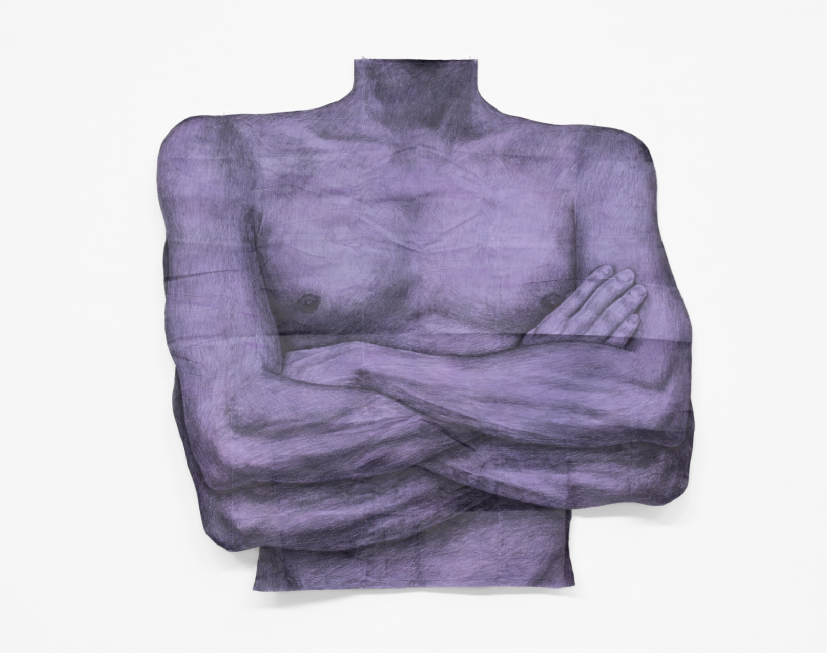
Figure 9: Z.T. Nguyễn, Insectoid, graphite and acrylic on letter-sized sheets of paper, 32 x 32 inches (81.28 x 81.28 cm). Photo: courtesy the artist © Z.T. Nguyễn and Pat Garcia
LX: What is the CRT in Watching about?
Figure 10: Z.T. Nguyễn, Watching, hand-drawn digital image, found CRT television, acrylic-pigmented cement, dimensions variable. Photo: courtesy the artist and island © Z.T. Nguyễn and island
ZTN: I grew up with CRT TV sets, so I think it evokes a sense of domesticity, like it's a snapshot of the home at night. But it isn't necessarily a warm or welcoming home space, which I think is felt though the cement pill bottles and beer bottles and that garish magenta color, but also in the other furniture piece in the show, which is a chair that's flipped over with a drawing hanging on its underside. I’d been wanting to use the backsides and undersides of discarded furniture pieces as unconventional frames for my drawings, since they're the parts of the furniture that you're not supposed to see, which affects the conceptual context for viewing the drawings. Like, is this drawing a secret that I'm only seeing because someone happened to flip this chair over? And why did they flip it over? Was it in a fit of rage? I ended up naming the chair piece after the show, Facts Are Bigger in the Dark. Eventually, one day, I’d really love to do a show where all the drawings are displayed on the backs or on the undersides of furniture, and none are on the walls.

Figure 11: Z.T. Nguyễn, Facts Are Bigger in the Dark, squid ink, graphite, colored pencil, and acrylic on letter-sized sheet of paper; overturned found chair, 23.5 x 36 x 16 inches (59.69 x 91.44 x 40.64 cm). Photo: courtesy the artist © Z.T. Nguyễn
But the drawing itself for this piece was made with squid ink, actually, which I feel was a significant choice for me. Fun fact: squid ink is actually the original sepia ink! I guess it's no longer a standard art material, though, because I had to get it from a culinary website, since it's more commonly used to dye food in Italian and Japanese cuisines. I really wanted to make a drawing using the materiality of fear. And since squids and octopuses and cuttlefish emit ink to escape danger, it was kinda perfect. It smells really, really bad, though—like, super fishy—[laughs] and it's a really difficult material to work with, so the drippy, messy markmaking just emerged as I drew it. Graphite is such a controlled medium in comparison, especially because I mostly use mechanical pencils, so it was a bit of a challenge for me to get it to look decent. It even works differently than other kinds of ink, like India ink—it just sits on top of the paper and doesn't absorb into it as easily.
LX: That makes sense that it’d be viscous. But there’s also something about the ink itself, as a kind of self-protective mechanism. Even with squid, it’s about defense, survival.
ZTN: Right, like that's part of its defense; it even resists my control over it. I had to learn to let go of my sense of control and ended up just spraying it with water so it could just drip all around the paper. And that ended up working really well! It was so much better when I let it do its own thing; it actually looked like the materiality of fear.
LX: When I saw the CRT TV and single chair, I subconsciously thought of Warhol’s Electric Chair. Was that your intention, or were you more focused on evoking absence?

Figure 12: Andy Warhol, Electric Chair, 1971, screenprint, sheet: 35 7/16 x 47 ⅞ inches (90 x 121.6 cm). Edition 192/250 | 50 APs. Whitney Museum of American Art, New York; gift of Peter M. Brant © The Andy Warhol Foundation for the Visual Arts, Inc./ Licensed by Artists Rights Society (ARS), New York (73.92.3) https://whitney.org/collection/works/7335
ZTN: It wasn't my intention, but I'm glad you thought of that because of its political indications. I personally was more focused on absence and a kind of unfriendly domestic space, which I mentioned earlier with Watching. But I think it's best exemplified in the smallest drawing in the show, which is less than two inches on its shortest side. Its title is Home, and I think the significance of its impact is in its small size versus some of the bodies in other drawings around it that are larger than life. So, what does it mean for this space—this home, this place of supposed comfort and rest—to be so tiny that a body could never fit into it? What does someone do when their own home is too small for them?
Figure 13: Z.T. Nguyễn, Home, graphite and acrylic on paper, 3.9 x 1.9 inches (9.90 x 4.82 cm). Photo: courtesy the artist and Pat Garcia © Z.T. Nguyễn and Pat Garcia
LX: Did you ever feel that way while making this, like physically out of place or out of sync? I’m thinking about how our bodies sometimes feel out of space, and whether that influenced the scale of your work.
ZTN: I think so. Those feelings, for me, come from being queer, being Southeast Asian, ongoing politics, all of the things we've been talking about so far. Not belonging and not being heard. Interestingly, for a work that has so much of my personal strife wrapped up into its ideation, I think it’s the smallest finished artwork I've ever made. I wonder what that means [laughs].
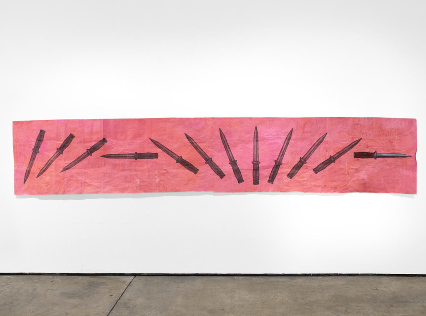
Figure 14: Z.T. Nguyễn, Almost, graphite, colored pencil, soft pastel, and acrylic on letter-sized sheets of paper, 172 x 32.5 inches (436.88 x 82.55 cm). Photo: courtesy the artist © Z.T. Nguyen
LXM: Fascinating, tell me more about Almost.
ZTN: Funny that we're following the smallest work in the show with this piece, which I think might be the largest. I had to watch a lot of slow-motion videos of knife throwers to make this drawing; I was studying how knives spin through the air, so that the drawing could imply that same movement. The process of drawing the same knife over and over again as it spins through space was really tedious and time-consuming, but I consider that to be part of the potential energy of the drawing and the effect it has on a viewer. The whole thing is about fourteen-and-a-half feet long—the longest single dimension out of all the works in the show—but it all comes down to the moment where the rightmost edge puckers inwards to meet the tip of the rightmost knife: the only one in the drawing that's fully rendered in color with soft pastel. That edge shifts into a deeper magenta or red, almost like it's bruising as it strains itself to meet the blade, like it's asking to be punctured. It’s about that split second before it hits—that tiny space between the tip of the knife and the edge of the paper.
LX: I love that undulating edge. Is it meant to suggest puncturing skin or a specific body part?

Figure 15: Z.T. Nguyễn, Almost (detail), graphite, colored pencil, soft pastel, and acrylic on letter-sized sheets of paper, 172 x 32.5 inches (436.88 x 82.55 cm). Photo: courtesy the artist © Z.T. Nguyen
ZTN: Not necessarily, but I'm not opposed to that interpretation at all. I wanted the pink to feel bodily, but not strictly skin-like. More like the layers beneath the skin's surface—something flesh-like, almost like the color of muscular diagrams in science or anatomy textbooks, but maybe more vibrant or urgent than that. Similarly to how I was talking about color before, this pink is also about its relationship to red: it's a softer, less powerful version of it. Like, think of this pink as the potential energy of anticipation, and the red edge as the intensity of rupture. In a lot of ways, I think this work was the centerpiece of the whole show, even though I also think it's the most different from the rest of the works… it's like this one piece summarizes the emotional qualities that the others achieve collectively.
LX: Fascinating. Before we end, let's move on to your Perrotin work and its text.
ZTN: Ah, yes. This one is my baby [laughs]! Or, like my big baby. They’re all my babies, but I think I'm still really attached to this one because it was the last piece that I made at Yale. I wrote the text for it myself, but originally it was for this creative writing class that I was lucky enough to have taken in my last semester. It was a prose poem I wrote for an assignment, but I figured it could actually work really well as a drawing. Let me read it to you:
My certainty, usurped. My face, splattered with saliva. My limpness, swollen. Those niceties don't apply here, not on this splintered table whose legs are so so wobbly. The noise of it all—the fear, the guilt, the ecstasy—I bristle at the thought of trying to imagine it otherwise.
It took a massive effort on my part to draw the mosquito-text, which I did over the course of a few days. I think I must’ve pulled two at least all-nighters to get it done before my last final critique at Yale? I was also preparing for surgery during that time so I was in a lot of physical pain and discomfort, which had been going on for, like, two months at that point. It was a brutal last semester; I don't know why I did all that [laughs]. But I'm kinda glad it all worked out, since I'm actually really pleased with the result. I kept thinking about how fragile, how impossible it would be for mosquitoes to come together to spell words that have meaning like this. But also, if it actually happened, I thought about how painstakingly brief it would last before dissolving. Kinda like Mosquito Star, which we discussed earlier, but on a much more ambitious scale.
LX: Wait, so the writing is actually tiny drawings of mosquitoes?
ZTN: Yeah! The words are made up of about 2,500 individually-drawn mosquitoes. I think I'm really interested in the meaning of the words, of the language, but within the context of the mosquitoes. Like, yes, it is about the homoerotic and masochistic implications of the words themselves, but, it's contained by the brevity of a moment when everything suddenly aligns and becomes clear, only for it to scatter away from you. Like, how precarious and fragile and fleeting a split second of clarity can be, and the desire that you have to hold onto it, or to stretch it out. That's what this drawing is. I see that in the lower green portion, too, with the head rising from the water, but I think a lot of its significance does lie in the upper brown portion, in the mosquito-text. I wrote about it in an Instagram post, which articulates it a bit better than how I'm explaining it right now, I think. I can read it for you:
The words in A sort of delicious terror are made up of roughly 2,500 individually hand-drawn mosquitoes in flight—a swarm that some might describe as precarious, or maybe even threatening. It's a motif I've invoked several times in the past few years of drawing.
But I think I'm (slightly) less interested in the precarity of the mosquitoes themselves here, and more interested in the precarity of so many moving parts. If mosquitoes ever actually converged to form language like this, any kind of meaning that's conveyed would be so brief it would only last an instant—and then in the next, the mosquitoes would dissipate back into chaos. This drawing is largely about holding that instant, the moment where things align against all odds before falling apart again. It's about how we remind ourselves of the moments that are profoundly meaningful and erotic and liberating and humbling and radical and necessary, especially amidst genocide, fear-mongering, and violence. If there's one thing I’ve had to do the most during my MFA at Yale, it was maintaining and tending to these moments continuously alongside engagement and action as times and circumstances changed and warped.
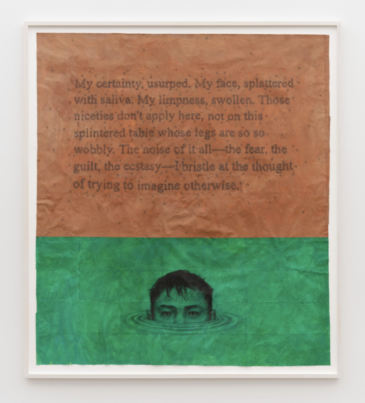
Figure 16: Z.T. Nguyễn, A sort of delicious terror, graphite, colored pencil, and acrylic on letter-sized sheets of paper, 83 x 73 inches (unframed) (210 x 185.42 cm [unframed]). Photo: courtesy the artist, Perrotin Gallery, and Guillaume Ziccarelli © Z.T. Nguyễn and Perrotin
Queerness and queer desire often make up the content or subject matter of my work, but it’s always driven by themes of liberation and revolution, even if it's in a way that isn't obvious. I guess it's because I see those things as inherently linked. In this particular drawing, queerness is really anchored in the text, in the meaning of the language itself. It describes a sexual encounter or intimate moment that is gross and masochistic and maybe even scary but in a way that the narrator actually really desires. But the fact that it's made of mosquitoes and so temporary—that's the part that feels liberatory to me, or rather, that this drawing has frozen this moment in place and pinned it down feels liberatory. It's like holding onto a moment of desire forever, a moment that was supposed to have just come and gone. I think I see it as analogous to holding onto moments of meaning and collective power.
Radical moments, not necessarily of sexual desire, but of the desire for real change, moments that are actively being suppressed. In our current political climate, I was really thinking about what it means for me to graduate from an institution like Yale and what it means for me to show my work at a gallery like Perrotin, and what I wanted my work to say or to evoke. What can I even offer at a time like this? What does it mean to be a student artist, or a recently graduated artist, while ICE raids are happening on campus and abducting my peers? While we're being doxxed by far right groups for opposing war and genocide, while there are crackdowns on protests, while faculty members are being censored? While entire curricula about feminism, queer theory, race, or diasporic perspectives are being masked or altered or erased altogether? It's an impossible thing to balance.
LX: “Splattered with saliva” also conjures the splattering of blood to me.
ZTN: Interesting. In the context of blood of a bodily fluid that might result from real violence, I think this idea of holding onto a pivotal moment changes. It becomes more of a moment of not backing down and not forgetting, rather than a moment of desire or ecstasy. I think that shift makes those moments where desire and violence come close together—where they almost even intersect—really important to this work. It's like a reminder that even if the moments we freeze in place and hold onto stem from desire, we ultimately need to see change through to the very end.
Z.T. Nguyễn
Z.T. Nguyễn (b. 1997, Silver Spring, MD) is an artist based between Maryland and New York. In 2025, he had his debut solo exhibition at island, New York. His work has been included in group exhibitions at Perrotin, New York; Klaus von Nichtssagend, New York; Asia Art Archive in America, Brooklyn; and Vincom Center for Contemporary Art, Hà Nội; among others. He has participated in residencies and fellowships at Textile Arts Center, Brooklyn; The Alternative Art School & MAIIAM Contemporary Art Museum, online; and Asia Art Archive in America. Nguyen received his BFA in Painting from Rhode Island School of Design in 2019 and his MFA in Painting and Printmaking from Yale School of Art in 2025.

Beauty Inside the Chaos: In Conversation with Jaouad Bentama
Following a near-death injury that resulted in 47 broken bones, Jaouad Bentama’s approach to art was never the same; art became his healing remedy and second chance at life. Lara Xenia speaks with Bentama about his career, artistic techniques, and personal philosophies.

Figure 1: Jaouad Bentama, Reflexion: Composition LVXVII, mixed media, 48 x 36 inches (121.92 x 91.44 cm). Photo: courtesy the artist
Lara Xenia: What materials do you gravitate towards?
Jaouad Bentama: After a near-death injury, I started using the same materials that they used to repair my body. My body was full of iron stitches and staples, so I decided to work primarily with scalpels, staples, and threads. That way, when I align or apply the lines to the side of the canvas, I can take them away, thread by thread, without knowing what’ll happen. It’s a bit of a chance result, kind of like how we all have a chance of living. I view my works as a window of life. I can convey what happened to me through the canvas. I always hope that it’ll still retain its beauty.
LX: That’s really cool. What was your experience of growing up in Paris like?

Figure 2: Jaouad Bentama, Composition XXXVI, 2024, mixed media acrylic on canvas, 48 x 36 inches (121.92 x 91.44 cm). Photo: courtesy the artist
JB: I have a Moroccan family. We grew up in the 17th and 18th arrondissements, between La Porte de Saint-Ouen and La Porte de Clignancourt. When I was about 8, I heard a lot about Gauguin, Monet, Picasso, and Renoir, all of whom I didn't know about. Then when I’d go on high school field trips to museums and I’d see Renoir’s work, I’d feel like a kid again. I was always doing small drawings because one of my neighbors used to draw. I was always drawn to painting and liked to render something super messy into something beautiful…I love finding the beauty inside of the chaos. I started my journey by drawing and going to the museum by myself while working at restaurants and at other side jobs in Paris, but I wasn’t that fulfilled. I knew in my gut that this wasn’t what I wanted to be in my life, so in 2012, I decided to leave for New York City.
I view my works as a window of life. I can convey what happened to me through the canvas. I always hope that it’ll still retain its beauty.
LX: Why New York?
JB: I had seen so many documentaries about the 1980s New York art scene, which had some of the best people. Every artist I revered stopped by NYC at one point, from Jackson Pollock to Basquiat to Edith Piaf, so I decided I was going to make something happen.

Figure 3: Jaouad Bentama, Composition XLV, 2024, mixed media acrylic on canvas, 40 x 30 inches (101.6 x 76.2 cm). Photo: courtesy the artist
LX: Did you know anyone there initially?
JB: Nobody…it was the most beautiful blague [laughs]. I did not have an apartment. In the beginning, I’d stay in a small hostel in Chelsea for weeks on end where I’d pay 75 bucks a week for about three weeks at a time. One of my friends told me I had to go to Washington Square Park, where all the artist sellers were. I’d go to Brooklyn, the Bronx, and Harlem with them and I’d start selling those drawings on a simple stoop, sitting on the chairs and following people, asking, “Hi, how are you? Do you want a drawing? Could you give me a tip?” At the end of the day, you're going to make a bit of income, but you’re still in movement.
Figure 4: Jaouad Bentama, Composition I, mixed media acrylic on canvas, 40 x 30 inches (101.6 x 76.2 cm). Photo: courtesy the artist
LX: In moments that it might have been physically or financially debilitating for you as an artist, what motivated you to keep persevering in your nascent career?
JB: I always listened to the song inside my soul that kept saying, “Stay in New York City.” I knew it was not gonna be that easy, but I stayed and focused on what I could do. I had so many struggles and didn’t know how I was gonna stay or make an income. It's a tough city in some ways, but also a beautiful one because during that time, I learned how to talk to people and sell my work. You win every day by being alive. In my mind, I kept reminding myself, “I’m a winner” and I built resilience. After all, I am a son of an immigrant and I have that in my blood.
When I first moved to the city, I was meeting new people and seeing the art scene, getting immersed in the art collectives in the Lower East Side. I used to have a crew of friends making art in the inside of a big basement in Ludlow Street. I then moved to an artist collective, where I realized others were struggling just as much, if not more. We all supported each other. We’d go to shows in Brooklyn or Queens and pitch in for installations. Someone would get a bit of money for their project and share opportunities, then one day, I got inspired to make works based on Mickey Mouse and got some recognition and income from that.

Figure 5: Jaouad Bentama’s studio. Photo: Lara Xenia
Then my life changed. In Tulum in 2021, a truck hit me while I was on a scooter, and another motorcycle ran over me thereafter. I broke 47 bones, fell into a coma, and they rebuilt my chest with plates. I spent a month-and-a-half in a hospital away from everyone I knew and was left for dead on the road, but somehow I survived. Without art, I would not have healed. That is where my story begins. I could have cried for myself, but instead I chose to move forward. Maybe the accident was a gift from God, like a chance to create something bigger than me. After a year and a half of therapy, when I could not move my arm or walk properly, I became more intentional and introspective. I didn’t want to just make art, but to live it, write it, and move through it.
I was deconstructed, rebuilt, and began creating again. The body is an incredible vessel and to heal, it needs peace and good energy. Since then, I have chosen to be myself fully through my canvases. That is why I turned to strings, since I was sewn back together. I am also really inspired by artists like Nicolas de Staël and Simon Hantaï, so I wanted to experiment with my modes of production.

Figure 6: Jaouad Bentama, Composition XLII, mixed media, acrylic on canvas, 40 x 30 inches (101.6 x 76.2 cm). Photo: courtesy the artist

Figure 7: Nicolas de Staël, Composition sur Fond Rouge, 1951, oil on canvas, 31.88 x 21.25 inches (81 x 54 cm). Photo: courtesy Mitchell-Innes & Nash
I was deconstructed, rebuilt, and began creating again.
LX: Gosh, that’s really incredible; I am glad you are alright now. Do you rip the thread across the surface?
JB: Yes, it's a lot of layers because the more layers you put, the more you heal because after that, I unframed them, and put a different frame after. I can rip the thread, until it stops. [Points to work] For the black-and-white piece, I put a lot of stitches into it, using the materials from my surgery directly on the canvas. It’s not easy to create, because as a painter I don’t just paint on top. I work with materials, layering pain, life, and scars. Each layer reminds me of what I’ve lived through, but also what others carry. I call that piece Healing in New York. I use the products of my accident, like staples, stitches, patches, layer after layer, just like the ones all over my body. I’m also experimenting with using street posters and advertisements as a base layer for some of my newer works.

Figure 8: Jaouad Bentama, Composition, mixed media acrylic on canvas, 72 x 60 inches (182.88 x 152.4 cm). Photo: courtesy the artist
LX: It’s beautiful; it’s literally like you're suturing the piece.

Figure 9: Studio view of posters. Photo: Lara Xenia
JB: Voilà. That, for me, is the meaning of creating. You see a shadow inside, then another color, then layer after layer, you step back, you come close, and you step back again. This one is still neat, and almost varnished. I leave it that way, so people can experience it from multiple dimensions. Sometimes it takes a month just to finish one piece, but that’s what makes it new and different. I want my work to be silent, like a dialogue between you and the canvas. It should pull you into a zone…
LX: Yes, tell me a bit about your Tiffany & Co. series.

Figure 9: Jaouad Bentama, Composition XLI, 2024, mixed media acrylic on canvas, 48 x 36 inches (121.92 x 91.44 cm). Photo: courtesy the artist
LX: Yes, tell me a bit about your Tiffany & Co. series.
JB: I have made around 15 pieces for them. My work is currently in Riyadh, Bangkok, and other locations. I especially love making these square ones. I always try to combine my work with something deeply psychological, so the viewer feels a sense of peace.
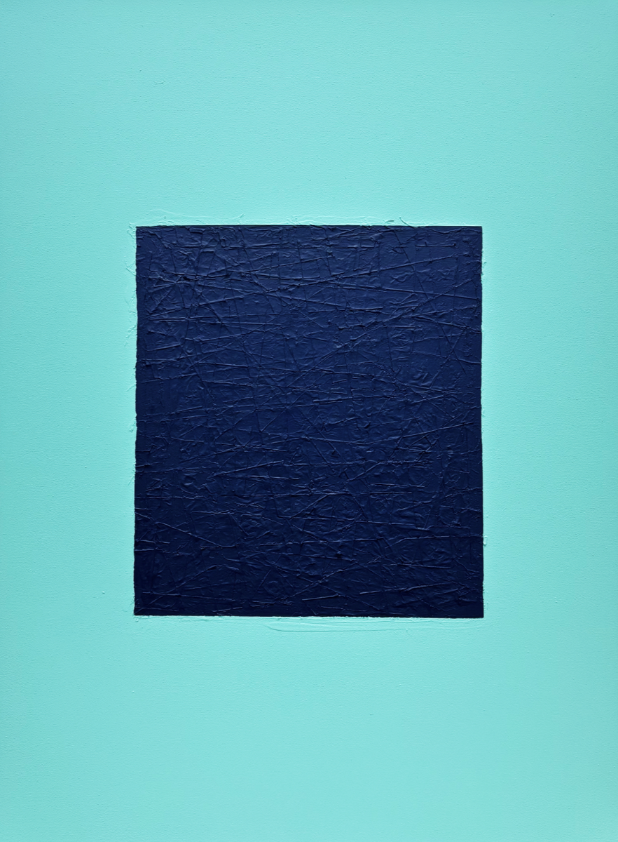
Figure 10: Jaouad Bentama, Blue: Composition LV, 2025, mixed media acrylic on canvas, 48 x 36 inches (121.92 x 91.44 cm). Photo: courtesy the artist

Figure 11: Installation view of Jaouad Bentama, Composition LV, LVI, and LIV, 2024, mixed media acrylic on canvas, 48 x 36 inches (121.92 x 91.44 cm). Photo: courtesy the artist
LX: How did you find solace within the studio, and also within companions you had?
JB: By myself. I love to work with la dualité. I’m always asking questions. The day I stop asking questions, my art will die.
LX: What are the questions you ask yourself on a given day?
JB: “Are you still here?” It’s the deepest question I can ask—because what is the mind, if not presence? That question keeps me grounded in the present moment. It’s a way to survive pain and to keep creating. Each stitch, each layer of pain, and each color was part of that story of being alive again. A window into the soul…I was supposed to die. But I survived. And that survival turned out to be a gift.

Jaouad Bentama
Photo: Emmanuel Giraud
Jaouad Bentama (b. Paris, France) moved to New York in 2012, immersing himself in the city’s artist collectives before joining Mana Contemporary in 2017. His work explores memory, identity, and cultural displacement through layered surfaces that reflect both personal and collective histories. In December 2021, a severe accident followed by a coma in Tulum, Mexico profoundly transformed his practice. From this rupture emerged the central motif of his work: the tear. Bentama, the tear is not merely a scar but a threshold, a space where trauma and rebirth coexist, a mark of survival and shared vulnerability. In his ongoing series Les Déchirures, he layers acrylic, ink, torn paper, and raw canvas to create textured reliefs landscapes of memory and repair where absence becomes presence and damage turns into beauty. Through his art, Bentama creates a powerful language of endurance and poetic expression, transforming fragility into strength.

Ne jamais séparer les cerises : en conversation avec Lassana Sarre
Sarre s'entretient avec Lara Xenia sur son intérêt pour Frantz Fanon, le portrait et l'importance de la représentation.
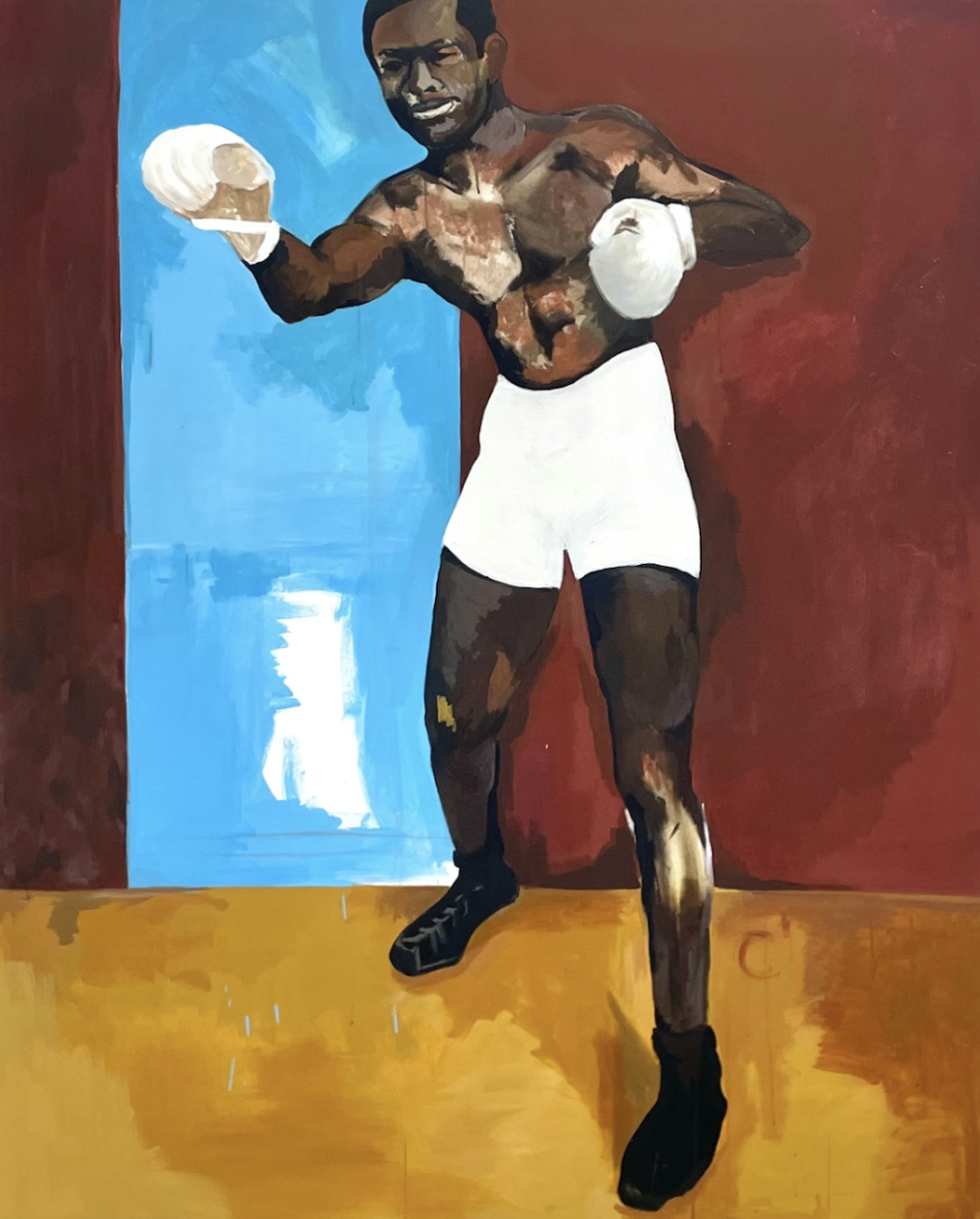
Figure 1: Lassana Sarre, Combattre, 2022, acrylique sur toile, 62.99 × 51.18 pouces (160 × 130 cm). Photo: avec l'aimable autorisation de l'artiste © Lassana Sarre
Lara Xenia: Vous avez mentionné que votre travail était influencé par Manet, Courbet et Velázquez. Où trouvez-vous habituellement votre inspiration ?
Lassana Sarre: Mon inspiration vient de situations réelles, ancrées dans les aspects morphologiques et psychologiques du sujet : ses métaphores, son histoire et la rencontre elle-même. La rencontre avec un sujet à un instant, et à travers l'art visuel, je m'efforce de raconter des histoires qui capturent la tension de cet instant entre moi et une autre forme humaine ou figurative. C'est comme un témoignage, ou une vraie rencontre. Parfois, je pars d'un sujet original, d'un inconnu, et la rencontre n'est qu'un instant bref et fugace. J'essaie de créer une relation organique avec le tableau, car mon intention change lorsque je rencontre un sujet aussi rapidement. Par exemple, lorsque je vivais à New York, dans le Lower East Side, j'ai rencontré un homme devant mon appartement. Nous n'avons parlé que quelques instants, mais j'ai ressenti son intensité.
LX: Intense dans son énergie ou dans son comportement ?

Figure 2: Lassana Sarre, L'homme qui fume, 2025, acrylique sur toile, 62.99 × 51.18 pouces (160 × 130 cm). Photo: avec l'aimable autorisation de l'artiste © Lassana Sarre
LA: Dans son comportement et sa communication. Il parlait très vite, mais il racontait beaucoup d'anecdotes personnelles et sa vision des États-Unis, de New York et de la couleur. J'ai donc décidé de le dessiner dans la rue. C'était cette personne qui est restée là, l'espace d'un instant, dans un format portrait très classique, face à moi. Il est resté immobile pendant peut-être deux ou trois minutes. J'aime appeler cela des marqueurs de mémoire. Je l'ai immortalisé à cet instant. Malheureusement, je n'ai retenu ni son prénom ni son nom.
LX: Ah, intéressant. Pourriez-vous me dire ce qui vous a inspiré pour peindre Frantz Fanon ?

Figure 3: Lassana Sarre, Frantz Fanon, La gravure au temps, 2025, acrylique et fusain sur toile, 62.99 × 51.18 pouces (160 × 130 cm). Photo: avec l'aimable autorisation de l'artiste © Lassana Sarre
LA: Encore une fois, ce sont des peintures de réalité. Je pensais beaucoup aux problèmes sociaux, et pendant mon exposition, je lisais Black Skin, White Masks de Frantz Fanon, qui répond aux questions sur l'avenir. Dans le cadre des recherches autour de la figure noire, j’ai réalisé un hommage allégorique à Jean Amilcar. Enfant sénégalais, il est réduit en esclavage à l’âge de 5 ans et envoyé en France en 1787 pour être le fils adoptif de la reine Marie-Antoinette. Baptisé à Versailles sous le nom de Jean Amilcar, il apprit à lire et à écrire là. Mais après l’arrestation de la reine, il est placé en pension et meurt à 14 ans à l’Hospice de l’Unité à Paris. Alors que je réalisais ce dessin totalement fantomatique, dessiné avec du charbon de bois sur papier; les enfants du quartier qui viennent souvent dans mon studio ont soudainement commencé à m’imiter.
C’est alors que surgit mon inspiration derrière cette peinture Fanon, où figure une pose pyramidale importante congelée sur la toile. Il y avait beaucoup d'idées que je voulais proposer dans l'exposition, alors j'ai continué ma réflexion sur les questions posées par Franz Fanon. Son œuvre a posé des questions extrêmement importantes sur l'avenir des jeunes, de l'oppression, du colonialisme et des relations humaines. Il était également psychanalyste, mais a travaillé dans le domaine médical, j'étais donc curieux de mesurer l'impact que le racisme pouvait avoir sur ce jeune à la fois impuissant et tout-puissant. Le dessin de Frantz Fanon, à droite de la peinture, est presque effacé et fait au crayon. Il est là, figé dans le temps, presque gravé dans la roche.
Figure 4.1: Marie Victoire Lemoine, Portrait d'un jeune homme au gilet brodé (présumé de Jean Amilcar), vers 1785–1790, huile sur toile, 25.5 × 21.4 pouces (64.77 × 54.36 cm), Acheté avec des fonds du Cummer Council (AP.1994.3.1), Cummer Museum of Art and Gardens, Jacksonville, Floride.
Figure 4.2: Lassana Sarre, Jean Amilcar, 2025, fusain sur papier, 39.37 × 27.56 pouces (100 × 70 cm). Photo: avec l'aimable autorisation de l'artiste © Lassana Sarre
LX: C'est comme le formidable apex. De quoi s'agit-il avec ce dessin sur son dos ?
LA: C'est un dessin de Pikachu dans Pokémon [rires]. Pika, qui n'est ni dangereux ni électrique, a une présence contemporaine sur la jeunesse d'aujourd'hui.
LX: Comme c’est drôle. Quelle est l’histoire de L'enfant aux cerises ?

Figure 5: Lassana Sarre, Ne jamais séparer les cerises, 2025, acrylique sur toile, 74.80 × 51.18 pouces (190 × 130 cm). Photo: avec l'aimable autorisation de l'artiste © Lassana Sarre

Figure 6: Édouard Manet, L’enfant des cerises, vers 1858, huile sur toile, 25.78 × 21.42 pouces (65.5 × 54.40 cm), Calouste Gulbenkian Museum, Lisbon, Portugal (395). Photo: avec l'aimable autorisation du Musée Calouste Gulbenkian © Édouard Manet
LA: Elle s'inspire du Garçon aux cerises d'Édouard Manet (vers 1858), un tableau qui raconte la tragédie d'un jeune enfant pauvre des rues qui a aidé Manet. Ce garçon, Alexandre, était psychologiquement fragile et faisait beaucoup de bêtises, mais lorsque Manet a menacé de le chasser de l'atelier, Alexandre s'est suicidé. Il est mort très jeune par amour de la peinture. Ces deux éléments se rejoignent dans cette composition. Je rends hommage à Édouard Manet en intitulant mon exposition « Enfant aux cerises », car je questionne le pouvoir de la peinture. Manet rend un immense hommage à cet enfant, et je rends également hommage à ma genèse, à mon frère jumeau et à l'amour de la peinture. J'ai également choisi d'utiliser des tons très sombres.
LX: Ah, oui. Je me souviens que « La Corde » (1869) de Baudelaire s’est inspiré de cet incident. Était-ce aussi pour une exposition ?
LA: J'ai commencé ce tableau à la galerie Polaris. J'y ai travaillé pendant un an, puis je suis allé à New York, je suis revenu et je l'ai retravaillé. Il est composé de touches subtiles de couleurs très sombres qui se répandent lentement sur la toile.
LX: Avez-vous beaucoup réfléchi au thème de l'adversité dans votre travail ? Placez-vous souvent vos personnages dans un espace suspendu pour refléter ce sentiment ?
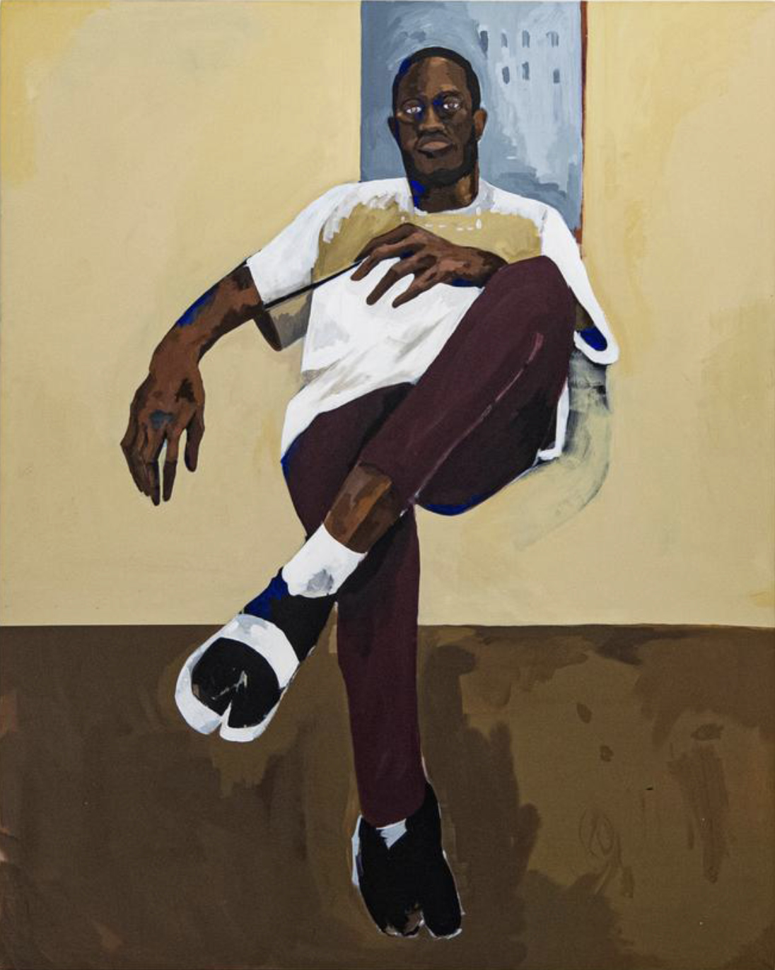
Figure 7: Lassana Sarre, Sans titre, 2023, acrylique sur toile, 62.99 × 51.18 pouces (160 × 130 cm). Photo: avec l'aimable autorisation de l'artiste © Lassana Sarre
LA: Oui. Toute ma pratique aborde la question des tensions sociales et de l'ascension sociale en France. Si l'on considère les tableaux de maîtres anciens et la question du portrait, comme chez Manet ou Ingres, les peintres représentent toujours la haute société, comme la royauté, la haute bourgeoisie et les riches. Ils ont toujours pensé au confort et représenté des personnages très posés dans des environnements somptueux. J'essaie de défier cela en capturant mes sujets comme flottants, pour évoquer l'ascension sociale. Soit ils flottent, soit ils atteignent une certaine élévation sociale, mais l'absence de chaise évoque cette idée. C'est censé être introspectif.
LX: C’est fascinant de constater que l’effacement des meubles dans ta composition lui ajoute autant de puissance psychologique. J'aimerais aussi en savoir plus sur L’Homme à la larme sur votre récente exposition au Musée du Val-de-Marne.
J'essaie de défier cela en capturant mes sujets comme flottants, pour évoquer l'ascension sociale.
LA: Oui. J'ai commencé à peindre ce tableau en octobre 2023, puis je suis allé à New York. L'Homme à la larme était une observation sur la violence, car j'étais profondément touché par la brutalité mondiale. C'était cette tension, cet entre-deux que l'on ressentait face à la violence. Les artistes ont toujours parlé de la violence dans le monde, de Guernica à Géricault. C'est un quasi-autoportrait, mais ce n'en est pas vraiment un, car il me représente très âgé. Il parle beaucoup de l'espace-temps et du poids de la violence sur le vieillissement de l'âme. Avec une seule larme, j'ai essayé d'imiter cela en la faisant s'estomper dans cette peinture ocre et terreuse. Les teintes évoquent aussi les briques que l'on peut voir à New York. J'ai été inspiré par tout cela.

Figure 8: Lassana Sarre, L'homme à la larme, 2025, acrylique sur toile, 74.80 × 62.99 pouces (190 × 160 cm). Photo: avec l'aimable autorisation de l'artiste © Lassana Sarre
LX: L'homme est aussi un peu aveugle, non ?
LA: Oui, absolument. C'est une image réelle, inspirée par mon père, qui est borgne. Pour tous mes personnages, je le recrée physiquement. La pupille, ou le regard, est l'un des éléments les plus importants du portrait. J'explore la relation entre le réel et le regard borgne, le visible et le caché. Ce sont des préoccupations classiques pour moi, qui invitent le spectateur à regarder le tableau avec sincérité.
LX: Très intéressant. Je suis également curieuse d’en savoir davantage sur le diptyque Dualité de la paresse et violence des caresses. Pourquoi avoir choisi ce format et cette teinte jaune ? S'agit-il d'un ballon dans la composition ?

Figure 9: Vues de l’exposition « Forever Young » du 14 juin 2025 au 4 janvier, 2026, Musée d’art contemporain du Val-de-Marne (MAC VAL), Vitry-sur-Seine, France. Photo: avec l'aimable autorisation de l'artiste et Aurélien Mole © Adagp, Paris 2025, Aurélien Mole
LA: Oui. Ce tableau mesure deux mètres et demi sur trois. J'imaginais la Porte de la Liberté comme un hommage à la jeunesse et aux Noirs de France. C'est une sorte d'expérimentation, car je n'ai pas fini de dessiner le ballon ; c'est de l'imagination. Il représente l'idée de voler, comme un geste de liberté. Celui de gauche se trouve à La Madeleine, à Paris. Le jaune fait référence à Nahel Merzouk, un jeune Français qui conduisait sans permis et a été tragiquement tué par un policier. Sa mort a fait sensation en France. Nahel conduisait une Mercedes AMG jaune ; j'ai donc choisi ce jaune pour refléter la violence et la catastrophe de l'histoire. En conceptualisant le jaune et la violence, mon assistant d'atelier et moi avons décidé d'utiliser cette couleur pour symboliser les deux. Pour la jeune fille du tableau, j'ai transformé l'image d'Assa en une fille aux cheveux bleus. Assa habite dans le quartier près de mon atelier et adore dessiner dans la rue et jouer dehors.
J'explore la relation entre le réel et le regard borgne, le visible et le caché.
Dans ce dessin, je voulais la montrer en train de créer avec une fleur de rue plutôt qu'avec un crayon. Elle a choisi des fleurs rouges, appelées Obsalis Trianglealis, qui sont fortes et belles. Je lui ai demandé : « Puisque tu es jeune, que tu aimes dessiner et que tu assumes tes responsabilités( réaliser dans la rue, pourrais-tu dessiner une fleur dans mon tableau en utilisant une vraie fleur plutôt qu'avec de la peinture ? » Parce qu'elle représente l'avenir de l'art et voit la vie avec profondeur et liberté. Elle a essayé, en dessinant la fleur avec la fleur elle-même. Organique, elle est temporaire et éphémère, s'estompant avec le temps. Au musée, le jaune représente la violence, en hommage au jeune garçon et en réflexion sur les violences policières en France. Parallèlement, elle a dessiné la fleur qui disparaît et j'ai peint une grande image d'elle s'envolant et s'émancipant. C'est donc une dualité de séparation et de tendresse, une dualité de peintures qui n'est pas tout à fait un diptyque, mais qui reste néanmoins connecté.
LX: Mais c'est aussi magnifique que ce soient des membres de votre communauté que vous montrez. Même la façon dont vous l'avez mis en forme, avec un petit cercle et les chaînes, est intéressante. Attends, vous êtes si chanceux d'être entouré de tous ces enfants.
LA: Oui [rire].
LX: La femme dans Songe d'êtres Toujours me semble vraiment familière.

Figure 12: Lassana Sarre, Songe d'être toujours, 2025, acrylique sur toile, 47.24 × 31.5 pouces (120 × 80 cm). Photo: avec l'aimable autorisation de l'artiste © Lassana Sarre
LA: Oui. Ce tableau est inspiré d'une photo emblématique de Maya Angelou, que j'ai retravaillée. C'est un hommage à une femme qui a inspiré penseurs et intellectuels outre-Atlantique. L'œuvre a été commandée par une femme, et comme je peins rarement des femmes, c'est pour moi une rupture significative. Mon travail se concentre souvent sur la réalité et la violence des hommes, mais j'essaie à chaque fois d'adoucir ces figures. J'étudie souvent la peinture et j'aime intégrer les mouvements artistiques existants dans mon travail pour me positionner dans l'histoire de l'art et maintenir un lien institutionnel important.
LX: De quoi êtes-vous fier, dans la vie ou dans votre art ?
LA: Je ne suis pas fier de ce monde et de sa violence [rires]. Mais la peinture est un reflet de moi-même, et je suis fier de découvrir un nouveau geste à chaque évolution de l'œuvre. Je peins ma réalité, parfois simplement en me fiant à la peinture et aux tons noirs. Quand on dit que c'est noir, ce n'est pas seulement noir; c'est une métaphore du corps et de mon expérience de vie.
LX: Je voulais également poser une question sur Le reflet dans l'air.
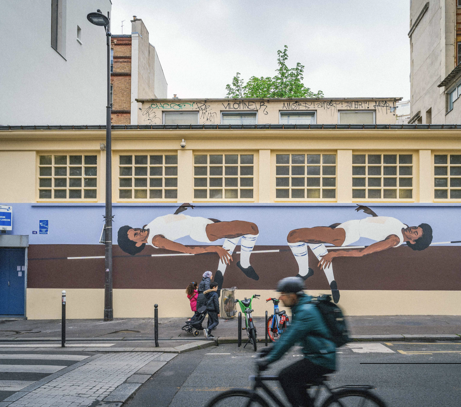
Figure 13: Lassana Sarre, Le reflet dans l'air, 2024, EX-AEQUO, Fonds d'art contemporain de la Ville de Paris. Photo: avec l'aimable autorisation de l'artiste © Lassana Sarre
LA: Oui. Cette œuvre, commandée par le Fonds d'art contemporain de Paris pour les Jeux Olympiques, rend hommage à une grande athlète nommée Marie-José Perec. Elle fut la première femme noire à obtenir un score exceptionnel aux Jeux olympiques. Il est très important pour moi de lui rendre hommage.
LX: Super cool. Idéalement, où se situerait votre exposition, si vous pouviez en organiser une?
LA: Je ne sais pas, peut-être dans dix ans vingt ou 30, au MoMA. Ce n'est pas la fin de ma vie, mais c'est vraiment important pour moi de faire partie de la plus grande institution du monde. Je pense que ce serait magnifique.

Photo: avec l'aimable autorisation de Maurine Pret © Maurine Pret et Conversarting
Lassana Sarre
Lassana Sarre (né en 1994 à Paris, France) est un artiste plasticien et portraitiste né à Paris et élevé à Vitry-sur-Seine. Son parcours artistique s'ancre dans une quête perpétuelle de réinvention des récits historiques et des représentations identitaires. Diplômé des Beaux-Arts de Nice et de la Villa Arson des Beaux-Arts de Paris, il s'inspire des grands maîtres de la peinture occidentale tels que Vélasquez, Courbet et Manet. Son œuvre s'affranchit des cadres rigides pour établir un dialogue critique avec l'histoire de l'art. Il place le corps noir au centre de compositions où mémoire collective, résistance et introspection individuelle s'entremêlent dans une tension à la fois esthétique et conceptuelle. Son travail, marqué par un jeu constant entre présence et effacement, propose une réinterprétation des codes classiques tout en explorant les enjeux sociaux et politiques contemporains.
Chaque toile devient un espace de réflexion, où les silences du passé se confrontent aux exigences d'un avenir pluriel. Lassana Sarre transcende les frontières artistiques en réintégrant le corps noir dans des récits visuels qui rejettent l'objectification et célèbrent sa complexité. En ré-interprétant des poses classiques et en intégrant des éléments minimalistes, il crée des œuvres dont la sobriété visuelle renforce l'impact conceptuel. Il appartient à une génération d'artistes qui ne se contentent pas de revisiter le passé, mais le transforment en matière vivante, un prisme à travers lequel prend forme une esthétique résolument contemporaine, consciente et visionnaire. Influencé par le graffiti, il n'hésite pas à marquer ses gestes, mettant en valeur des éléments éloquents. Sarre vit et travaille à Paris.
Never Separate The Cherries: In Conversation with Lassana Sarre
Sarre speaks with Lara Xenia about his interest in Frantz Fanon, portraiture, and the importance of representation.

Figure 1: Lassana Sarre, Battling, 2022, acrylic on canvas, 62.99 × 51.18 inches (160 × 130 cm). Photo: courtesy the artist © Lassana Sarre
Lara Xenia: You’ve mentioned that your work is inspired by Manet, Courbet, and Velázquez. What else do you get inspired by?
Lassana Sarre: My inspiration comes from real situations, rooted in the morphological and psychological aspects of the subject, like its metaphors, its history, and the encounter itself. The encounter with a subject is a moment in time, and through visual art, I strive to tell stories that capture the tension of that moment between me and another human or figurative form. It's like a testimony, or a real encounter. Sometimes I start with an original subject, like a stranger, and the encounter is only a brief, fleeting moment. I try to create an organic relationship with the painting because my intention changes when the encounter is so quick. For example, when I lived in New York City, on the Lower East Side, I met a man outside my apartment. We only spoke for a few moments, but I felt his intensity.
LX: Intense in his energy or in his behavior?
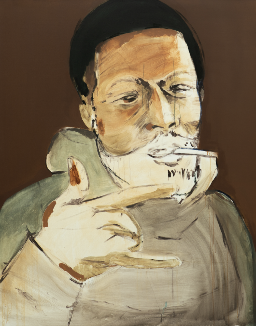
Figure 2: Lassana Sarre, The Smoking Man, 2025, acrylic on canvas, 62.99 × 51.18 inches (160 × 130 cm). Photo: courtesy the artist © Lassana Sarre
LA: In his attitude and his communication. He spoke very rapidly, but he shared many personal anecdotes and his vision of the United States, New York, and color, so I decided to draw him in the street. It was this person who was there, facing me for a moment, in a very classic portrait format. He remained motionless for maybe two or three minutes. I like to call these memory markers. I immortalized him in that moment. Unfortunately, I couldn't remember his first or last name.
LX: Wow, interesting. Could you tell me what inspired you to paint Frantz Fanon?

Figure 3: Lassana Sarre, Frantz Fanon, Engraving in Time, 2025, acrylic and charcoal on canvas, 62.99 × 51.18 inches (160 × 130 cm). Photo: courtesy the artist © Lassana Sarre
LA: Again, these are paintings that are based on reality. I've been thinking a lot about social issues, and during my exhibition, I was reading Frantz Fanon's Black Skin, White Masks, which addresses questions about the future. As part of my research on the Black figure, I made an allegorical tribute to Jean Amilcar. He was a Senegalese child who was enslaved at the age of 5 and sent to France in 1787 to be the adopted son of Queen Marie-Antoinette. He was baptized at Versailles under the name Jean Amilcar, where he learned to read and write. But after the queen's arrest, he was placed in a boarding school and died at the Hospice de l'Unité in Paris at the age of 14. While I was making this completely eerie drawing using charcoal on paper, the local children who often come to my studio suddenly started imitating me.
This is when my inspiration for this large pyramidal Fanon painting came to me. There were many ideas I wanted to present in the exhibition, so I continued my reflection on the questions posed by Franz Fanon. His work posed extremely important questions about the future of young people, oppression, colonialism, and human relationships. He was also a psychoanalyst, but worked in the medical field, so I was curious to measure the impact that racism could have on this young man, who was both powerless and all-powerful. The drawing of Frantz Fanon, on the right of the painting, is almost erased and done in pencil. It is there, frozen in time, almost etched in stone.

Figure 4.1: Marie Victoire Lemoine, Portrait of a Young Man in an Embroidered Vest (presumed to be Jean Amilcar), c. 1785–1790, oil on canvas, 25.5 × 21.4 inches (64.77 × 54.36 cm), Purchased with funds from the Cummer Council (AP.1994.3.1), Cummer Museum of Art and Gardens, Jacksonville, Florida.

Figure 4.2: Lassana Sarre, Jean Amilcar, 2025, charcoal on paper, 39.37 × 27.56 inches (100 × 70 cm). Photo: courtesy the artist © Lassana Sarre
LX: It's like a great apex. What's that drawing on its back about?
LA: It's a drawing of Pikachu from Pokémon [laughs]. Pikachu, who isn't dangerous or electric, has a contemporary presence among today's youth.
LX: How funny. What's the story behind Never Separate the Cherries?

Figure 5: Lassana Sarre, Never Separate the Cherries, 2025, acrylic on canvas, 74.80 × 51.18 inches (190 × 130 cm). Photo: courtesy the artist © Lassana Sarre
Figure 6: Édouard Manet, Boy with Cherries, c. 1858, oil on canvas, 25.78 × 21.42 inches (65.5 × 54.40 cm), Calouste Gulbenkian Museum, Lisbon, Portugal (395). Photo: courtesy the Calouste Gulbenkian Museum © Édouard Manet
LA: It's inspired by Édouard Manet's Boy with Cherries (c. 1858), a painting that tells the tragedy of a young, poor street child who helped Manet. This boy, Alexandre, was psychologically fragile and got into a lot of mischief, but when Manet threatened to throw him out of the studio, Alexandre committed suicide. He died very young for the love of painting. These two elements come together in this composition. I pay homage to Manet by titling my solo exhibition "Child with Cherries" because I wanted to question the power of painting. Manet pays a huge tribute to this child, and I also wanted to honor my genesis and allegiance to my twin brother, and to this grand love of painting. I chose to use very dark tones throughout.
LX: Oh, I see. I remember that Baudelaire’s “The Rope” (1869) was inspired by that incident. Was that also for an exhibition?
LA: I started this painting at Polaris Gallery. I worked there for a year, then went to New York, came back, and reworked it. It's composed of subtle touches of very dark colors that slowly spread across the canvas.
LX: Have you thought much about the theme of adversity in your work? Do you often place your figures in a suspended space to reflect this feeling?

Figure 7: Lassana Sarre, Untitled, 2023, acrylic on canvas, 62.99 × 51.18 inches (160 × 130 cm). Photo: courtesy the artist © Lassana Sarre
LA: Yes. My entire practice addresses the question of social tensions and upward mobility in France. If you look at Old Master paintings and the question of portraiture, like Manet or Ingres, painters always depicted high society, such as royalty and the upper middle class. They always thought about the notion of comfort and depicted very poised figures in sumptuous environments. I try to challenge this by rendering my subjects as floating figures, to suggest their social ascension. They're either floating or they're achieving a certain social elevation, but the absence of a chair conjures this idea. It's meant to be introspective.
LX: It's fascinating to see how the removal of furniture in your composition adds so much psychological power to it. I'd also like to know more about Man with a Tear at your recent exhibition at the Musée du Val-de-Marne.
I try to challenge this by rendering my subjects as floating figures, to suggest their social ascension.
LA: Yes. I started painting this picture in October 2023, and then I went to New York. Man with a Teardrop was an observation on violence, as I was deeply affected by global brutality. It was this tension, this in-betweenness that one feels in the face of violence. Artists have always spoken about violence in the world, from Guernica to Géricault. It's almost a self-portrait, but it's not really one, because it depicts me at a very old age. It speaks a lot about space-time and the weight of violence on the aging soul. With a single teardrop, I tried to imitate that by making it fade into this earthy, ochre painting. The hues also are reminiscent of the bricks that you can see in New York. I was inspired by all of that.
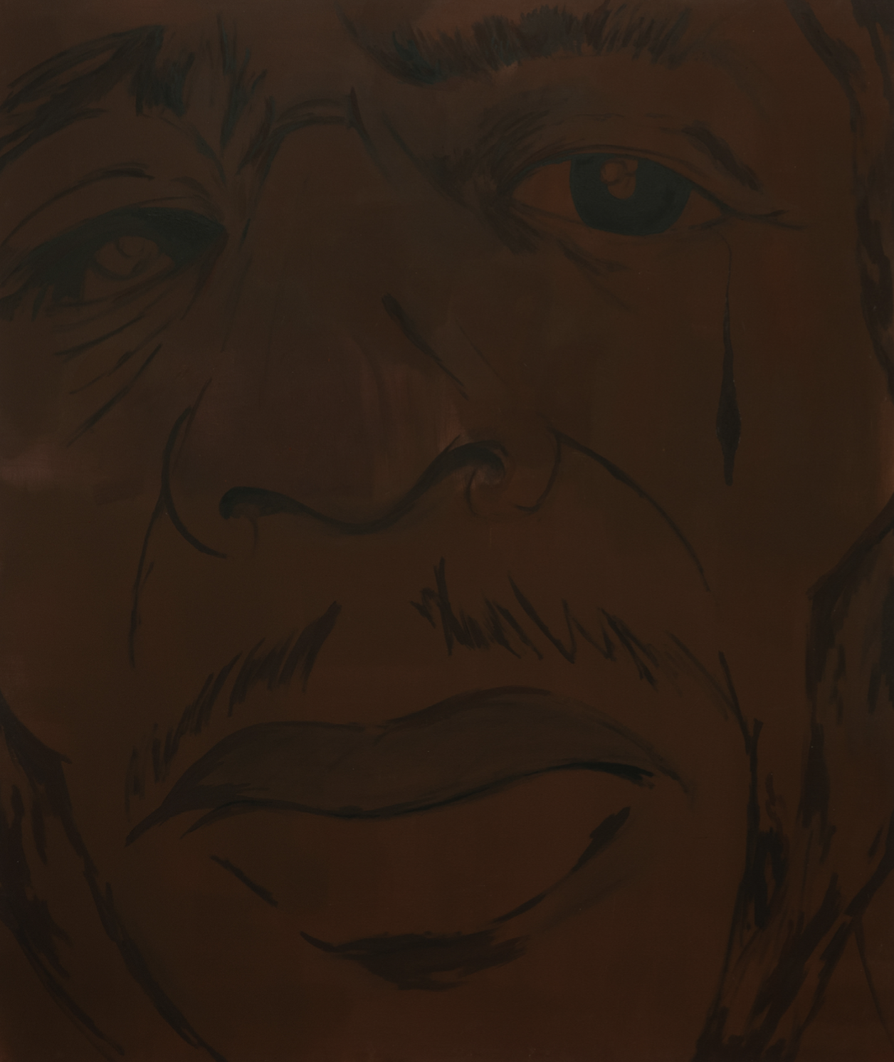
Figure 8: Lassana Sarre, Man with a Tear, 2025, acrylic on canvas, 74.80 × 62.99 inches (190 × 160 cm). Photo: courtesy the artist © Lassana Sarre
LX: The man is also a little blind, isn't he?
LA: Yes, absolutely. It's inspired by a real image of my father, who is one-eyed. For all my characters, I physically recreate him. The pupil, or the gaze, is one of the most important elements of the portrait. I explore the relationship between the real and the one-eyed gaze, the visible and the concealed. These are classic concerns for me, inviting the viewer to look at the painting with sincerity.
LX: Very interesting. I'm also curious to know more about the diptych Duality of Laziness and Violence of Caresses. Why did you choose this format and this yellow tint? Is it a balloon in the composition?

Figure 9: Views of the exhibition “Forever Young” from June 14, 2025 to January 4, 2026, Musée d’art contemporain du Val-de-Marne (MAC VAL), Vitry-sur-Seine, France. Photo: courtesy the artist and Aurélien Mole © Adagp, Paris 2025, Aurélien Mole
LA: Yes. This painting measures two-and-a-half meters by three. I imagined the Gate of Liberty as a tribute to the youth and the Black people of France. It's an experiment because I didn't finish drawing the balloon; it's imagined. It represents the idea of flying, as a gesture of freedom. The one on the left is at La Madeleine, in Paris. The yellow refers to Nahel Merzouk, a young Frenchman who was driving without a license and was tragically killed by a police officer. His death caused a sensation in France. Nahel was driving a yellow Mercedes AMG; so I chose this yellow to reflect the violence and catastrophe of the story. In conceptualizing yellow and violence, my studio assistant and I decided to use this color to symbolize both. For the young girl in the painting, I transformed Assa's image into a girl with blue hair. Assa lives in the neighborhood near my studio and loves to draw in the street and play outside.
I explore the relationship between the real and the one-eyed gaze, the visible and the concealed.
In this drawing, I wanted to show her creating with a street flower rather than a pencil. She chose red flowers, called Obsalis Trianglealis, which are strong and beautiful. I asked her, "Since you're young, you like to draw, and you take responsibility in making works in the street, could you draw a flower in my painting using a real flower rather than paint?" Because she represents the future of art and sees life with depth and freedom. She tried, drawing the flower with the flower itself. Since it’s organic, it is temporary and ephemeral, and fades over time. In the museum, the yellow represents violence, as a tribute to the young boy and a reflection on police brutality in France. At the same time, she drew the disappearing flower, and I painted a large image of her flying away and emancipating herself. So it's a duality of separation and tenderness, a duality of paintings that isn't quite a diptych, but nonetheless retains that connection.
LX: But it's also beautiful that you're showing members of your community. Even the way you shaped it, with a small circle and the chains, is interesting. Wait, you're so lucky to be surrounded by all these children.
LA: Yes [laughs].
LX: The woman in Songe d'êtres Toujours looks really familiar to me.
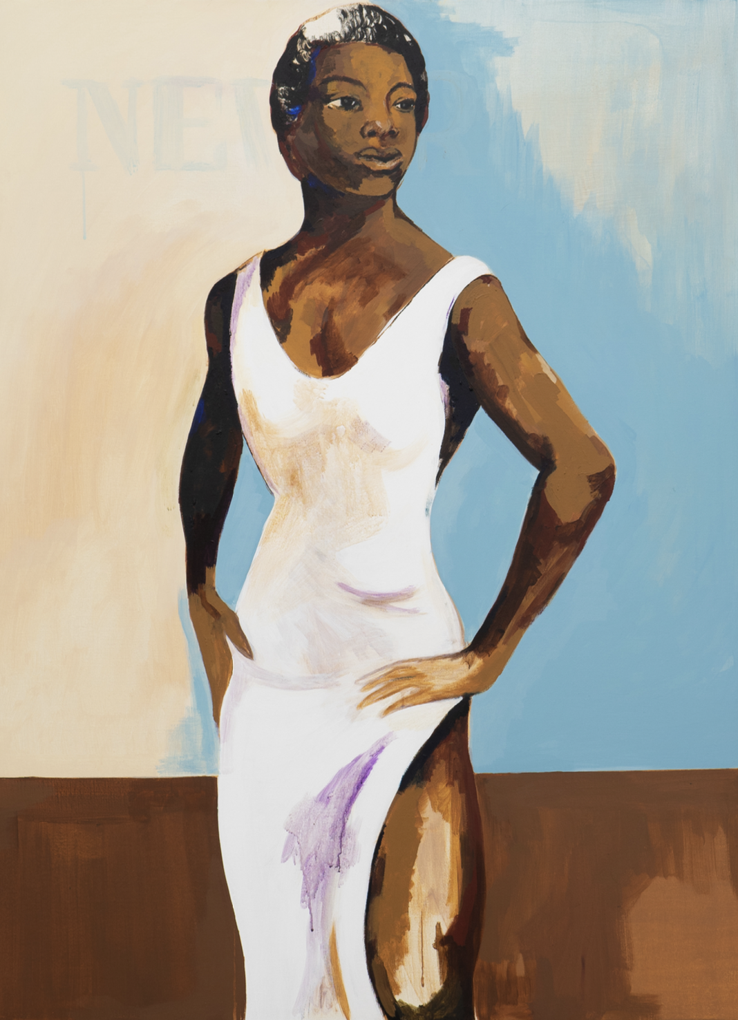
Figure 12: Lassana Sarre, Songe d'êtres Toujours, 2025, acrylic on canvas, 47.24 × 31.5 inches (120 × 80 cm). Photo: courtesy the artist © Lassana Sarre
LA: Yes, this painting is inspired by an iconic photograph of Maya Angelou, which I reworked. It's a tribute to a woman who inspired thinkers and intellectuals across the Atlantic. The work was commissioned by a woman, and since I rarely paint women, it's a significant departure for me. My work often focuses on reality and the violence of men, but I always try to soften these figures.
LX: What are you proud of, in life or in your art?
LA: I'm not proud of this world and its violence [laughs]. But painting is a reflection of myself, and I'm proud to discover a new gesture with each evolution of the work. I paint my reality, sometimes simply relying on paint and dark tones. When we say it's black, it's not just black; it's a metaphor for the body and my life experience.
LX: I also wanted to ask a question about The Reflection in the Air.

Figure 13: Lassana Sarre, Reflection in the Air, 2024, EX-AEQUO, Contemporary Art Fund of the City of Paris. Photo: courtesy the artist © Lassana Sarre
LA: This work, commissioned by the Fonds d'art contemporain de Paris for the Olympic Games, pays tribute to a great athlete named Marie-José Perec. She was the first Black woman to achieve the highest score at the Olympic Games. It's very important to me to honor her. It was as if the Phrygian cap unfolded like a dancer, reflecting the change of guards…that victory was significant for me to memorialize.
LX: Super cool. Ideally, where would your exhibition be located, if you could organize one?
LA: I don't know, maybe in 10, 20, or 30 years, at MoMA. It's not the end of my life, but it's really important to me to be part of the greatest institution in the world. I think it would be magnificent.

Photo: courtesy Maurine Pret © Maurine Pret and Conversarting
Lassana Sarre
Lassana Sarre (born 1994 in Paris, France) is a visual artist and portraitist born in Paris and raised in Vitry-sur-Seine. His artistic career is rooted in a perpetual quest to reinvent historical narratives and representations of identity. A graduate of the Beaux-Arts de Nice and the Villa Arson des Beaux-Arts in Paris, he draws inspiration from the great masters of Western painting such as Velázquez, Courbet, and Manet. His work breaks free from rigid frameworks to establish a critical dialogue with art history. He places the Black body at the center of compositions where collective memory, resistance, and individual introspection intertwine in a tension that is both aesthetic and conceptual. His work, marked by a constant interplay between presence and erasure, offers a reinterpretation of classical codes while exploring contemporary social and political issues.
Each canvas becomes a space for reflection, where the silences of the past confront the demands of a plural future. Lassana Sarre transcends artistic boundaries by reintegrating the Black body into visual narratives that reject objectification and celebrate its complexity. By reinterpreting classic poses and incorporating minimalist elements, he creates works whose visual sobriety reinforces their conceptual impact. He belongs to a generation of artists who do not simply revisit the past, but transform it into living matter, a prism through which a resolutely contemporary, conscious, and visionary aesthetic takes shape. Influenced by graffiti, he does not hesitate to mark his gestures, highlighting eloquent elements. Sarre lives and works in Paris.

All Dolled Up: In Conversation with Amy Chasse
Amy Chasse investigates the paradoxes of inhabiting a human body. Chasse speaks with Lara Xenia about her upbringing, her interest in nihilism, and the many lives of her dolls.

Figure 1: Amy Chasse, Winner winner chicken dinner, 2024, archival pigment print, 22 x 17 inches (55.88 × 43.18 cm). Photo: courtesy the artist © Amy Chasse
Lara Xenia: Do you remember the first carnival you attended?
Amy Chasse: I grew up going to them every summer, so I’m not sure. I’m from a really rural area of Connecticut, so going to county fairs and carnivals was something we’d do with friends and family for the rides, fair food, and 4-H contests.
LX: What was life like before Yale?
AC: I studied Painting at Syracuse University in central New York. After graduating, I spent five years in the city and supported myself as an elementary school art teacher. I used to wake up extra early to paint in the corner of my room before school started, so I switched from oil to acrylic to avoid breathing in fumes [laughs]. I eventually leveled-up to a shared studio in Brooklyn. Three years into my time there, I left teaching to become a bartender to have more free time to paint during the day. I was producing a lot of work, but missed learning alongside other artists, so I ultimately applied to grad schools and landed at Yale.
LX: Wow, that’s really admirable; you’ve got tenacity. How has your practice evolved since starting your MFA?
AC: My practice has always been pretty interdisciplinary, but being in an MFA program has really pushed me in unexpected ways. I consider myself a painter, but I’ve become more interested in sculpture and installation. During my first semester at Yale, I took an intro to photography class where we were assigned to shoot 100 photos a week. I wanted to explore how placing my doll in real-world scenarios would affect how people perceive it. I brought the doll to my childhood home and staged a dinner scene with my mom at the kitchen table…I was especially interested in capturing her reaction. She was visibly disgusted by the doll, but still a good sport and went along with the shoot [laughs].
LX: What a fun concept for a photo series. Your mum also looks mildly mortified here [laughter].
Figure 2: Amy Chasse, Eating Together, 2o24, archival pigment print, 11 × 8.5 inches (27.94 × 21.59 cm). Photo: courtesy the artist © Amy Chasse
AC: [Laughs] She was. I wanted to capture her discomfort with the doll. The photos for me also explore personal family dynamics. I grew up with a single mom and it’s probably the most important and complex relationship in my life, so in some ways the photos are kind of diaristic.
I wanted to explore how placing my doll in real-world scenarios would affect how people perceive it.
LX: The baked potato is fun too. There’s a French phrase, “métro, boulot, dodo”, which sums up the experience of having to “commute, work, sleep.” And sometimes it’s just frozen or congelé veggies for dinner.
AC: Definitely. We’re an Irish family, so potatoes were always on the menu. I chose to include microwaveable veggies with melted cheese to highlight exactly what you are referring to. The domestic setting is important because it’s where we go to rest and retreat, but it’s porous to the realities and pressures of the outside world.

Figure 3: Amy Chasse, Living Room, 2024, archival pigment print, 11 x 8.5 inches (27.94 x 21.59 cm). Photo: courtesy the artist © Amy Chasse
LX: I love the stark contrast between your mom being on one end of the couch and your lab slumbering next to the doll in between them [laughs]. Was your mom genuinely freaked out, or did you stage her reaction to look that way?
AC: For that one, I told her, “This is the last photo—just one more.” I put the doll on the couch and said, “Just act normal, like you’re watching TV.” She looks perfect in this one. I love her body posture [laughs].

Figure 4: Jeff Wall, Pair of Interiors, 2018, two inkjet prints (diptych), each 81.75 × 59.88 inches (207.5 × 152 cm), edition of 3 + 1 AP. Photo: courtesy Gagosian © Jeff Wall
LX: Yeah, it looks staged. It vaguely reminds me of the awkward couch scenes by Jeff Wall.
AC: I love those. Those are great photographs. They almost feel painterly.
The domestic setting is important because it’s where we go to rest and retreat, but it’s porous to the realities and pressures of the outside world.
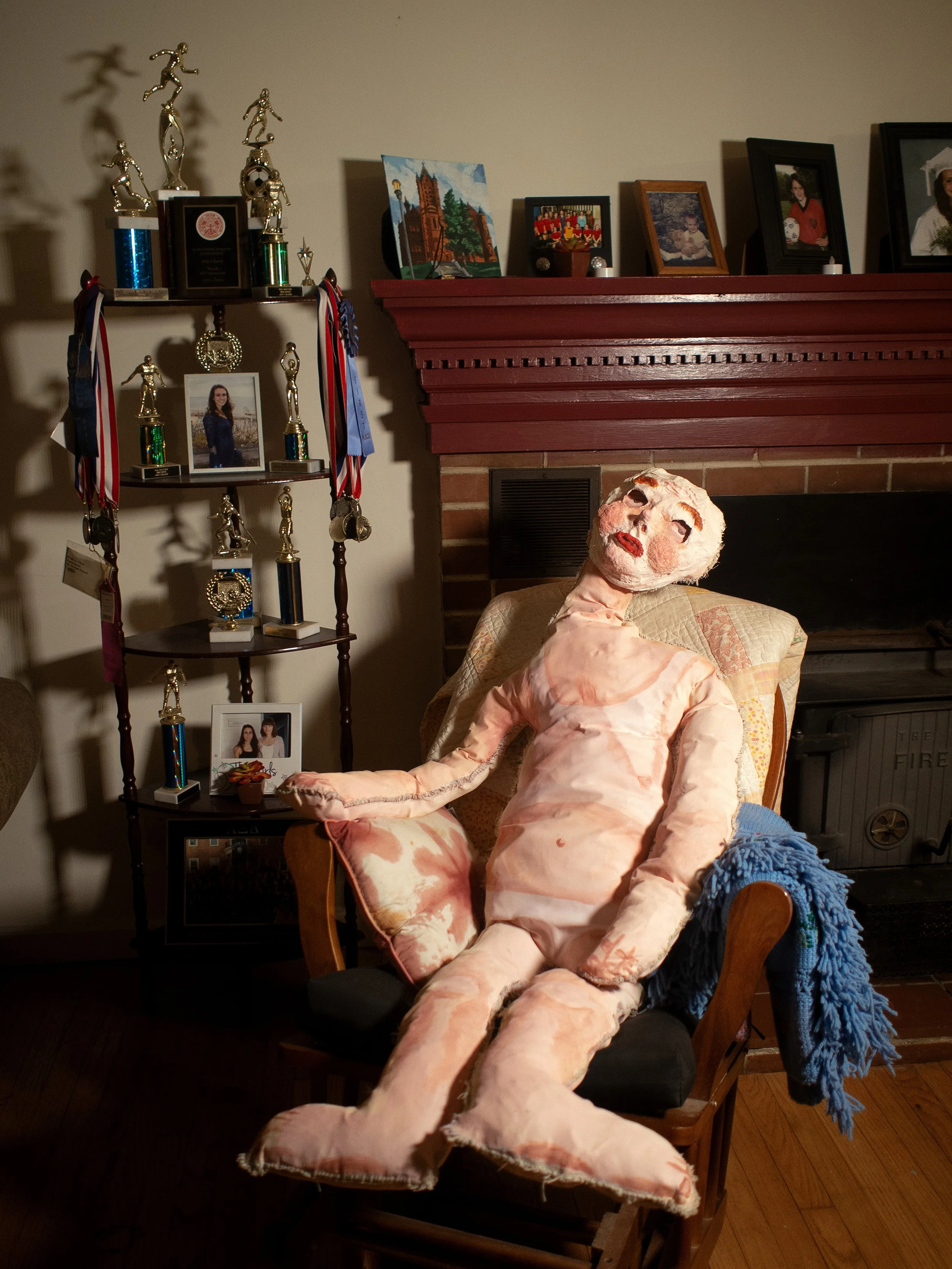
Figure 5: Amy Chasse, Resting, 2024, archival pigment print, 11 x 8.5 inches (27.94 x 21.59 cm). Photo: courtesy the artist © Amy Chasse
LX: Same. I really like this one because it's like a moment of rest and harps on the tradition of depicting individuals leisurely sitting in their salon. What inspired this particular pose and these accoutrements? I like how you include yourself here as an adorable soccer kid.
AC: Yes, so many plastic trophies. Soccer was my sport [laughter]. I’m an only child, so the photos in the background are all of me. The mantle is like this weird relic of my childhood accomplishments. While the figure isn’t particularly me, here it feels like a stand-in for my lived experience. It makes me think about all the time that has passed and how those photos and trophies have stayed right there this entire time.
LX: What got you interested in making figures in this way?
AC: I’ve always been interested in representing the figure, but it wasn't until a couple of years ago that I decided to represent how it feels to inhabit a human body, as opposed to how it’s perceived by others. The figures that I create sometimes appear dissociative and trapped, which relates to my interest in how our experiences and environment can impact our bodies and how we live in them.
LX: What does the doll signify for you?
AC: It’s not so definitive. I am still figuring out what it means to me and I think that will always change. Kind of like your relationship with anyone in your life. However, I do think that the doll is not a specific person but more of an idea. One of the things I am thinking about is the experience of navigating late-stage capitalism and the demands of what it takes to survive in that environment, as well as the effects it has on our body and our mind. I identify with that experience, but it is not me or anyone in particular.
LX: What’s the doll’s origin story within your practice?
AC: The original figure came from a small painting I made in the corner of my room in 2020. I ended up painting over it, so the original no longer exists, but I was referencing that image for a couple of years. I was really drawn to the disassociative eyes and full cheeks in the figure and those elements kept reappearing in my new works. One day, I was curious about what would happen if I made the figure three dimensional, so I cut the canvas into the shape of a doll stencil, sewed it, and stuffed it with reusable bags. I painted it and it sat on the floor of my studio for quite some time. I was struggling in my practice, so in order to get out of my own head I decided to make plaster and paper mache masks purely for fun. One morning in my studio, I got the idea to put one of the masks on the doll. That’s when the character really came to life.
LX: I like the sense of ennui or boredom. Are all of the figures self-aware?
One of the things I am thinking about is the experience of navigating late-stage capitalism and the demands of what it takes to survive in that environment, as well as the effects it has on our body and our mind.
AC: I think they are self-aware and they are searching for something, like we all do. As we lose our sense of community and become more isolated from one another it is easy to feel disconnected, lost and like you are operating on auto-pilot. Like, why am I even here? What is my purpose in life? That sense of nihilism is another theme I am investigating through the lens of the doll.

Figure 6: Amy Chasse, Night Swim, 2025, pencil and oil on canvas, 42 x 30 inches (106.68 x 76.2 cm). Photo: courtesy the artist © Amy Chasse
LX: Did you grow up in a religious household?
AC: Yes, I went to Catholic school until sixth grade. At one point, there were only going to be three kids in my grade, so they combined the fifth and sixth grades because they didn't have enough students.
LX: Wait, how many kids were in your school?
AC: Definitely under 100 in the whole school from kindergarten to eighth grade.
LX: Oh my God, how did you turn out to be so normal [laughs]?
AC: That's because I escaped to public school in sixth grade [laughter].
The figures that I create sometimes appear dissociative and trapped, which relates to my interest in how our experiences and environment can impact our bodies and how we live in them.
LX: Take me through the one with the car.
Figure 7.1: Amy Chasse, In Transit, 2025, oil, acrylic, oil pastel, plaster, stickers, silicone, vinyl and wood on canvas, 75 x 58 inches (190.5 x 147.32 cm). Photo: courtesy the artist © Amy Chasse
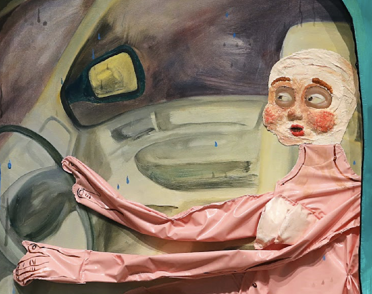
Figure 7.2: Amy Chasse, In Transit (detail), 2025, oil, acrylic, oil pastel, plaster, stickers, silicone, vinyl and wood on canvas, 75 x 58 inches (190.5 x 147.32 cm). Photo: courtesy the artist © Amy Chasse
AC: The idea for this piece came from the memory of being a kid in the backseat of my mom’s car, watching raindrops race down the window. I am interested in how something mundane can become animated through your imagination, especially in childhood. The piece started out as a painting and ended up becoming more sculptural, similar to a diorama. There’s three inches of wood framing the sides and the front piece is also made of wood. I cut out large organic shapes with a jigsaw and inlaid plexiglass to create car windows. The figures are actually physically trapped in between the canvas and the plexi.
LX: That’s really interesting. It reminds me a bit of something in Manet’s work. In Manet’s Modernism, Michael Fried coined the term “facingness” to describe how Manet renders the subject as “facing” outward toward the viewer and confrontationally acknowledging the viewer’s presence as a “beholder.” Manet’s subjects appear dissociative but not entirely disengaged. That ambiguity changes how the viewer experiences the work, and imbues the work with a sense of theatricality.
Your figures’ eyes almost look a little bit inebriated or intoxicated in a way….they’re so gargantuan they look almost startled. It captures the tense dynamics between a mother and daughter, and the anxieties that motherhood brings, as being in the literal “driver’s seat” of responsibility. I picked up on that tension here. What aspects of abjection interest you the most?
AC: What you said about Manet and the eyes really resonates, since affect is central to my work. Like I said, the figures do not have a fixed meaning, so the viewer’s emotional response is what matters most to me. I’m drawn to creating something that feels both familiar and unsettling, where you want to look, but it also feels uncomfortable. That tension between attraction and repulsion is something we often experience in life, and it fascinates me.
Figure 8: Amy Chasse, Riders, 2024, acrylic, plaster and paper mache on canvas, 85 x 75 inches (215.9 x 190.5 cm). Photo: courtesy the artist © Amy Chasse
LX: I love that. I also wanted to ask about this sprawling sea creature work.
AC: Before starting grad school I was working on a series of paintings with figures and fish. I started by looking at images of trout, which evolved into these eel hybrid sea creatures. A lot of my work has a fantasy element and water is a recurring theme, perhaps from spending time fishing with my dad as a kid.
LX: I’m also curious if you’re interested in queerness or performativity at all?
AC: I’m glad you caught that. Most people don’t. I’m queer, but I’m in a long-term heterosexual relationship, so people might not immediately assume that queerness informs my work. It definitely plays a role in the way I chose to render my figures, even if subconscious.
LX: Really cool. What’s your process like and which artists are you inspired by, if any?

Figure 9: Kati Horna. Untitled (Remedios Varo wearing a mask by Leonora Carrington), 1962, gelatin silver print, 8.5 × 7.75 inches (21.6 × 19.7 cm). Photo: courtesy the Kati Horna Estate © 2025 Kati Horna Estate, Carol and David Appel Family Fund, Museum of Modern Art (MoMA), New York, NY (966.2018)
I’m drawn to creating something that feels both familiar and unsettling, where you want to look, but it also feels uncomfortable. That tension between attraction and repulsion is something we often experience in life, and it fascinates me.
AC: I’m constantly influenced by things I see out in the world. I often make quick sketches of figures I find interesting even if I’m unsure why I’m drawn to them. I might love the cheeks in one sketch and then see a movie character with a fascinating nose, and I’ll stitch or collage it all together to make something new. These Frankenstein-like characters naturally find their way into my work.
As for artists, I'm really into her Cindy Sherman right now. I’ve also been drawn to the three witches of Surrealism: Remedios Varo, Leonora Carrington, and Kati Horna. Horna is less known, but her photographs, dolls, and masks really speak to me. There’s something uncanny and almost documentary that really draws me in. During critiques, I was continuously encouraged to watch David Lynch’s Twin Peaks and Eraserhead, so I’ve started exploring his work too.
LX: Can you tell me about what’s on your agenda for this road trip with your doll you’re about to embark on?
AC: Yes! I’m taking a 10 day road trip with the doll to explore what some people might consider to be “fly over states”.
LX: That’s epic [laughter].
AC: Yeah, I’ve always been drawn to the rural and suburban areas of the U.S. that are often perceived as mundane, but make up so much of the American landscape. My travel plans are flexible, so I can take local recommendations and pivot based on curiosity and intuition. I’m approaching the trip as a 10 day durational performance and want to investigate how my relationship with the doll evolves and changes over time. I plan to observe and document my vulnerability to the doll and the projections I put onto it. I like the notion that the doll has the potential to be my road trip partner, a stand-in, my only friend, an enemy, an annoyance and so much more. I’ll be using the time to reflect on the “illusion” of a roadtrip as a means of escape from things, to write, and to photograph our life journey together.

Amy Chasse
Amy Chasse (b. 1997, Norwich, CT) investigates the paradox of inhabiting a human body that is simultaneously present and absent of self. Through cutting, stitching, stuffing, and brushing, Chasse uses figuration to engage with the abject, creating emotionally and physically depleted figures or “dolls” that confront feelings of nihilism and otherness within the human condition. She films and photographs these dolls in domestic spaces she considers “psychic interiors,” examining the impact of late-stage capitalism on the nuclear family. Within these interiors, her figures serve as conduits between reality and an alternative world. Through interdisciplinary modes of making, she explores the intersections of transgression and desire. Chasse is based in Brooklyn, NY and is currently pursuing her MFA in Painting/Printmaking at Yale University.

To Burn, To Float, To Refuse: In Conversation with Joy Li
Whether crawling on all fours in durational performances or staging quiet rebellions in glass-walled offices, Joy Li’s work resists the familiar. With Lara Xenia, Li reflects on the evolution of her practice—from early sculptural experiments to her recent works with fire, transparency, and edible forms.
Lara Xenia: Tell me about your current series.

Figure 1.1: Joy Li, Transparent Trap, 2025, glass, butterfly specimen, screen,printed circuit board, rubber, 7.1 × 12.6 × 6.7 inches (18 × 32 × 17 cm). Photo: courtesy the artist, Podium Gallery, and Lok Hang Wu © Joy Li

Figure 2.1: Joy Li, Specimen Collection, 2025, 29.5 × 19.7 × 23.6 inches (75 × 50 × 60 cm), glass, banknote, metal, LED, ceramic, copper wire, and rubber. Photo: courtesy the artist, Podium Gallery, and Lok Hang Wu © Joy Li
Joy Li: My latest work, now on view in a solo exhibition at Podium Gallery in Hong Kong, explores transparency, both as a material and a concept. The title, Green Water, reflects the interplay between rational thought and emotion—two forces that often operate consciously and unconsciously at once. I think maintaining that balance is essential. The exhibition includes works that mark a shift in my practice. Last semester, I took a scientific glassblowing class in Yale’s chemistry department, where I learned to make lab-grade glassware…not for art, but for experiments. I had never worked with glass before and wasn’t sure how it would relate to my work.
In a group critique with Sarah Oppenheimer and the first year cohort, others described my work as mysterious and narrative-driven—terms I hadn’t associated with my practice. That moment pushed me to reconsider how I construct and expose meaning, both materially and conceptually. In these new pieces, both the exteriors and interiors are fully transparent. The wires and circuit boards I once concealed are now exposed. It was a major shift, but also incredibly freeing; the material clarity mirrored a conceptual breakthrough, and the sleek surfaces made my older, boxier pieces feel outdated.

Figure 2.2: Joy Li, Specimen Collection (detail), 2025, 29.5 × 19.7 × 23.6 inches (75 × 50 × 60 cm), glass, banknote, metal, LED, ceramic, copper wire, and rubber. Photo: courtesy the artist, Podium Gallery, and Lok Hang Wu © Joy Li
LX: It definitely has an industrial quality. Knowing you took a chemistry-based class makes it even more interesting because there’s almost a formulaic logic to it that I wouldn’t have initially picked up on. Even visually, it’s like a pipeline—with money on the front. It’s a compelling connection.
JL: I used to work a lot with butterfly wings in earlier pieces, but I wanted to go beyond the insect itself and explore butterflies as cultural symbols. In this work, I show various banknotes from around the world that feature butterflies. There are 123 in total.

Figure 1.2: Joy Li, Transparent Trap (detail), 2025, glass, butterfly specimen, screen,printed circuit board, rubber, 7.1 × 12.6 × 6.7 inches (18 × 32 × 17 cm). Photo: courtesy the artist, Podium Gallery, and Lok Hang Wu © Joy Li
LX: Fascinating. What do papillons mean for you, then?
JL: I see butterflies as representations of the human body, with its fragility, both physical and mental, in contemporary settings. The structures are inspired by architecture. Inside, I placed a slow-motion video of a blooming flower, which I think of as an advertisement for butterflies.
LX: I love how participatory that piece is. Have you explored interactivity in other works as well?
JL: Yes, in my solo exhibition in Shanghai I made an edible cookie sculpture that people could eat during the opening. I wanted people to be able to digest and absorb my sculptures, until the sculpture disappeared. I was struggling with all the storage and shipping, so I thought it was a perfect solution [laughter].

Figure 3.1: Joy Li, Ouroboros, 2023, 2.17 × 2.17 inches (5.5 × 5.5 cm), cookie. Photo: courtesy the artist © Joy Li

Figure 3.2: Joy Li, Ouroboros, 2023, 2.17 × 2.17 inches (5.5 × 5.5 cm), cookie. Photo: courtesy the artist © Joy Li
LX: How fun. How many cookies did you make? The food component vaguely reminds me of Rirkrit Tiravanija’s Pad Thai Diplomacy performance.
JL: Yes, yes, definitely. I think I probably made 60 or something. They were all gone.
LX: They look delectable, so I bet. What are you currently researching?
JL: I’m researching miniature theme parks in China, specifically The Window of the World in Shenzhen, where I’m currently based. It was built in 1994 and features around 100 scaled-down global landmarks, from the Pyramids to the Eiffel Tower. I’m interested in moving beyond critiques of Western imitation to explore why it was built when it was—maybe to signal China’s recovery, modernization, and global integration. There’s a kind of pride in it: you don’t need to leave China to see the world—the world is already here. I’m in early talks with a curator friend who specializes in East Asian architecture about a potential collaboration, and I’m still reading to find my entry point. I’m optimistic that it could become my thesis.

Figure 4: China Travel Service (Holdings), Hong Kong Limited and OCT Group, New York Cityscape at The Window of the World, Shenzhen, China, 1994
This is a miniature of New York City, with the Twin Towers. It was the first park I ever visited as a kid, and after revisiting it last week, it felt completely outdated, now that the vicinity is surrounded by sleek skyscrapers. My recent works are directly influenced by architectural models. They carry layered meanings—a hopeful vision of the future, a sense of panoramic control, and the playfulness of a manipulable toy. I’m still exploring what that ambiguity means for my practice.
LX: Speaking of your practice, I was really moved by your multichannel work and intrigued by your use of an antenna in the video I saw in your studio. Could you walk me through how that piece came together?
JL: I began developing that body of work three years ago, exploring performance, sculpture, and installation. I gradually became interested in how to use footage and documentation from my performances more creatively. I see all of my works as part of an ongoing study of the same themes. I started thinking about how to construct a narrative through this documentation—whether through a vlog or a self-documentary video that not only shows the performances, but also reveals the intentions behind them. My first video work was my undergraduate thesis, The Deviation of Desire. It features a projection of my hand interacting with my own body as I perform a series of actions involving fire, and I later compiled the footage into a single, cohesive video.
Figure 5: Joy Li, The Deviation of Desire, 2021, single-channel video, color, sound, 13 minutes 39 seconds, https://vimeo.com/540782835
Since then, I’ve created more video works while also considering their sculptural qualities. As a sculptor, I’m interested in giving video works a tangible presence—something the audience can physically navigate and experience with their whole body. The work you saw in my studio was my first attempt to integrate everything from live performance, installation, and multichannel videos. That marked a turning point.
Figure 6.1: Joy Li, Intermission, 2024, performance. Photo: courtesy the artist and Maximiliano Cervantes © Joy Li
Figure 6.2: Joy Li, Intermission, 2024, performance. Photo: courtesy the artist and Maximiliano Cervantes © Joy Li
Before starting at Yale, I attended the Skowhegan Residency, where I created Intermission. I transformed my body into a nonhuman, monster-like figure using white contact lenses that blocked my vision, allowing me to see only colored lights. Intermission was also my first durational nonhuman performance. For five hours, I actively moved through the space and interacted with a live audience. After the audience left, I spent the night in the performance space, and it wasn’t until I woke up the next morning and walked out that the performance truly came to an end.
LX: That’s wild to me. That must’ve been exhausting.
JL: Yes. That performance really pushed me to think about the limits of the human body. It’s essentially impossible to become truly nonhuman—our behaviors are deeply tied to our physical form, especially our ability to walk upright. In that piece, I was on all fours, which is a recurring gesture in my work. Crawling disrupts the body's usual movement—it’s one of the fastest ways to shift into something unfamiliar or unsettling. The experience raised a larger question for me: is becoming nonhuman even possible, or is it an inherently futile pursuit? That question inspired the development of my video installation and performance work.
Figure 6.3: Joy Li, Intermission, video installation, 2025, 20 minutes 56 seconds, https://vimeo.com/1061913339 © Joy Li
LX: I was especially struck by the physicality of your performance and the way you integrated microeconomics into the premise.
JL: Yes, during my first semester at Yale, I took a microeconomics class because I was curious about how people make decisions. Microeconomics is really about allocating limited resources. I started thinking of those resources not just as money, but as time and energy, especially in performances. Models like opportunity cost and diminishing returns became useful frameworks to reflect on what I put into each performance versus what comes out of it.
The experience raised a larger question for me: is becoming nonhuman even possible, or is it an inherently futile pursuit?
In that video sculpture, I brought together elements of performance, economics, and sculpture. The piece plays with the sculptural notion of front, side, and back: the front consists entirely of screens, while the back features a small window revealing a piece of paper perforated with the word “Now”—a reference to the present moment. I also placed a treadmill on top, using it as an instrument by pressing my fingers and hands against it to generate sound.
LX: I liked how introspective you were when you spoke about your life experiences. I also vividly remember the scene of you walking nude in the middle of a road in Maine, and the Shenzhen city slogan on your studio wall still cracks me up [laughs].

Figure 7: “Time is Money, Efficiency is Life”, Shenzhen, China. Photo: Wikipedia Commons
JL: Yes—that slogan is from my hometown, Shenzhen [laughs]. I find it fascinating, especially in how it reflects the ways bodies and minds are shaped by their environments. I’m particularly drawn to themes of desire, fear, and anxiety, and “Time is Money, Efficiency is Life” reflects a key component of what drives my work.
LX: I have to ask: do you ever feel vulnerable when you perform in the nude?
JL: When I’m performing, I don’t really think about it. I consider how people might react before or after, especially when reviewing the documentation…but once I’m in it, I’ve already made the decision. I know what I want to do, and I just commit to executing it.
LX: I wish I could do that, and I have a lot of reverence for the way you perform—it’s such a brave thing. Being proud and comfortable in your body is powerful, and I think that’s what makes your performances so captivating. As an audience member, you can really feel that you’re fully present, as both yourself and the performer.
I’m particularly drawn to themes of desire, fear, and anxiety, and “Time is Money, Efficiency is Life” reflects a key component of what drives my work.
JL: It’s funny because you said I seemed really present, and I was, but I also felt detached from my body. At that moment, it became artistic material. The discomfort or shame we feel about exposing ourselves comes from cultural norms, but during the performance, I set that aside. I’m not Joy Li the person—I’m part of the work. I don’t think about it until afterward, when I return to being a social being and go, “Oh god, that’s how I looked? Okay…fine.” [Laughter]
LX: What does performing mean to you?
JL: Performance, for me, is about surrendering—on my own terms. It’s never just chaos. I build a structure, like my tent, and within that, I allow myself to lose control. That in itself is a form of control.
LX: That’s beautiful. Let’s look at some of your older works together.
I’m not Joy Li the person—I’m part of the work.
JL: Yes, yes. [Points to portfolio] This is a bow tie. We usually use them for luxury packaging. In Chinese, we call them “butterfly knots”, so I decided to render an artificial butterfly killing a bunch of real butterflies in this sculpture.
LX: This slit looks like a snake's tongue.
JL: Yes, that’s deliberate.

Figure 8.1: Joy Li, Butterfly Killer No. 01, 2024, 39.37 × 39.37 × 43.31 inches (100 × 100 × 110 cm), stainless steel, butterfly specimens, resin, ceramic tiles, epoxy, and acrylic. Photo: courtesy the artist © Joy Li
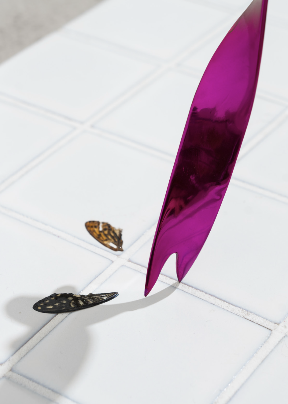
Figure 8.2: Joy Li, Butterfly Killer No. 01 (detail), 2024, 39.37 × 39.37 × 43.31 inches (100 × 100 × 110 cm), stainless steel, butterfly specimens, resin, ceramic tiles, epoxy, and acrylic. Photo: courtesy the artist © Joy Li
I build a structure, like my tent, and within that, I allow myself to lose control. That in itself is a form of control.
LX: I’m enamored by this work where you’re suspended in the air. It looks like a magic trick!

Figure 9.1: Joy Li, Wings of Icarus, 2024, iron, wax, paint, nylon rope, cotton thread, and human body. Photo: courtesy the artist © Joy Li

Figure 9.2: Joy Li, Wings of Icarus, 2024, iron, wax, paint, nylon rope, cotton thread, and human body. Photo: courtesy the artist © Joy Li
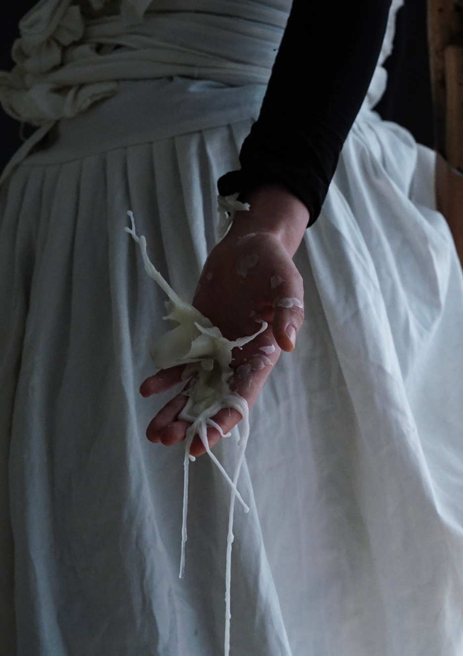
Figure 9.3: Joy Li, Wings of Icarus, 2024, iron, wax, paint, nylon rope, cotton thread, and human body. Photo: courtesy the artist © Joy Li
JL: For Wings of Icarus, I was sitting on something that supports my body. I was inspired by how street performers have props that can make them actually appear as if they’re floating. I made this installation that could make me float in the middle of the air, but it's also an illusion, with a big city backdrop.
Fire is a source that requires energy. While the candle burns and drips on my hands and the skeleton in my wings, wearing white contact lenses made me completely blind, except for being able to see the light of the flames. The flames appeared in my vision as flickering red triangles. At that moment, I felt connected to Icarus and I began to meditate on why Icarus could not resist the temptation of the Sun. Let me read you the accompanying poem I wrote for it:
With the wings that I constructed from features and wax, I flew to the Sun, My gaze made you overly beautiful, Like a giant incandescent egg of an idol. I approached with sanity, knowing the cost of your lethality I was aware of the importance of distance, And I thought I was in control Until defeated by my cowardice.
Wings caught fire, eyes were burnt, but blindness has brought the true vision. When my life was on the line, the blindness helped me escape from my body and return to infinity.
Time disappears. The falling suspends And now, I know what to do.
I should shut up.
That was the first time I used those white contacts in my work, which definitely influenced Intermission. I made the skirt specifically for that piece. The illusion I was aiming for was one of weightlessness—of floating—but in reality, I couldn’t move. It’s about the tension between the desire for freedom and the constraints of life in a modern city.
LX: Wow. The only other figurative candle-based sculptures I’ve seen are Urs Fischer’s ephemeral melting works—but I’ve never seen someone hold fire in a gallery space.
Wings caught fire, eyes were burnt, but blindness has brought the true vision. When my life was on the line, the blindness helped me escape from my body and return to infinity.

Figure 10: Urs Fischer, Untitled (after The Abduction of the Sabine Women by Giambologna), 2011–2020. Photo: courtesy the artist, the Pinault Collection, and Stefan Altenburger © Urs Fischer
In your poem, you write about blindness as a condition that allows you to exist. Was there a specific moment that drew you to performance, where you felt, “This will set me free”? And did that moment also spark your interest in exploring themes of blindness and light?

Figure 11.1: Joy Li, This Performance is a Form of Refusal, 2021, metal, fabric, faux fur, hair, cable tie, feather, and human body. Photo: courtesy the artist © Joy Li

Figure 11.2: Joy Li, This Performance is a Form of Refusal, 2021, metal, fabric, faux fur, hair, cable tie, feather, and human body. Photo: courtesy the artist © Joy Li
JL: Yes, this piece felt connected to an earlier work I made in 2021 called This Performance is a Form of Refusal. After graduating in the middle of COVID, I moved back to China and settled in Shanghai. Although I had studied sculpture in undergrad, I initially took a job as a graphic designer for this luxurious shopping mall on the underground floor. It was windowless and drenched in cold, white light. The office culture felt deeply performative, and built on a hierarchy of flattery and suppression.
I remember thinking, “If being human means this, I’d rather be something else.” My second job was in branding design, mainly for restaurants and similar clients. The office was located in a sleek skyscraper—polished, regulated, and deeply alienating. And I was still haunted by a simple thought: “I’d rather be something else.” So I started to make body extensions, like wearable sculptures, and apparatuses, to transform myself into something “other”, something monstrous. Two days before I quit, I even snuck into the office at night, staging a kind of quiet rebellion and protest.
LX: That is so iconic and has such Charles Bukowski-energy. You were probably on all of the security cameras [laughter].
JL: I know, right? I’d pay to get that footage. I was there around 2:00 or 3:00 A.M., walking through the space in that outfit. I went into the meeting room where we used to gather, then into my office where I sat for eight hours a day. Looking back, I realize a lot of my performances are small acts of protest in one way or another.
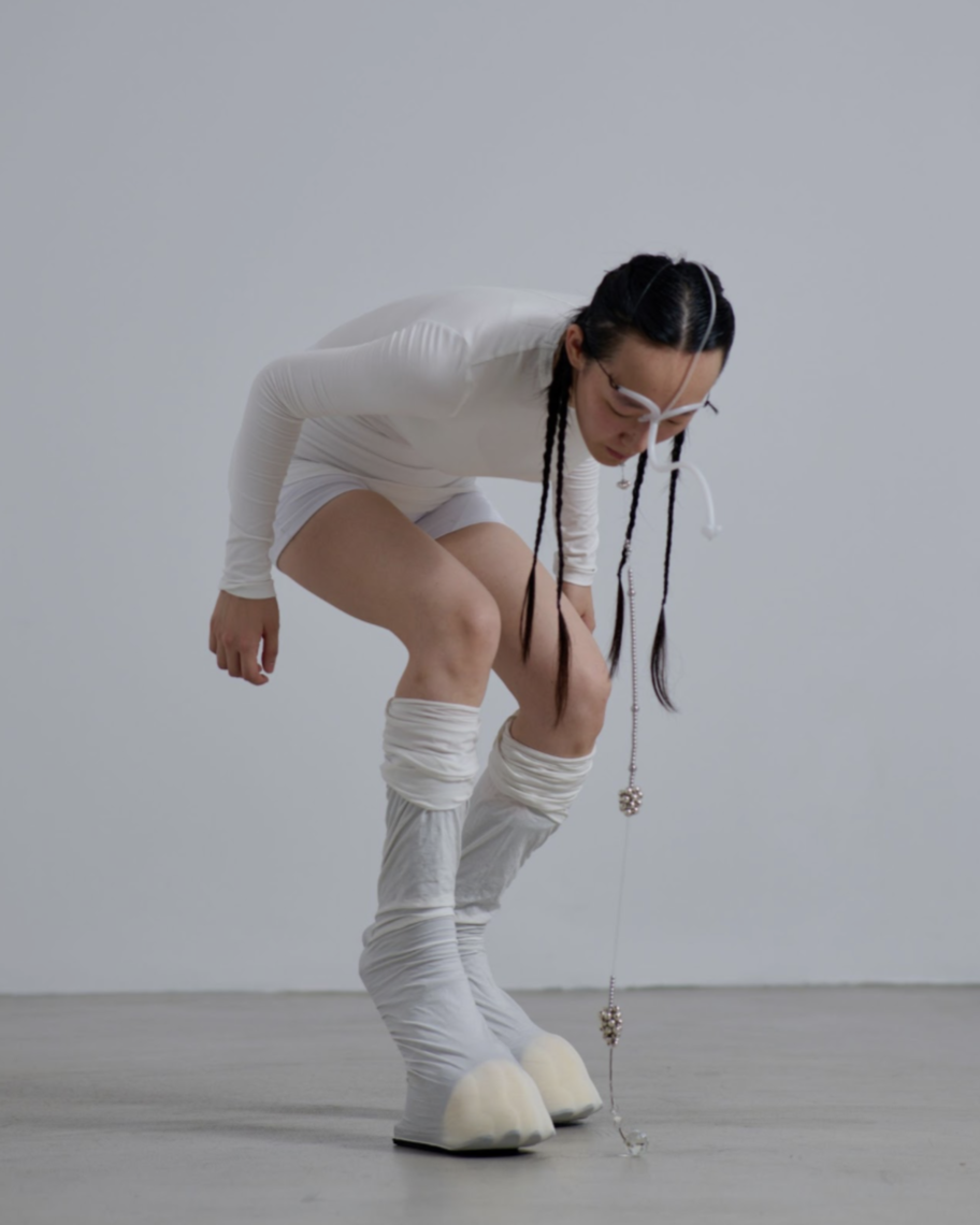
Figure 12.1: Joy Li, Rattlesnake, 2024, 3D printed resin, wood, sponge, springs, bells, metal, fabric, crystal chandelier, pendants, hair, essential oils, fishing line, and human body. Photo: courtesy the artist and Liang Zilong © Joy Li

Figure 12.2: Joy Li, Rattlesnake, 2024, 3D printed resin, wood, sponge, springs, bells, metal, fabric, crystal chandelier, pendants, hair, essential oils, fishing line, and human body. Photo: courtesy the artist and Liang Zilong © Joy Li

Figure 12.3: Joy Li, Rattlesnake, 2024, 3D printed resin, wood, sponge, springs, bells, metal, fabric, crystal chandelier, pendants, hair, essential oils, fishing line, and human body. Photo: courtesy the artist and Liang Zilong © Joy Li
LX: I love that for you. On a more personal note, do you ever feel pressure to censor yourself or resist being labeled as a “Chinese artist”?
JL: Definitely. I don’t deliberately frame my work through identity, but those layers of being Chinese and being a woman are inseparable from how it’s perceived. I’ve moved a lot, both within China and to the U.S., and that nomadic experience, along with navigating censorship, taught me you can’t control interpretation. There’s no perfect place to live or make art; it’s about knowing what matters to you and adapting. For me, being smart and nimble is key.
LX: Thank you for sharing your insights on that with me. Which artists or figures do you look up to?
JL: As a kid, I admired Snoopy for his carefree spirit—he did whatever he wanted, whether he was a pilot or a writer, without worrying about others’ opinions [laughs]. But in terms of artists, I really like Rebecca Horn and Pierre Huyghe; he is probably one of my favorites. I also like Martha Barney, Annicka Yi, and Hiro Stora.
LX: Lastly: what do you hope your performances leave behind?
JL: I want the audience to re-experience and reflect on the familiar—the body, and the desires, power structures, and mundane routines that unfold around it. Within these everyday encounters, can we discover new possibilities?

Joy Li
Joy Li (b. 1999, Gansu, China) obtained her BFA degree in Interdisciplinary Sculpture with a Theater minor at the Maryland Institute College of Art in 2021. She is currently studying in the MFA Sculpture program at the Yale School of Art, and is expected to graduate in 2026. Her works include sculpture, installation, performance, and video, exploring the tension of interactions between objects, emotions, and relationships. In her works, she reinterprets objects and bodies to magnify the allure and danger inherent in everyday items, allowing the audience to re-experience and interact with familiar things in unfamiliar ways.
She is the recipient of the 2025 Schickle-Collingwood Prize from the Yale School of Art and the 2024–2025 Porsche “Young Chinese Artist of the Year” Award. In 2024, she also attended the Skowhegan School of Painting & Sculpture.
Her recent solo exhibitions and projects include: “Gas Station X”, 2024, Vanguard Gallery, Shanghai; “Icarus’ Wings”, 2024, Guangdong Times Museum, Guangzhou; “Green Water”, 2023, LINSEED, Shanghai; “Golden Lines and White Lightings”, 2023, Aranya, Chengde; “Salomé”, 2022, 33ml OFFSPACE, Shanghai. Her selected group exhibitions include: “Ballet with the Devil”, PODIUM, Hong Kong; “Porsche ‘Young Chinese Artist of the Year’ Nominees’ Exhibition”, Shanghai Exhibition Center, Shanghai; “Four Winds: A Different Perspective on Southern Art”, 2024, Guangdong Contemporary Art Center, Guangzhou; “Open the Door”, 2024, Gallery func, Shanghai; “At the Beginning, You Find Nothing There”, 2024, Petitree, Shenzhen; “Embodied Rituals”, 2024, Guangdong Times Museum, Guangzhou; “After Human: Marks of the Beasts”, 2024, Tomorrow Maybe, Hong Kong;“moments that home came into being”, 2023, Third Street Gallery, Shanghai; “Tie Up”, 2023, Mugyewon, LINSEED, Seoul; “LAB 2: Co-Working Space”, 2022, LIU HAISU Art Museum, Shanghai; and “Art Nova 100”, 2021, Guardian Art Center, Beijing.

Folding Reveries: In Conversation with Sok Song
Sok Song speaks with Lara Xenia about his passion for origami and fashion, his Korean heritage, and how his practice has evolved.

Figure 1: Sok Song, Korean or American Army?—Uniform Duality, 2024, graphite transfer collograph and pressure print monotype on BFK Rives, 30 × 22 (76.3 × 55.88 cm). Photo: courtesy the artist © Sok Song
Lara Xenia: I am fascinated by how your works reimagine origami on a completely different scale, and sometimes take up the entire room. How did you get obsessed with it?
Sok Song: Yes, I started origami when I was little…maybe six or seven. I remember very vividly that my three brothers and I would play this game in Korea called dakji. It’s very similar to the American bottle cap game, where you flatten bottle caps and try to flip over your opponent’s by slamming yours down on top. But with dakji, you fold square pieces of paper into thick tiles then each player takes turns slamming their tile onto the opponent’s to flip it. If you manage to flip it over, you win that round—and sometimes you even win the opponent’s piece. It’s a classic flipping game, like the one shown in Squid Game, where the guy in the subway gets slapped every time he fails to flip it. Almost every Korean kid knows how to play it. All the neighborhood kids played it as well.
LX: Interesting. Were you competitive with your brothers?
Figure 2: Sok Song, Dollar Bill Teddy Bear, 2010. Photo: courtesy the artist © Sok Song
SS: So competitive [laughs]. My mom was especially angry because it requires paper and growing up, there was paper, but it was from the newspaper or the magazine, phone books, or any kind of paper calendar. We would take any paper that was in the house to make stock. She would be so annoyed that we were using any kind of paper, some important papers. I distinctly remember having a giant black trash bag filled with papers that we’d hold onto and sleep with, to say, “You can't steal this. I want all of this.” [Laughs] From a young age, I knew that I was gonna start collecting papers. Now, I have a different type of paper collection [laughter].
LX: That's so funny. What compelled you to start making origami so seriously?
SS: When I moved to southern Arizona from Korea when I was eight, I stumbled into a library and checked out an origami book with dragons on the cover. I was hooked. I started looking for other books on folding from there. After I moved to New York, I found out that there's a national organization called Origami USA headquartered there that holds multiple conventions in the country. Every year, 500 people come from all over the world to teach origami and take classes. I started volunteering for it and ended up designing the Origami Holiday Tree at the American Museum of Natural History. Funnily enough, Origami USA is housed in the museum’s basement, after one of the former curators endowed it with that space in exchange for visitor services aid and designing the tree. So the Origami Tree has been a museum fixture and tradition for over 55 years. Since I designed it for seven years, I still consult with them annually for when it goes up every November.

Figure 3: Installation view of the Origami Holiday Tree, Fantastic Creatures: Mythic and Real, 2007, The American Museum of Natural History, New York City. Photo: courtesy the artist © Sok Song
LX: Wow. I also noticed that you write didactic books.
SS: Yes, when I started doing the tree, Random House asked me to do my first book, but then I started traveling to other countries with the organization to attend origami conferences, so I got immersed in a very niche community. Every country has their own organization and hosts biannual conferences. When you start taking classes, and reading hundreds of origami books, you start thinking about how to make other things. I was teaching, making, and designing objects for the other conferences, so those were all included in my publications.
LX: What centers you when you're making the work?
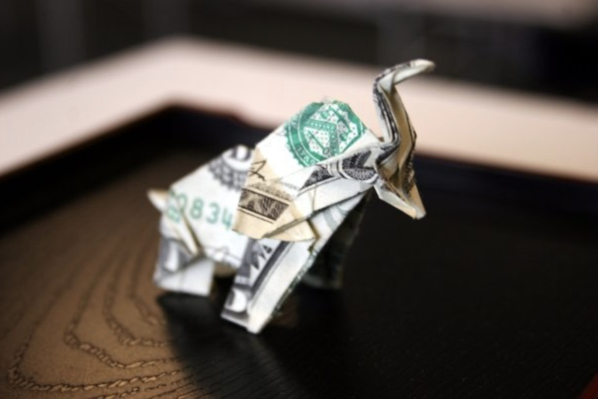
Figure 4: Sok Song, Dollar Bill Elephant, 2010. Photo: courtesy the artist © Sok Song
SS: I like that origami has mathematical principles. There are only certain ways that you can transform a flat, square piece of paper into a three-dimensional shape. Some designers think mathematically, and use computers to design the internal structures of the folds. But I’m more of a doodling, trial-and-error type of person. If I want an elephant, I know that I need to get a long trunk and flat ear, so I instinctively know how to fold the square into that base. Then I experiment, like, “Do I want the ears a little bit bigger or the trunk a little longer?” There’s a subconscious mathematical geometric thinking that's happening. I try different things to see what it's going to turn into. Sometimes I will just doodle and fold unknowingly, and it'll turn into something.

Figure 5: Do-Sok-a-Hedron. Photo: courtesy the artist © Sok Song
Art as a practice came fairly late because I was teaching workshops and doing origami installations and the origami job at the Museum of Natural History in New York for a while. I started publishing the books, and then I started doing custom paper sculptures for events in New York, or teaching at schools and parties. Part of me really wanted to try to see if folded objects and sculptures could become fine art. Yet, it was very much an uphill battle because there's a divide between art and craft. Origami is seen as more of a craft, or a childhood activity, rather than as a high art form or sculpture.
There are basically two types: the geometric, representational kind—like cranes made of sharp edges and triangles—and the more organic, lifelike origami, where you sculpt the paper into a person with a jacket and buttons, or an insect with antennae and legs. Still, as soon as people hear the word origami, something shifts; they think of kids and craft, and that changes how they see the work. I used to call myself an origami or paper artist, but just saying the word always shaped the conversation, whether I was in the U.S., Japan, or Korea.
Figure 6: Sok Song, Rupture under Pressure, 2025, balloons and charbonnel ink monotype on BFK Rives, 30 × 22 (76.3 × 55.88 cm). Photo: courtesy the artist © Sok Song
Before the pandemic, I thought about going into education because I’d taught at every private school and a lot of public schools in all five boroughs of New York, but most of the full-time positions required a Master’s or an MFA. During the pandemic, when online classes became accessible, I decided to finally finish my Bachelor’s, which I had started at Parsons but I dropped out of a fashion degree. I completed my BA through CUNY Hunter, where I also took studio art classes and got some guidance on MFA applications. I graduated in 2024, applied to Yale as I was finishing, and by some stroke of luck or chance I got in, along with a few other schools. I took that as a sign to immerse myself in it.

Figure 7.1: America’s Next Top Model, Cycle 12, 2009, origami vêtements. Photo: courtesy the artist © Sok Song
Figure 7.2: Sok Song, Origami Phone Bill Dress, Fashion Week 2015, origami vêtements. Modeled by Tara Sukoff for Imitation of Christ. Photo: courtesy the artist © Sok Song
LX: No way! I don't think it was by chance. You’re really expanding the possibilities of origami and printmaking across mediums.
SS: I was trying to do that when I was at Hunter too, incorporating folding into all the fine art mediums. I folded canvases and paintings. I folded clay, metal, and sculpture, and made videos of folding things to try to see what would stick. Printmaking had the most folding synergy because the process is very much like origami. It's systematic. You have to do this first, then you have to do that and to prepare the plate. It’s step-by-step, just like origami.
LX: That’s such an interesting point you make, especially when you think about folding in the context of other artists. For instance, Simon Hantaï famously folded his canvases while painting, and even Francis Bacon manipulated photographs in fascinating ways. He’d often fold photographs cylindrically to distort and adapt them for his paintings. This one looks like a literal Mandelbrot fractal [laughs whilst pointing at a work].

Figure 8: Simon Hantaï, Étude, 1969, oil on canvas, 108.25 × 93.69 inches (275 × 238 cm). Gift of the Collectors Committee, National Gallery of Art, Washington, D.C. Photo: courtesy The Estate of Simon Hantaï © The Estate of Simon Hantaï

Figure 9.1: Francis Bacon, Portrait of Henrietta Moraes, 1963, oil on canvas, 65 × 56 inches (165 × 142.5 cm). Photo: courtesy The Estate of Francis Bacon © The Estate of Francis Bacon

Figure 9.2: Francis Bacon studio material, John Deakin, Henrietta Moraes, late 1950s, Collection Dublin City Gallery The Hugh Lane. Photo: courtesy John Deakin Archive © John Deakin Archive and The Estate of Francis Bacon
Printmaking had the most folding synergy because the process is very much like origami. It's systematic.
SS: Yes, I made a lot of this in my first year at Yale. I am learning more about contemporary artists and others that have used the basics of folding at YUAG. I’m always fascinated by paintings where you can see the folds, like Sam Gilliam paints, folds all of his canvases as they paint them, and then stretches them out. There are artists who use folds to block things out while they paint and unfold to see what happens when they use folding. It seems even here at YUAG, one of the guest Teaching Fellows folds his canvas and then paints it, then opens it and paints it again.
LX: Could you tell me about that amazing print series in your studio with the Korean flags on them?
SS: I first started experimenting by putting folded paper through the printmaking press and noticed how each layer left a different imprint. I wondered, “What if I pressed clothing?” Because of my interest in textiles and fashion, I became fascinated by how every fold, seam, and layer of fabric created varying tones, especially when using graphite transfer paper. One layer might leave a faint gray, while multiple layers produce deep black marks due to the pressure of the rollers. This made me think more about the construction of clothing and my own identity—especially traditional Korean garments, like the hanbok, which are tied together entirely through fabric. I was struck by how these clothes are designed to fit the body without modern fasteners like zippers or darts, and how that reflects both the cultural tradition and function. All in all, the technique took me about two years to formally develop.
Figure 10: Sok Song, Installation view of Forgotten Heroes, 2025, hangers, dry cleaning plastics, vêtements, and mannequins, dimensions variable. Photo: courtesy the artist © Sok Song
After my niece and nephews were born, they each wore colorful Korean garments for a traditional 100-day celebration. As part of the ceremony, symbolic objects are placed in front of the baby, like a brush for an artist or a calculator for someone going into finance, and whichever item the baby grabs is said to predict their future. It always struck me as a strange, stereotypical pressure to place on a newborn, and it got me thinking about traditional culture, garments and my own upbringing. My family immigrated to the U.S. because my aunts married American military men stationed in Korea, and we came on an extended family visa. We lived near military bases in Arizona and Texas, so southern Arizona was Fort Huachuca, and Fort Hood in Texas. Near the base, my parents worked in Korean restaurants and a dry cleaner that served soldiers—our lives in the U.S. was always shaped by that military connection.
LX: So the uniforms they were laundering were all American military uniforms?
This made me think more about the construction of clothing and my own identity—especially traditional Korean garments, like the hanbok, which are tied together entirely through fabric.
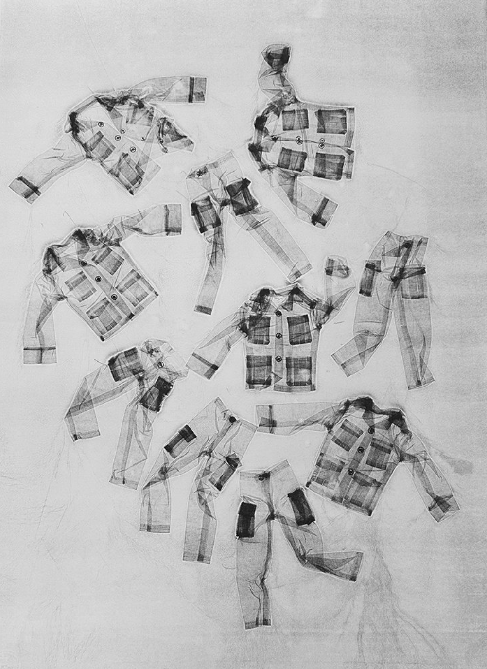
Figure 11: Sok Song, U.S. Army undressed, 2025, from the A.P.T. (Air, Pressed, Transferred) series. Photo: courtesy the artist © Sok Song
SS: Yes, they are American military uniforms. But I sewed one side of a Korean-American Korean flag, and one side with an American flag because I felt like that's where I grew up. It is this weird niche intersection of Korean-American military presence.
LX: How has that presence impacted you?
SS: As a Korean citizen with a U.S. green card, I’ve had to file regular waivers to avoid mandatory military service in Korea—if I didn’t I could be arrested upon visiting. Korea doesn’t allow dual citizenship, so becoming a U.S. citizen would mean giving up my Korean nationality entirely. I’ve considered naturalizing, but hesitated, because I was unsure if I might want to return to Korea someday. It wasn’t until the pandemic that I realized how fragile green card statuses are—staying abroad for over six months can lead to losing it, even after a lifetime of living here in the U.S. It’s so crazy because I feel like I've lived here my whole life, but it doesn't really count because of this little card status.
LX: Is that another thing that maybe you would explore, like the idea of a paper identity card?

Figure 12: Sok Song, Folded Identity Portrait, 2025, Ben Day dots on paper, 30 × 22 inches (76.2 × 55.88 cm). Photo: courtesy the artist © Sok Song
SS: Yes, a lot of the things that I was doing the first semester here had to do with the protection of identity. My first project was folding faces and folding portraits of identity photographs of people in my community, like my friends and the people who were international students at Yale because I was also turning them into halftone dot printing, like Ben Day dots. It obscures the identity. If you step really far away from it, you can see the picture, but if you're up close, you can't see whose face it is.
LX: That’s really cool. Do you proudly identify with your Korean heritage? Were you able to foster a community and relish in your culture when you moved here?
SS: Yes. I’m always there—I came here when I was eight, and my parents made us go to Korean school and Korean church. I still speak Korean to my parents all the time, even though they are fluent in English because they had to run an American business, but it’s more comfortable to speak to them in Korean. There are lots of things that I feel very proud about in the Korean heritage. I feel there's also a lot of things that weigh on my mind because every time I go to Korea, I feel the weight of the whole north and south division. I'm constantly trying to think of ways of how that plays out in my art and how I think about my identity.
It’s a small, niche community centered around U.S. military bases. When I got to Yale, I even reached out to the Korean Studies librarian to explore it further. It has to do particularly with military brides that come over as a result of American military presence in a certain country. I grew up in that world, attending church two or three times a week with 200 Korean women who were married to American military men. Our churches in Fort Huachuca, Arizona and later Fort Hood, Texas were community hubs and religious centers, with language classes, taekwondo, Sunday school, and shared meals every week. Everyone knew each other, celebrated milestones like 100-day birthdays together, and helped preserve Korean culture for the next generation.

Figure 13: Installation view of Rupture and Reverie: Air Pressure Manifolds, 2025, Yale MFA Pit Crit. Photo: courtesy Chen Xiangyun and the artist © Chen Xiangyun
LX: I love that. Tell me about your inspiration for the balloon-filled crit installation.
SS: I don't think I saw helium balloons, until going to birthday parties of my friends in school. I was always fascinated by them. At Yale, that turned into a pit project after my cohort surprised me with a birthday movie night. Mar had ordered “Happy Birthday” balloons, but they accidentally came as “Happy Valentine’s Day” balloons in Spanish [laughter]. It was hilarious. I kept those balloons in my studio for weeks, watching them slowly deflate, and became really intrigued by their emotional resonance of being object at times for celebration, joy, and even fear—especially with the anxiety around them popping. My studio has almost no ventilation, so the balloons lingered and were constantly shifting. When it came time to plan my final pit crit installation, which we only have one each semester, I wanted to use the full height of the 30-foot space, but we weren't allowed on tall ladders due to liability rules. So I thought, “What if helium could do the lifting for me?” I installed around 200 balloons, each tied to prints of uniforms and clothing I’d made. I even directly printed some things onto the balloons. Viewers had to pull the balloons down to see the work or pop them to get a print hidden inside. It turned a limitation into an immersive, interactive experience and space.
LX: What made you choose graphite for your pit crit?
SS: Because my background in origami is rooted in sharing and interactivity, I’ve always believed a design doesn’t fully come alive until it’s taught to someone else. I love the ripple effect of teaching a fold at a convention and watching it spread. That communal spirit has molded my MFA work, from the exploding balloon pit crit to my final review, a fashion show involving students from all departments. I find joy in making experiences participatory.
For the pit crit, I transformed the space using graphite lines on the floor, plastic boots for participants, and balloons tied to prints. The idea was for people to walk through and leave subtle graphite footprints, to echo the graphite transfer prints on the walls. But as soon as it started, everyone began sliding around—the graphite powder, which is a dry lubricant, made the floor slick. A huge cloud of graphite filled the air, and people asked if it was toxic…it’s not, it’s just an irritant, but luckily, I had N94 masks ready just in case. I think I mentally blacked out. It was chaotic and funny, and not at all what I expected, but it created a much more physical, immersive experience than I’d planned.
Because my background in origami is rooted in sharing and interactivity, I’ve always believed a design doesn’t fully come alive until it’s taught to someone else.
It was really, really interesting. I don't remember it happening at all because it was not what I expected. It was really generative, and the conversation that it brought out about mark making and leaving traces, and ended up doing what I really thought I wanted, or what I was planning, but I thought they would be more gentle with the steps, but nope, you just it was what it was at the end of the day, after two days of crits, I think everybody wanted to let out some steam. When they were told they could just walk around and slide around and graphite, they've never done it before, so they went all over the place.
LX: I mean, that's also great. It's a contained area, and what a fun cohort to frolic in graphite with. Are there any artists that you are inspired by?

Figure 14: Do Ho Suh, Installation view, Home Within Home, 2013, National Museum of Modern and Contemporary Art, Seoul, Korea, 2013–2014. Photo: courtesy Lehmann Maupin © Do Ho Suh
SS: There’s a lot of Korean artists I’m inspired by, but Do Ho Suh is a big inspiration for me because we share a lot of similarities in terms of our interests in Korean identity and home and family. I also got to meet Shahzia Sikander, who is amazing. We did a studio visit and I've admired her forever because of her meticulous practice of being able to do really small-scale to large-scale installation and paintings with lots of layers. And she's the arts practitioner fellow for RITM right now at Yale. It was great to have a meal and studio visits with her.
LX: In all your years of teaching, what role has origami played in your friendships or social life? Has it ever brought someone into your life who became important to you?
SS: Origami has profoundly impacted the way that I see the world and interact with people. Most of my closest friendships in New York trace back to it. I started a Meetup group years ago because I loved folding in public, not alone at home. That’s how I met my best friend Judy. She came to one of the sessions, asked how to make something, and we instantly bonded over our shared interests in knitting, clay, and other crafts. She's now a brilliant ceramicist and weaver, and we’ve traveled the world teaching origami together—from France to South America to Asia. She even taught herself French to teach at a convention in Lyon! She recently helped me with a loom project, too—I’d just taken a Yale class with Sarah Zapata called “Alternative Cloth” that focused on fiber-based practices like weaving, knitting, and macramé. Now, I’m helping with a workshop led by Yale weaver Sophie Ness. It’s all coming full circle.
LX: I also like that you decided to place all the works on hangers because immediately I affiliate that with, “Oh, let me pick my outfit for the day.” But instead the cloth is distilled down to paper.
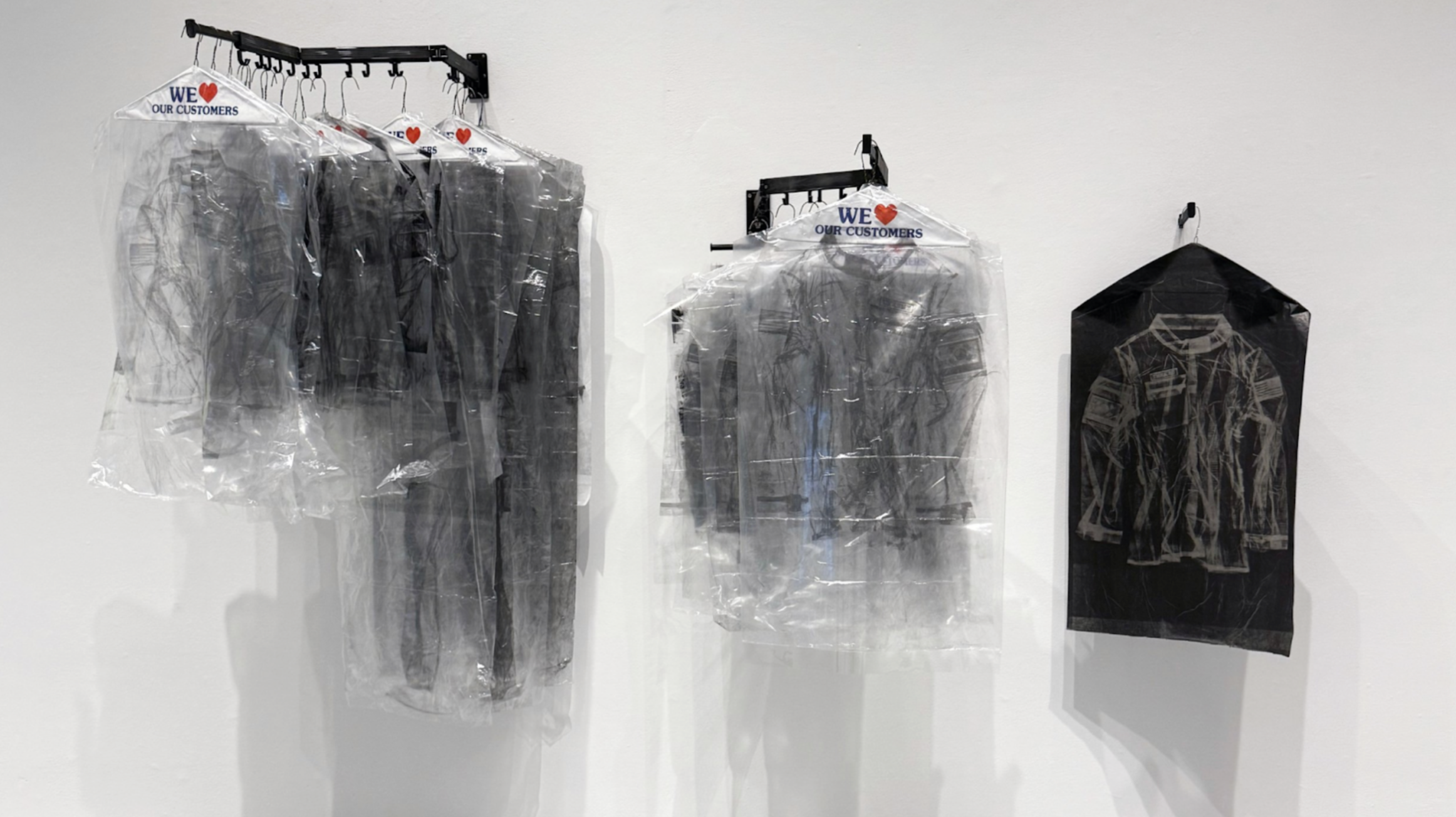
Figure 15: Sok Song, Installation view of Forgotten Heroes, 2025, hangers, vêtements, and dry cleaning plastic, carbon transfer paper, dimensions variable. Photo: courtesy the artist © Sok Song
SS: Yeah, practicality-wise, it was really easy to hang on hangers. They also looked really cool to me and it had a relationship with dry cleaning and garments. But at Yale, I quickly learned how critique works: if you bring something into the room, it becomes part of the conversation. One key lesson in Yale’s pedagogy is: if you don’t want the critique to focus on ladders, don’t bring a ladder. I brought colorful hangers to my pit crit, hoping the focus would be on the prints, but naturally, the discussion became all about the hangers.
LX: That makes a lot of sense. What's your practice day-to-day?
SS: My schedule has totally shifted at Yale. I used to be a night owl, but working with heavy machinery like the press made me realize I need to be alert, so now I go to bed earlier and wake up around 6:00 or 7:00 AM. That quiet morning time in the studio, before anyone else arrives, has become my most productive window. Having my own nearby studio space and a supportive partner who moved with me from New York has made the transition easier. He brings me dinner when I work late, and those small comforts have made a big difference.
LX: We love acts of service [laughter].
SS: I totally agree. It makes a huge difference, and I tend to be the one doing acts of service, so I have difficulty accepting it. But my partner has been amazing at taking care of lots of things that I don't have to worry about throughout the day. He’s a writer, a poet, and a playwright, and he’s always busy too. I’m so grateful.

Sok Song
Sok Song is an award-winning origami designer and founder of Creased, Inc., a creative studio specializing in origami and paper sculpture for advertising, graphic design, and large-scale installations. What began as a childhood hobby has evolved into a distinctive career in contemporary paper arts.
He is the author of two books: Origami Chic: A Guide to Foldable Fashion (Capstone) and Crease + Fold: Innovative Origami Projects Anyone Can Make (Penguin Random House). He also founded and produced Creased: Magazine for Paper Folders, an internationally distributed periodical spanning 12 issues that he curated and designed. Song holds a unique interdisciplinary degree in Folding and Fine Arts with a focus on Asian Art Studies from the CUNY Graduate Center—the first official university degree in origami. His practice is deeply informed by his Korean heritage and shaped by his experience growing up as a first-generation immigrant in rural military towns across the American Southwest. Through his work, he explores themes of identity, resilience, and community.
Over the years, Song has participated in numerous artist residencies and fellowships, and has presented his work at conferences and institutions around the world. His custom designs and sculptures have been featured in Vogue, Vanity Fair, Elle, InStyle, Cosmopolitan, Marie Claire, GQ, and The New Yorker, among many others. He has created commissioned work for clients including Condé Nast, Paul Smith, Kenzo, Saks Fifth Avenue, MoMA, The Museum of Art and Design, The American Museum of Natural History, Saatchi & Saatchi, and Walmart.
Currently based in New Haven, Song travels internationally to exhibit and teach, advocating for origami as a powerful medium for artistic expression and cultural storytelling. He is the 2024 Artist-in-Residence at Makerspace NYC, where he developed a public sculpture for MakerPark in Staten Island exploring themes of immigration, militarized zones, and border conflict through origami and ceramics. Song is pursuing an MFA in Painting/Printmaking at the Yale School of Art, where he is a 2024 CCAM Fellow at the Center for Collaborative Arts and Media. He also serves as a Wurtele Gallery Teacher at the Yale University Art Gallery and was recently awarded a Mellon Centering Race Consortium Pedagogy Fellowship through Yale’s Center for the Study of Race, Indigeneity, and Transnational Migration (RITM). In 2025, he served as coordinator for the Yale Norfolk School of Art and is currently in residence at the Scuola Internazionale di Grafica in Venice. Song is the 2025 Henry Moore Fellowship recipient for Yale and will spend the summer at the Henry Moore Studios & Gardens printing origami and researching public sculpture.

The Shimmering In-Between: A Conversation with Kimberly R. Heard
Within her practice, Kimberly R. Heard plays with “Light” to reveal the humanity of her figures. Heard speaks with Lara Xenia about her acute study of chromaticism, love for her family, and interest in ephemera.

Figure 1: Kimberly Heard, Untitled, 2025, oil on canvas, 64 × 42 inches (162.56 × 106.68 cm). Photo: courtesy the artist and Chen Xiangyun © Kimberly R. Heard and Chen Xiangyun
Lara Xenia: What was the first musical CD or album that you purchased?
Kimberly Heard: The Diary of Alicia Keys. I'm big into R&B, and the early 2000s era was classic.
LX: Such a nostalgic choice. How did you get into the arts?
KH: Yeah, I got into music and sound when I was young. I attended a music conservatory school where I played violin. It wasn’t accessible to me in middle school, so my parents just suggested I try something else. I was always sketching and drawing or doodling on the side of my notes in lectures, even now. I got into digital art in community college, where I initially wanted to be an illustrator, and realized quickly that I didn’t enjoy it and wondered how to continue with my love of drawing. When I transferred to my alma mater, UCSD, I went all in.
LX: Has the lyricism of your violin training informed your gestures or approach to constructing compositions?
KH: I didn’t play for long, but I have a tempo, or compositional tendencies. I enjoy a mix of abstract and figural. I think a lot about the frequency of how we experience things—whether that's art, life, or the simplicity of Light.
LX: Can you tell me about the work Of Days?

Figure 2: Kimberly Heard, Of Days, 2019, graphite on unstretched canvas, 237 × 88 inches (601.98 × 223.52 cm). Photo: courtesy the artist © Kimberly R. Heard
KH: That's my largest piece, to date. I think one day I’ll go back to it. It’s a collage. At the left end, there's a figure facing the picture plane. On the far right end, I’m looking out to the viewer, as a self-portrait—albeit with much longer hair [laughter]. The middle field has a multitude of figures collapsing onto one another, stretching and compressing like an accordion.
I was really starting to think about time and how painting can be temporal in the way that it holds time and memory. It felt like having a dialogue with myself, gazing at the end of it in this moment of self-portraiture, responding to my own marks in real-time while I'm depicting it. I've become less interested in a direct way of navigating time through my work. For me, time is interwoven, to some degree. Not to get all—what's the name of that movie where it's…
LX: Inception?
KH: I guess Inception in a way. But what's the other? It’s a Marvel movie where they're talking about quantum space. Ant Man! Getting Ant Man, on this [laughter]. In that piece, Of Days, time is more like a constellation of spaces as opposed to one linear narrative. The marks are collapsed onto each other so much that you can't really pinpoint a start or end; it’s abstracted in a continuum.
LX: Yes, you have the fleeting feet teeter-tottering, yet the musculature of each figure is really defined. How has your earlier experience with other professions informed what you currently paint now?
I was really starting to think about time and how painting can be temporal in the way that it holds time and memory.
KH: Illustration certainly has. I guess “occupation” makes it sound like I was getting paid and I was not [laughs]. I worked many roles throughout college…service roles, warehouse roles, then administrative roles which eventually carried me into marketing.
LX: I’m honestly really interested in your approach to opacity and your influences. Let’s get into your early practice, with As Symbol & Concept.
KH: Mm. Family photographs were the catalyst for that series. My grandmother gifted me with a collection of photo albums and other ephemera. Looking at this version of their lives was incredible—not from a nostalgic point of view where I thought, “Oh, a better time,” but because it gave me access to a version of the world where the bodies I love existed—before I ever did.
Photographs are really interesting. They capture all of this information into a tangible material and symbolizes a moment that I wouldn't have access to otherwise. It felt like an invocation. I saw my godmother smoking cigarettes at dinner parties. I saw my other Nana posing on the hoods of cars with her friends, probably listening to some music and being sassy. I thought, “They were getting down!” [laughter]. That was really beautiful.

Figure 3: Kimberly Heard, As Symbol & Concept, #12, 2023, from the As Symbol & Concept series, charcoal, oil medium, and graphite, 40 × 30 inches (101. 6 × 76.2 cm). Photo: courtesy the artist © Kimberly R. Heard
The ephemeral quality took on a different type of significance. A photograph as a material is flat; tilt it one way or another, and you’re reminded of the space that you’re physically in. That realization made me want to reach for more, so I thought, “Well, what is a photograph? It's a drawing with Light.” As someone who deeply enjoys drawing, I wondered what it could mean to actually draw with Light? If I experiment with Light’s interaction with various drawing materials, can I evoke some sort of shifty, shimmering dimensionality in the picture plane?” So, I tried it out.
LX: Wow, that’s really interesting. Had you also ever worked with photography before in a dark room, or was it total experimentation?
KH: I’m a tinkerer and I usually go in first with my hands to understand something new [laughter]. I took an intro photography class but didn’t dabble much until I purchased a film camera of my own later on. When I sorted through the photographs my grandmother gave me, I realized, “Something’s happening here,” and followed that rabbit hole—one of many.
LX: What was your last rabbit hole or the reason for venturing down one?
KH: I have a recent series that is related to my discoveries from As Symbol & Concept. I'm loosely thinking about two ideas: perception and spatialism. There are incredible artists who are thinking about this as well in their practices—Torkwase Dyson, Fred Eversley, Ad Reinhardt. I’m gleaning from them and how they're thinking, pulling these ideas together, trying to focus my lens to capture…something. I don't know what the thing is yet, but it's a rabbit hole that I'm still hopping down.
LX: I was wondering, when you think about spatialism, are you also thinking about identities across the board? Are you specifically channeling your experience of moving through spaces, or a more ontological or collective space?
Figure 4: Kimberly Heard, As Symbol & Concept, #7, 2023, from the As Symbol & Concept series, charcoal, oil medium, and graphite, 20 × 16 inches (50.8 × 40.6 cm). Photo: courtesy the artist © Kimberly R. Heard
KH: I’m thinking of spatialism as a way of synthesizing various sensory elements—Light, materials, and movement—with real space. These things are fluid, mutable, and changeable. Even how we use the term, “I'm holding space for you.” You can’t see what’s being held, but you feel it. You can sense it. That gesture signals to me that space is not a fixed concept. It can be negotiated physically, materially, and collectively. That’s exciting to me.
LX: That's cool that you’re approaching it as a mutable element. I really loved the technique you employed to make the hair look textured and speckled with dabs of paint. You can also tell from the women’s gestures that they are just caught in a jovial moment. Even though their expressions are indiscernible, you can feel that there's so much to it. I also was interested in that Alvin Ailey-esque dancer canvas in your studio. Is that an experiment?
Even how we use the term, “I'm holding space for you.” You can’t see what’s being held, but you feel it. You can sense it. That gesture signals to me that space is not a fixed concept. It can be negotiated physically, materially, and collectively.
KH: It is, it’s a part of the recent series I mentioned. I’m mixing chromatic blacks to explore how I can manipulate the perception of color with Light. I am not satisfied with that piece though, so that one might be going in the can; I’m going to roll you up and forget about you [laughs].

Figure 5: Kimberly Heard, Untitled 1, 2025, oil on canvas, 58 × 80 inches (147.32 × 203.2 cm). Photo: courtesy the artist and Chen Xiangyun © Kimberly R. Heard and Chen Xiangyun
LX: For the green figure painting, is that just a full stream of consciousness? It’s cool how the figure is oscillating and plunging back-and-forth in space. What's your painting process?
KH: My process now is very diaristic. There's always been a balance of chance and precision that anchors my curiosity. Most of the As Symbol & Concept series was painted in darkness. It was exciting to not fully see what I was painting, even while painting it. I learned that to be an integral part of my process—sensing and feeling. With the piece you’re referring to, I had compulsively drawn the same head position for days in my sketchbook and carried it over almost subconsciously.
LX: It can be maybe disconcerting from some angles. You’re left wondering if the person is pressed against the ground or a surface, or if they’re merely lying down comfortably. The shoulder’s distance makes it disorienting, but the fact that it's blissfully in this color field makes you not know what's going on.
KH: Exactly. I was thinking about precipitation as an analogy and wanted to make something that could conjure a fog of intense, indistinguishable affect. It doesn't always have to conjure ease. But if I’m not affected by the work that I’m making in my studio, then it has to cook a little longer. That's important to me and I find that happens most for me when things are hinged in an in-between. During Open Studios, someone stood in front of that painting for five minutes not saying a word. When I asked them if they had any questions, they said, “No, I'm just feeling it.”
LX: I can honestly feel that through the sheer range of things you make and it’s incredible how many emotions come to the fore; that’s what makes your art transfixing. Could you tell me about the painting of your grandpa?

Figure 6: Kimberly Heard, As Symbol & Concept, #6, 2023, from the As Symbol & Concept series, charcoal, oil medium, and graphite, 20 × 16 inches (50.8 × 40.6 cm). Photo: courtesy the artist © Kimberly R. Heard
KH: I love that one. This photograph was in that box my grandmother gifted to me. My entire life, I had only known the bald version of my grandpa, but in this photo, he had a full head of hair. I thought, “Oh!”[Laughs]. When I looked at the photo a bit longer—and not from the perspective of someone who is his grandchild—I saw him as himself, a reclining figure taking a nap. I sensed a tenderness for not only him having that moment of solitude, but also for the person behind the camera who felt moved enough to capture that moment. I wanted to render that. To capture that tenderness myself, while retaining some degree of interiority by not fully giving away his expression. That's his to have, his to hold and keep. My goal is just to nod to it.
LX: That feeling is so palpable for the viewer in this series. You’re also honoring the figures by not granting the viewer full access to that space and by preserving a concrete, abstract vision of what that beautiful moment was for each person. The one with the group of children underscores that to me.

Figure 7: Kimberly Heard, As Symbol & Concept, #4, from the As Symbol & Concept series, charcoal pastel, oil, graphite, and Conté crayons, 20 × 16 inches (50.8 × 40.6 cm). Photo: courtesy the artist © Kimberly R. Heard
KH: Absolutely. I think about that a lot. It’s like the experience you have with a Polaroid photo. There's a point of emergence as it’s developing where the whole photo is black. Then an image starts to form, and the excitement builds. Eventually it’s complete. But truthfully, the final image isn’t really what was enjoyed—it's the desire for it. The anticipation. The beauty of the experience was in the process; being present in that space, and the anticipation of returning that moment, even though it happened only moments prior.
LX: I also really love your portrait of the little boy with the glint in his eyes. It looks like it’s from the ‘70s, just based on his outfit.

Figure 8: Kimberly Heard, Dad, 2023, from the As Symbol & Concept series, charcoal pastel, oil, graphite, and Conté crayons, 20 × 16 inches (50.8 × 40.6 cm). Photo: courtesy the artist © Kimberly R. Heard
KH: It’s of my dad as a boy.
I wanted to render that feeling. To capture that tenderness myself, while retaining some degree of interiority by not fully giving away his expression. That's his to have, his to hold and keep. My goal is just to nod to it.
LX: Oh, that's so sweet as a daughter to make that. He must’ve been so touched.
KH: He sat quietly for a while after I handed it to him. I realized that he was shedding tears. He was probably nine or ten there. I think people feel honored when there's tangible evidence of them being acknowledged for their existence in life.
LX: How beautiful and you’re absolutely right. What are you currently working on?
KH: There’s always something on the stove in this kitchen. Things are either simmering, boiling, or sometimes I’ve forgotten all about it, and it's molding on the side [laughs]. I recently received the Robert Schoelkopf Memorial Traveling Fellowship, so I’ll be in Paris for a while to follow another rabbit hole and discover more about that. Making my own pigments would be very interesting as well. I’ve been researching the Impressionists and their use of chromatic blacks—or, a black that is mixed through colors. It’s why my current work appears greenish blue—it’s a chromatic black.

Figure 9: Kimberly Heard, A Speculative Encounter, 2024, from the As Symbol & Concept series, charcoal pastel, oil, graphite, and Conté crayons, 42 × 36 inches (106.68 × 91.44 cm). Photo: courtesy the artist © Kimberly R. Heard
I think people feel honored when there's tangible evidence of them being acknowledged for their existence in life.
LX: Does that happen through you diluting it?
KH: For this series, yes. I'm working primarily with oil, which has a great range of opacity. For As Symbol & Concept, opacity functioned vastly differently, systematically even. Each material has a unique way of absorbing, refracting, or reflecting Light. When used in a particular way, our perception of that interaction changes.
LX: I personally love physics, but I wanted to return to the concept of spatiality and your interest in space on a whole. What prompted you to make a research-driven series beyond your chromatic interests?
KH: Because I have questions [smiles]. It’s more research driven by phenomena that intrigue me. It’s like “I am curious about what this thing is doing, and I have to know how, or why.” [Laughs]. Sure, I can know that something is happening, but knowing that doesn’t tell me how that effect is created.”
How do I talk about the experience that I'm having with this object and how my association with it changes depending on the conditions surrounding it? Can I negotiate those conditions? That's where the concept of spatialism comes in for me. Fred Eversley comes to mind. His ideas about parabolically channeling physics, energy, and Light inspire me.

Figure 10: Fred Eversley, Parabolic Light, 2023, cast polyurethane, 109.88 × 28 × 14 inches (279.09 × 71.12 × 35.56 cm). Photo: courtesy Fred Eversley, David Kordansky Gallery, and Public Art Fund, New York. Presented by Public Art Fund at Doris C. Freedman Plaza, New York City, September 7, 2023–August 25, 2024
LX: I was sad when he passed. I remember seeing his work at David Kordansky a couple years ago.
KH: Yes. I watch his interviews often. He seemed like an amazing person. I like people who are really obsessive about something, and Eversley was certainly that. It’s refreshing to know that so many other artists have been curious about things that I'm curious about. I’m just finding my own way.

Kimberly R. Heard
Kimberly R. Heard (b. 1991) investigates the instability and mutability of perception, using oil painting as a method to steal/trap the ephemeral shift from concept to indexical form. Her process is diaristic, grasping to record what might otherwise slip away. Hence, her figures are often entangled, immersed, and nested in the ambiguity of gestural, monochromatic surroundings. By distilling material and indexical forms, the artist seeks to discover the spectral threshold between the sensed and the seen.
Heard is a recipient of the Robert Schoelkopf Memorial Traveling Fellowship. Her work has been exhibited at the Institute of Contemporary Art, San Diego, NAAMCC, Gallery QI, and Bread & Salt Gallery. She is currently working in New Haven, CT where she is pursuing her MFA in Painting at the Yale School of Art.

Intrinsic Paradox: In Conversation with Sol Summers
Sol Summers makes evocative paintings of cacti, cartoons, and well-known figures. Summers speaks with Lara Xenia about his artistic inspiration, material experimentation, and love for the outdoors.

Figure 1: Sol Summers, Daybreak, 2024, oil on canvas, 36 × 60 inches (91 × 152 cm). Photo: courtesy the artist © Sol Summers
Lara Xenia: I noticed you have a chess board in your studio. How often do you play?
Sol Summers: Yeah, I’ve definitely gone through obsessive phases with chess. There’s something incredibly satisfying about it. Making art is open-ended, ambiguous, never really done. But with chess, there’s a clear outcome. Win or lose, it’s definitive. I think that contrast is part of why so many artists, like Duchamp, were drawn to it. It scratches a very different itch than painting. You can spend forever trying to finish a piece, but a chess game always ends.
LX: Yes, Duchamp retired from being an artist to become a competitive chess player. How long do you take to grapple with each composition?
SS: I'm a slow painter. I would say things take a lot of time to marinate, and change. I like to let a painting evolve and have a life of its own.
LX: Did you do art when you were growing up? What drew you to paint in particular?
SS: Yeah, I was definitely a creative kid. I never really took to music like my brothers did, but I was into writing poetry and drawing. They were these private little outlets. I was kind of a quiet, introspective kid. I loved biology, especially writers like Stephen Jay Gould and Oliver Sacks. Just really into the inner workings of things. I feel like the youngest is always the creative, brooding one in the sibling hierarchy. I don't know if you felt that too [laughs].
LX: Oh, definitely.
SS: Right? And I feel like in a young person’s mind, there’s this unspoken hierarchy of art materials. You graduate from pencil to colored pencil, then maybe acrylic, and eventually you work up the courage to oil paint. When I was a freshman in high school, oil painting felt like this huge leap. It was expensive, intimidating. I remember feeling guilty about spending the couple hundred bucks it took to get all the supplies. I still think about that sometimes when I’m being a little too precious with a tube of paint [laughs].
LX: I totally get that. Are you a Gamsol guy, or do you have a go-to brand?

Figure 2: Sol Summers, Untitled (Huntington Gardens Cactus), 2024, oil on canvas, 221 × 160 inches (152 × 122 cm). Photo: courtesy the artist © Sol Summers
SS: I think every painter has loyalty to a brand of paint. I used to be a really big Old Holland guy, and lately I've been really digging Williamsburg, but you’ll get to different levels of nerdom. I’m a total material nut. When they were banning the Lead White in the U.K., Lucian Freud purportedly stocked up on 5,000 tubes of it. There's some tubes of paint where I think, “Ugh, I should have done that,” like Williamsburg had this one Slate Grade that they discontinued. I was using the last tube of it as if it was liquid gold, putting the tiniest dab on my palette [laughter]. I loved that color.
LX: What’s your process like?
SS: It’s pretty varied. I’ve always been kind of a frustrated painter. For years I didn’t feel all that satisfied with what I was making. I think back then I used painting more as a form of escape. Now it feels more like a way of actually expressing something, so when I look at older work, it’s almost like it came from a different person. The whole energy was different. I used to hit huge creative blocks, and that would just build up until everything kind of exploded. But since I started looking more to nature for inspiration a lot of those creative blocks just evaporated. The paintings have been flowing more easily, and I think that has a lot to do with just feeling more connected to the source of the work.

Figure 3: Sol Summers, Cacti, 2024, oil on canvas, 60 × 48 inches (152 × 122 cm). Photo: courtesy the artist © Sol Summers
LX: I love that. A lot of artists, like De Kooning or Manet, would famously scrap or rework their canvases. Do you abandon any of your work?
SS: I'm a big time abandoner. I'm a quitter [laughs]. I heard a painter on a podcast say he finishes like 99 out of 100 paintings. That seems insane to me. I think as creative people our desire is to make “newness”, new things, and as long as you're making new things and really pushing that edge, a lot of things are going to fall apart. I think I finish about a quarter of what I start.
Sometimes paintings just pile up and I’ll toss them all at once. Especially during periods where I’ve felt a little lost, like when I was making those frog paintings. I started thinking about how much energy gets poured into these pieces that don’t quite work, but still feel charged in some way. And I wondered what if I could recycle that into something new? That impulse actually led to a TikTok I made back then. It’s kind of a time capsule of that whole strange chapter.


Figure 4: Sol Summers, Various stills from “Ribbit” TikTok process video, 2023. Assessed June 18, 2025. https://www.tiktok.com/@solsummers/video/7174704914822614315
LX: This blender video is wild! You’re literally recycling the material. That’s such an ethical thing to do [laughter].
SS: Yeah, I should not have been breathing that in. I had to throw the blender away after that. I had this moment of, “Wait, is this still food safe?” Probably not [laughs].
It’s funny, it’s been a long time since I even thought about those paintings. I can feel myself just kind of cringe, in this moment. There’s something kind of awkward about how new social media still feels. But at the same time, I really resonate with artists who try to make their work accessible. I get how alienating the art world can be. Sometimes you walk into a museum and just feel lost. Social media, for all its downsides, is an incredible bridge. It opens up a space for people who are curious but maybe never felt like they belonged in that world.
LX: It’s definitely an interesting terrain. And you also never know what twelve pieces in your studio are going to become your opus magnum.
SS: Absolutely, it’s funny how you never really know which paintings are going to stick, or which ones will end up meaning the most, even to you. My process has always been a bit all over the place. I don’t respond well to pressure, and a lot of my early work came from pushing back against that, just making what I wanted, almost as a form of personal rebellion. Looking back now, I think sometimes you make the painting, and sometimes the painting makes you. You learn from it, not just in the act of making, but in what happens after: showing it, hearing how people respond.
LX: That’s really true. I'm curious about what prompted you to start making polymorphic cacti and landscape compositions?

Figure 5: Sol Summers, Awakening, 2024, oil on canvas, 60 × 48 inches (152 × 122 cm). Photo: courtesy the artist © Sol Summers
Sometimes you make the painting, and sometimes the painting makes you.
SS: I was wandering through the Desert Botanical section at the Huntington Gardens in L.A. and noticed how the cactus had something very alien about it. It looked really challenging to paint succulents on a large-scale, so that was the impetus. As an artist, you're always looking around and you never stop working. I was in Sedona this weekend, and everything made me pause and think, “Ah, is that a composition?” [Laughs] I generally have a bunch of photos floating around on my computer and every once in a while I'll spring on one and decide, “Let me try to see if this works.”
LX: Do you go camping a lot out in the abyss, or do you mainly visit different botanical gardens to commune with nature?
SS: Yes, the wonderful thing about my life these last couple years has been, my job essentially is to go get inspired by nature and then make paintings, which - could you dream up a better job? It's insane. I've been spending a lot of time backpacking, camping, and just communing with nature. All my creative blocks have really dissolved and it's really opened my eyes to nature as the wellspring of creativity. When I’m out there, I have to be out there for sunrise and sunset, so I'll often nap in the middle of the day,
LX: That’s dedication. I bet it’s also nice to hike in L.A. for that.
SS: Yes, I hike a lot. I was actually out hiking when the fires started here with my buddy. A lot of trails are closed down now, but you can drive for an hour and find some hiking, which I've been doing.
LX: Wow, I can’t begin to imagine what that felt like.

Figure 6: Agnes Pelton, Departure, 1952, oil on canvas, 24 × 18 inches (60.96 × 45.72 cm). Collection of Mike Stoller and Corky Hale Stoller. Photo: courtesy Paul Salveson © Paul Salveson

Figure 7: Works in progress, 2025, oil on canvas, varying dimensions. Photo: courtesy the artist © Sol Summers
SS: Yes, it was pretty crazy. But I've been trying to see different terrain. For the last couple months, I spent a lot of time around Mount San Jacinto because I was looking at Agnes Pelton’s work and felt really inspired by the history of the region, since Pelton spent a lot of time near Palm Springs. I went up to The Summit a month ago; it felt like a very spiritually-imbued place. I’ve also been really obsessed with Pelton’s teacher, Arthur Wesley Dow, particularly his painting The Temple of Shiva. I visited Sedona in search of inspiration in that vein and plan to go back there and to the Monument Valley area.

Figure 8: Arthur Wesley Dow, The Glory of Shiva, Shiva Temple, Grand Canyon, 1912, oil on canvas, 24 × 18 inches (60.96 × 45.72 cm). Photo: courtesy Shannon’s Fine Art Auctioneers
LX: This painting is lovely and so transcendental.

Figure 9: Pavel Tchelitchew, Phenomenon, 1930, oil on canvas, 17.25 × 11.5 inches (44 × 29 cm). Photo: courtesy the artist © Pavel Tchelitchew
SS: Yeah, I’ve also been looking at Pavel Tchelitchew. To me, his work looks very psychedelic. His painting The Phenomenon is just unbelievable [shows painting], and the little details are completely insane. It’s almost like a mix of Otto Dix and Hieronymus Bosch; there's so much to see in it. And it’s weirdly ahead of its time. I’m always drawn to painters who feel out of step with their era. Odilon Redon’s another one, his work always felt like it belonged to some other world. I've also been looking at Ernst Steiner, Augustin Lesage, Max Ernst. At any given time, I have a rotating carousel of five painters who are infusing my brain.
LX: Do you use airbrushes or spray paint?
SS: Yeah, I actually use airbrush a lot—with oil paint, which is probably why my life expectancy is hovering around 35 [laughs]. But honestly, I think the tools we use end up shaping so much of what we make. I was just thinking about how even something as simple as the invention of masking tape probably changed the entire trajectory of painting. I know that I use it constantly. It’s like van Eyck and oil painting. What do the last 600 years of art history look like without oil paint? Who knows.
But anyway, back to your actual question [laughs]—I see the airbrush as this weird analog version of a digital tool. It has that clean, almost Photoshop-y brush quality, which makes it feel really contemporary in a way I like.

Figure 10: Sol Summers, Illumination, 2025, oil on canvas, 86 × 63 inches (218 × 160 cm). Photo: courtesy the artist © Sol Summers
LX: That’s neat. I like how you render the rest of the composition with acute detail, but leave the top register open. It almost grants the tableau breathing room, almost like it becomes a literal sky you can breathe in.
SS: Yes, I think Matisse said something like, “A painting should be like a comfortable armchair.” It should relax you, offer a space where the eyes can rest. In my newer work, I’m trying to build in that kind of space while also hiding strange things in plain sight. If you look closely at the mountain ranges in some pieces, they shift from pure cadmium red into dioxazine purple. The longer you look, the more the palette starts to unravel. It begins to feel almost illogical, like the colors don’t quite add up.

Figure 11: Summers painting en plein air, 2025. Photo: courtesy the artist
That tension really interests me…painting nature with synthetic, right-out-of-the-tube color. Most landscape painting relies on earth tones—ochres, umbers, siennas, which makes sense: you’re depicting nature with pigments that literally come from the earth. But it also creates a kind of sameness. When you use saturated, artificial color instead, it creates this dissonance that, weirdly, feels closer to how nature actually looks. I think we filter a lot of it out. But there are moments, particularly during sunrise and sunset, where the world feels almost unreal in its intensity.
And all of that loops back to the tools. I honestly don’t know how someone like Arthur Wesley Dow managed it, mixing colors in real time, outdoors, with the light changing minute by minute. When I was in Sedona, I remember thinking, you’ve got five minutes to lock in your entire palette before the moment’s gone. It made me appreciate how lucky we are to be able to bring those moments back into the studio, slow them down, and spend real time with them.
LX: So you use photographs as aides-mémoires then, or is it all imagined?

Figure 12: Studio view of the Cacti series, 2025. Photo: courtesy the artist © Sol Summers
SS: Some of the foreground is collaged from a couple different photographs and the very front is just imagined. Most of these recent paintings are from a couple trips to Tucson and Scottsdale that I took last year, so I’ve been working from an image backlog.

Figure 13: Aide-mémoire from Joshua Tree, 2024. Photo: courtesy the artist
LX: This might be a metaphysical question, but if you had to exist somewhere, would you rather be in the depths of the ocean or outer space?

Figure 14: Sol Summers, Untitled, 2025, oil on canvas, 36 × 24 inches (91 × 61 cm). Photo: courtesy the artist © Sol Summers
SS: I actually think about this quite a bit. When you're out in these more arid terrains like the desert, sometimes I’ll think to myself that it looks just like Mars, but with a little bit of vegetation. I don't think anything we're going to find in space is going to be as interesting as what's on Earth, so I would have to go with the deep ocean. I’m more curious as to what's down there. I think space is probably really boring.
LX: As a final question, who was this portrait of?
Art doesn’t move the world by force. It moves it by evolving the soul. It’s not decoration, it’s a technology of consciousness.

Figure 15: Sol Summers, Portrait of Matisse, 2018, oil on canvas, 91 × 63 inches (231 × 160 cm). Photo: courtesy the artist © Sol Summers
SS: This painting shows Matisse in his final years, making his paper cutouts. He’s old, wheelchair-bound, and yet he’s making these playful, almost childlike forms. That image just stuck with me. When I was younger, I used to feel this inner conflict about being an artist, like what’s the point of making paintings while the world burns? It felt selfish, absurd. I’d wonder: if everything collapsed tomorrow, what would any of this mean? Wouldn’t my time be better spent doing something “useful”?
I think now I see it differently. There’s this Picasso line: “The chief enemy of creativity is common sense.” And he’s right. Art doesn’t operate on logic. Picasso would have felt powerless against Franco when he painted Guernica, but that work became one of the most enduring anti-war statements in history. Not because it solved anything, but because it stirred something deeper.
Art doesn’t move the world by force. It moves it by evolving the soul. It’s not decoration, it’s a technology of consciousness. In that sense, it might actually be the most serious job there is. It’s how we process the unexplainable. It helps us make sense of what's happening and prepares us for what comes after, in life or death. So that’s what I see in that image. It’s not just a man foolishly passing time. It’s someone doing exactly what he’s meant to be doing: using what little time he has left to bring a bit more beauty into the world. And that’s not a contradiction. That’s the whole point.

Sol Summers
Sol Summers (b. 1998, Portland, Oregon) is known for his kaleidoscopic cacti and figurative works, as well as his deep affinity for sunsets and sunrises. Summers lives and works in Los Angeles, California. He attended the Rhode Island School of Design for one year before pursuing a full-time practice. His 2024 series Parhelion was featured in the Untitled Art Fair in Art Basel Miami, presented by Carl Kostyál Gallery.

Engineering Play: In Conversation with Wenqing Zhai
Wenqing Zhai approaches every paintbrush with the precision of a mechanical engineer. The artist speaks with Lara Xenia about her fascination with toys, her interest in Winnicott, and the symbolism behind her work.

Figure 1: Wenqing Zhai, Who’s counting, 2025, acrylic on cutting board, 12 × 8 inches (30.48 × 20.32 cm). Photo: courtesy the artist © Wenqing Zhai
Lara Xenia: If you could be in any era on any continent or time, where would you be and why?
Wenqing Zhai: That’s such a good question. Honestly, I think I’d choose…not to be on Earth at all. No matter the era, people always feel like their present is the worst, it’s a pretty universal mindset. But I think every age has its own chaos and uncertainty. It just feels heavier now because we’re in the middle of it. But really, the hard part isn’t about the time, it’s about being human. If I had the option, I think I’d skip humanity altogether and [pause] maybe come back as a cat or a dog. No existential dread, no emotional overload—just naps, snacks, and the occasional mood swing [laughs]. Actually, scratch that—I want to be a big sweet sea urchin. Uni is one of my favorite foods.

Figure 2: Wenqing Zhai, Who’s counting (sketch), charcoal on paper, 8 × 8 inches (20.32 × 20.32 cm). Photo: courtesy the artist © Wenqing Zhai
LX: Where did you grow up in Northern China and what was one of your first interactions with art?
WZ: I was born in Dalian and grew up in Jilin, in the northeast, where it’s famously cold. After fifth grade, I moved to Tianjin, a city right next to Beijing. I didn’t really get into art until much later. In China, art is often seen as a luxury as there’s a strong emphasis on science and its related subjects, and art was considered not academic. The first time I ever picked up a paintbrush was during a mandatory painting class in my senior year of high school, after I had moved to the U.S. I was just about to turn 18.
LX: That is really recent!
WZ: I know! I’m about to turn 27, so it’s only been about nine years. It still feels fresh to me. I can vividly remember the first time I finished a painting—it was the first time I really cared about something, and I immediately fell in love with it. During my senior year of high school, I would grab a canvas whenever I could and paint from photographs.
At the time, though, I kept it as just a hobby. I ended up going to Penn State for undergrad, majoring in Environmental Systems Engineering. In hindsight, it was such a timid choice [laughs]. I guess most of my friends were going into engineering or business, and I thought, maybe I’ll be a decent engineer too and do something good for the planet [laughs]. But I still remember that turning point, toward the end of my third semester, I was sitting in a physics lab, trying to solve this momentum equation I didn’t even care to understand. And I just had this voice in my head asking, “What are you doing here?” [laughter]. Right after that class, I walked straight to the School of Arts and Architecture and asked the administrator what I needed to do to transfer.
LX: Do you think that your early training as an engineer manifests in your practice now?
WZ: Definitely. I tend to approach each work with a lot of planning and structuring before I even start making it. There’s always a process of sketches, notes, and digital world-building when necessary, and I think that mindset comes from my engineering background.
LX: Your red alphabet sculpture is based on a mass-produced children’s toy, which I assume a lot of engineering happened in making it into such a larger scale. Can you talk about your process? What drew you to that object and why did you bring it to fruition?

Figure 3: Red Winfun Mini Book, 4.65 × 3.41 × 0.78 inches (11.81 cm × 8.66 cm × 1.97 cm). Photo: courtesy the artist
WZ: I found this toy at Goodwill, right after I had finished my three large paintings in my first MFA semester. I was feeling stuck and didn’t want to repeat myself. So I went thrifting and specifically looked for toys. I’m not sure why, but I was immediately drawn to this $3.00 plastic “alphabet book.” It’s one of those interactive educational toys that teaches kids letters by making sounds when you press the buttons. Ironically, it was made in China, but I never had anything like that growing up. I’ve been interested in exploring concepts of early conditioning and the politics of language, and this toy just sparked my inspiration. I didn’t want to just replicate this object—I wanted to subvert it. So I decided to scale it up and alter its content. My goal was to reveal how something as seemingly harmless as a toy can shape how we internalize norms from a very early age.

Figure 4: Wenqing Zhai, Find the letter “O”, 2025, acrylic on plywood and foam, 60 × 48 × 2 inches (152.4 × 121.92 × 5.08 cm). Photo: courtesy the artist © Wenqing Zhai
It turned into the most complex piece I’ve built so far. I started by sketching out the original shapes and designs in Illustrator, rearranging the components, and experimenting with different word-image pairings. This process took me a long time because I was literally going through a dictionary, meticulously trying out different words along with the images, making sure they were neither too subtle nor too subversive, but still provocative and poetic to some extent. Once I landed on a set I was happy with, I printed a full-scale mock-up on large paper to see how it would sit in space. From there, I moved into material experimentation—running several tests with smaller samples before building the final structure you see now.
LX: Fascinating, the work seems very didactic and ironic [laughter]. What was your childhood like?
WZ: I tend to associate childhood with play, but honestly, I don’t remember ever playing freely. So I wouldn’t say I had a fun or carefree childhood. I didn’t really have toys of my own; no one ever bought me a toy just for the sake of play. Most of them were hand-me-downs from other kids, or they came bundled with something else—like those “Learn English” DVDs my parents bought that included a tiny stuffed animal as a bonus. I remember there was a dragon character named Gogo who went on adventures and learned English along the way. Now that I think about it, the vibe and sound of that cartoon were oddly eerie.
Figure 5: Still from Gogo’s Adventures with English, episode 18, 2:01. Accessed May 28, 2025. https://www.youtube.com/watch?v=CgYmR_Dwz1Y&list=PL_5SUku5vOjgYQj-UkrjrnE79koNSihZf&index=17
My goal was to reveal how something as seemingly harmless as a toy can shape how we internalize norms from a very early age.
LX: Cartoons are so impactful; Rugrats was also pretty creepy. Could you tell me about We Built the Rules, Not the Room?

Figure 6: Wenqing Zhai, We Built the Rules, Not the Room, 2024, acrylic on canvas, 75 × 60 inches (190.5 × 152.4 cm). Photo: courtesy the artist © Wenqing Zhai
WZ: When I made this work, I was thinking a lot about what it means to be an artist in today’s economy. Art-making often feels like a vocation positioned for consumption—our work circulates in systems where visibility doesn't always equal agency. It can feel, at times, like artists are at the bottom of the food chain: producing in response to cultural and economic forces we have little control over. This was also the first time in quite a while that I included my own portrait in a painting. That decision brought a certain vulnerability with it. As soon as a face appears, viewers tend to project, asking “Is this about you? Is this autobiographical?” I don’t mind the question, but it does introduce a different kind of self-consciousness that I had to sit with during the making of the work.
LX: I honestly didn’t see that initially. It reminded me of that lucky cat figurine that you sometimes see in Chinese or Japanese restaurants.

Figure 7: Wenqing Zhai, We Built the Rules, Not the Room (detail), 2024, acrylic on canvas, 75 × 60 inches (190.5 × 152.4 cm). Photo: courtesy the artist © Wenqing Zhai
WZ: Yes, people typically put it right next to the register to welcome fortune. It’s like a figure to attach their beliefs on.
LX: Well it’s funny that you painted yourself as one here. You’re literally in a different dimension [laughs]. You also once mentioned to me that the fish in the painting emerged in a dream you had about your dad.
WZ: Yes, that’s right. At the time, my family was going through a financially difficult period—my dad was working extremely hard to support my tuition when I studied as an international student in the U.S. In the dream, though, instead of bringing home money, he brought back buckets of fish. And you know how, in dreams, everything just makes sense. At that moment in my dream, I understood the fish as fortunes—like they were a kind of symbolic wealth. I’m still not even sure where that association came from.
LX: It's fascinating that some artists whimsically include fish in their sky compositions. I don’t know if there’s a universal reasoning for that, but I remember Max Ernst depicted flying fish in the sky of Célèbes.

Figure 8: Max Ernst, Célèbes, 1921, oil paint on canvas, 49.37 x 42.48 inches (125.39 × 107.89 cm); frame: 55 × 47.64 × 4.02 inches (139.7 × 121.01 × 10.21 cm). Tate Modern, London, United Kingdom. Purchased 1975 (T01988). Photo: courtesy Tate Modern © ADAGP, Paris and DACS, London, 2025
WZ: That’s true. I once almost painted a whale in the sky. Maybe it taps into something deeper, like a collective memory. After all, we did evolve from fish at some point [laughs]. I’m kidding [laughter].
LX: Do you find comfort in making dream landscapes or making things out of this world?
WZ: I think the whole point of my paintings is to construct a world that doesn’t exist, one that feels safe because it’s imaginary and detached from our chaotic reality. But that safety is deceptive. There’s always something off in them, something unsettling. So yes, there’s a sense of comfort in world-building, but that’s not really the goal, it’s more about investigating what lies beneath that comfort.
LX: I’m curious if your practice is informed by psychoanalysis at all?
WZ: Oh yes, absolutely. My practice is definitely informed by psychoanalysis. One figure I’m especially drawn to is Donald Winnicott, who focused on early childhood play. He introduced the concept of transitional objects, things like a blanket or a thumb that children become attached to when they begin to realize they’re separate from their mother’s body. These objects serve as a bridge between inner and outer reality. He also developed the idea of transitional space, which is essentially the space of play, and he saw it as vital for creativity. There are certainly other psychoanalytic thinkers who informed my work, but I feel a particular connection to Winnicott because he writes so directly about play. As we grow up, we’re often discouraged from playing because it’s seen as unproductive or immature. So reclaiming play as an adult, especially through art, feels both liberating and subversive.
LX: I’ve never thought about a transitional object before—so fascinating. Your rocking chair work is a bit ominous and meticulously rendered.

Figure 9: Wenqing Zhai, Will the poking stop?, 2024, acrylic on canvas, 3D printed PLA, and jute rope, 80 × 60 inches (203.2 × 152.4 cm). Photo: courtesy the artist © Wenqing Zhai
I think the whole point of my paintings is to construct a world that doesn’t exist, one that feels safe because it’s imaginary and detached from our chaotic reality. But that safety is deceptive.
WZ: [Laughs] That’s actually the critique I wanted to embed in the work, the way so many fables or childhood stories come loaded with implicit bias. Stories like Pinocchio, or whatever bedtime tales we grew up with, were absorbed without questioning. I didn’t understand the intention behind them, but they still shaped us. This painting was my way of interpreting what I imagine the cycle would be.
LX: The cycle of what?
WZ: The cycle of internalizing these narratives without knowing their agenda, and then having to unlearn them later. I think a lot about how stories subtly inform our sense of morality—what’s “good” or “bad,” how to behave, what is the truth we need to hold on to. I grew up hearing cautionary tales that were framed as ethical lessons. They weren’t just stories; they were systems of values we were told to prioritize. This work was about trying to break from that—by questioning, reframing, or just making space for the weirdness those stories don’t allow.
LX: The red key reminds me of one of those toys you can drag along with a string. Why did you choose to dangle the teapot from an arm?
WZ: I feel like arms and hands represent power and manipulations, and teapots feel nurturing and domestic to me. I liked the tension between those two ideas. Fun fact: I actually got a lot of feedback saying the piece feels phallic.
LX: Was that even intentional? Where is the phallicism? I don’t see it.
WZ: Apparently the horse head, the wheels, even the way the arm stands upright—people read all of that as phallic. I didn’t see it that way, but I guess I had a lot of Freudian viewers [laughs].

Figure 10: Wenqing Zhai, Myth of Loss, 2024, acrylic on canvas, 40 × 40 inches (101.6 × 101.6 cm). Photo: courtesy the artist © Wenqing Zhai
LX: Neither do I [laughter]. This pink mask work also lured me into your studio. This is a bit of a tangent, but do you know the musical Cabaret?
WZ: No, what is it?

Figure 11: Film still of Liza Minelli as Sally Bowles, Cabaret, 1972. Photo: Bob Fosse © Turner Classic Movie
LX: It’s about a woman during WWII who worked in a cabaret. The main character, Sally Bowles, famously has these illustrious emerald nails, almost to reflect her unconventional personality. She’s like a femme fatale seductress in the production. When I saw that I briefly wondered if maybe there’s a cabaret-esque element with the mask.
WZ: That’s so interesting! And now that you mention it, I can totally see a Phantom of the Opera vibe in this piece. The composition does feel theatrical—and the dark background even has a curtain-like quality to it. I love the idea of metallic green nails as a symbol of unconventionality.
This piece is called Myth of Loss. I was thinking about the words “flower” and “deflower,” and how language so effortlessly disguises violence and patriarchal myth-making as romance.
LX: Why did you choose to use acrylic? I’ve also noticed you incorporate hands a lot in your works [points to a painting].

Figure 12: Wenqing Zhai, It’s Just Heavy Traffic, 2023, acrylic on linen, 49.21 × 39.37 (125 × 120 cm). Photo: courtesy the artist © Wenqing Zhai
WZ: That’s a great question. Starting with the acrylic—I just couldn’t stand the smell of oil paint and solvents. Thankfully, with the way acrylic has developed now, you can achieve many of the same qualities as oil, its glossiness, translucency, and even slower drying if you want it. But I usually work fast, so I love acrylic’s quick-drying nature. As for the painting with hands, this painting was inspired by arcade claw machines. I wanted to strip away any personal narrative or emotional projection, so I made the hands look mechanical, almost toy-like. I don’t hate painting hands, but I can’t say I love it either.
LX: What are you currently working on?
WZ: I’m working on a tangram puzzle that forms a square when assembled, but it’s scaled up to a point where it’s actually too large and heavy for even adults to play with. Beside this time-consuming project, I’m also making new paintings at the same time.
LX: [Looks up tangram] It’s interesting that these have a Chinese puzzle history.
WZ: Really? I had no idea it was originally invented in China. But now that you mention it, the Chinese name makes a lot more sense.
LX: Yes, qīqiǎobǎn (七巧板) or “seven boards of skill.” It’s apparently a dissection puzzle that was reputedly invented in China as early as the Song Dynasty and took off in the 18th century as a result of silk and porcelain trade, then made its made its way to Europe and America. It apparently reflects the philosophy that “complex truths” or infinite variety can derive from strict sets of rules or simple, interrelated parts.
WZ: Wow, I had no idea it had such a long history. I honestly thought it was a postwar Western product mass-produced in China. That’s really cool—thanks for sharing that.
LX: I love that that was totally unintentional.

Wenqing Zhai
Wenqing Zhai (b. 1998, Dalian, China) interrogates modes of play and childhood in her practice. Zhai engages with toys, puppets, stories and myths as social artifacts that hum beneath the surface of who we are. She is interested in the tension between illusion and truth, in what looks harmless and what hides underneath. Throughout her oeuvre, she sifts through these beliefs carriers to unravel their deceptions and manipulation. She examines what has shaped us and who benefits from the shaping, probing viewers to imagine what else could be possible. Zhai received her BFA in Drawing and Painting from Pennsylvania State University and is pursuing an MFA in Painting/Printmaking at Yale University.

Resisting Death: In Conversation with Inkpa Mani
A prolific painter and sculptor, Inkpa Mani creates art that reflects Indigenous resilience, spirituality, and erasure. Mani speaks candidly with Lara Xenia about his passion for linguistics, his connection to stone, and the evolution of his practice.

Figure 1: Inkpa Mani, The Spirit of Migration Has a Horse, 2024, oil on birch panels, 96 × 96 inches (243.84 × 243.84 cm). Photo: courtesy the artist © Inkpa Mani
Lara Xenia: What initially drew you to art?
Inkpa Mani: Growing up between Chihuahua, Mexico, and Minnesota, my earliest artistic memories involve finding Casas Grandes pottery shards during mountain walks. My grandfather, a rural farmer, taught us to respect these remnants, reminding us, “It is no longer us, but it is part of us.” Encountering Indigenous aesthetics, with its geometric abstraction and handmade beauty, deeply impacted me.

Figure 2: Anonymous artist, Jar with Four Faces, ceramic Casas Grandes vase, mid-13th–mid-15th century, Mexico, Mesoamerica, Chihuahua, Mexico, height 8.69 inches (22.1 cm), The Michael C. Rockefeller Memorial Collection, Bequest of Nelson A. Rockefeller, 1979, Metropolitan Museum of Art, New York, (1979.206.1171)
Later, my stepfather, a Dakota Sioux man from the Lake Traverse Reservation, significantly influenced my worldview by introducing me to Dakota traditions when I was seven. I was profoundly shaped by hearing oral histories, witnessing ceremonies, and participating in dances like the matachines, which blends traditions from Indigenous communities in northern Mexico, the American Southwest, and Northern Plains Dakota Sioux culture. Experiencing how our traditions were simultaneously revered in churches yet mocked socially pushed me toward making art. My work became a way to honor these contradictions, stories, and resilience in the face of cultural erasure.
LX: Could you elaborate on the meaning and significance of your Dakota name, Tachakpi Tokahe Inkpa Mani?
IM: My name translates roughly to “My spirit walks at the leading edge,” symbolizing mindful leadership and thoughtful action. The Dakota language holds nuances best understood through storytelling. I was given my Indian name by the Spotted Eagle Clan when I was 16. The elders explained it metaphorically with a visual as the lead goose in migration, breaking wind resistance for others, or as sunlight piercing through clouds—an initial ray of clarity. Using Inkpa Mani publicly honors my spiritual identity, family’s cultural beliefs, and guiding philosophy. While some critics mistakenly suggest it is performative, embracing this name genuinely reflects my identity and my upbringing within my community.
Living and working around the reservation and in some Native American spaces, I’ve become acutely aware of a broader absence of recognition for Indigenous peoples from Latin America and the Caribbean. This lack of cross-cultural awareness often results in the erasure or marginalization of Indigenous narratives that originate south of the U.S. border, reinforcing colonial boundaries of what is considered "authentically Indigenous." As someone whose family ancestry comes from Chihuahua, Jalisco, Mexico City, and the Yucatan, I have experienced my name weaponized in derogatory ways to question my legitimacy—reflecting how entrenched these boundaries are. Embracing and using my Dakota spirit name, Inkpa Mani, is not only an act of spiritual alignment and cultural reclamation, but also a deliberate resistance against those imposed colonial definitions of Indigeneity.
LX: You've openly addressed challenging questions of identity and appropriation, especially following your Minneapolis Water Works public commission. What was that experience like?
IM: At 23, I was awarded a $450,000 public art commission to honor Dakota history at Owámniyomni (St. Anthony Falls). My deep cultural ties through my adoptive Dakota Sioux family significantly informed my proposal. However, misunderstandings about my tribal enrollment status led to accusations of cultural appropriation, triggering intense scrutiny and a personal reckoning. This experience was part of why I chose Yale. I needed space to critically navigate my identity, authenticity, and responsibility as an Indigenous artist. The introspection from that period continues to shape my practice, making me more deliberate and culturally accountable.
LX: Your previous portrait series seeks to restore autonomy to Indigenous representation. What inspired these portraits?

Figure 3: Inkpa Mani, Portrait of Audrey German (“Rattling Chains Woman”), 2023–2024, oil over acrylic on canvas, 48 × 36 inches (121.92 × 91.44 cm). Photo: courtesy the artist © Inkpa Mani
My work became a way to honor these contradictions, stories, and resilience in the face of cultural erasure.
IM: Historically, images of Indigenous peoples were manipulated to reinforce false notions of a "dying race." My portraits intentionally counteract this by directly collaborating with my community. Elders and peers recommend individuals who exemplify integrity and whose stories deserve to be honored and remembered.
For example, Audrey German (“Rattling Chains Woman”) was repeatedly suggested. Her name honors ancestors executed during the 1862 Minnesota mass hanging, where Dakota warriors, still chained, walked proudly toward their deaths. Those chains became symbolic of dignity and resilience rather than oppression. Audrey’s portrait incorporates symbolic red markings rising from her throat, representing sacred speech, spiritual strength, and integrity, ensuring future generations understand her legacy.

Figure 4: Inkpa Mani, Portrait of Audrey German (“Rattling Chains Woman”) [detail], 2023–2024, oil over acrylic on canvas, 48 × 36 inches (121.92 × 91.44 cm). Photo: courtesy the artist © Inkpa Mani
LX: Stone plays a profound role in your material practice. Could you tell me more about your relationship with it?
IM: Dakota teachings view stones as our “grandfathers,” as the minerals within them mirror our own bodily composition. My adoptive grandmother, Pat Gill, taught me about this profound interconnectedness. Granite’s geological cycle—transforming from magma into sand, sandstone, limestone, marble, then back into granite—symbolizes endless renewal and permanence. By using crushed stone, marble dust, and natural pigments, my practice embodies these spiritual and geological cycles, directly engaging themes of permanence, resilience, and memory against the threat of erasure.
LX: The theme of "resisting death" recurs often in your work. How has this concept personally and artistically motivated you?
IM: "Resisting death" isn’t just metaphorical; it's deeply personal. My mother and both of my grandmothers passed away young, in their forties and fifties. Many men in my life were absent or lost prematurely. The guarantee of longevity has not been afforded to my family line. Knowing life’s brevity firsthand, my art became a way of resisting this mortality, actively preserving stories, people, and cultural practices that would otherwise risk disappearance.

Figure 5: Inkpa Mani, Pink Shells in the Sky; My Mother Dies, 2024, oil and acrylic on wood panel, 46 × 32 inches (116.84 × 81.28 cm). Photo: courtesy the artist © Inkpa Mani
Works like Pink Shells in the Sky; My Mother Dies directly engage these themes. Imagining shells thrown toward a pink sunset became a symbolic representation of my mother’s spirit, an active resistance to the erasure of her presence. Similarly, Sand in My Eyes, Sand in My Heart incorporates crushed stone and marble dust, symbolically addressing grief, loss, and the desire for continuity through the interplay of abstraction and materiality.

Figure 6: Inkpa Mani, Chihuahua MX, Landscape, 2025, oil, acrylic, stone dust, iridescent pigment on wood panel, 44 × 32 inches (111.76 × 81.28 cm). Photo: courtesy the artist © Inkpa Mani
IM: This painting holds deep emotional resonance. It references my ancestral lands in the Copper Canyons within the Sierra Madre mountains, with geometric abstraction symbolizing those rugged peaks and valleys. My ancestors watched countless sunrises illuminate those mountains, turning them vivid, cool colors. The materials—shells traded from distant coasts, turquoise, and shell necklaces—reflect ancient trade networks and signify cultural status and connection. The three squares in my compositions often symbolize past, present, and future, echoing traditional Sioux beadwork that similarly uses geometric forms to represent concepts like duality or the four directions.
LX: Fascinating. You’ve also expressed interest in granite. What materials did you use in Sand in My Eyes, Sand in My Heart? Are you drawn explicitly to using rock materials in your practice, and if so, do you grind the stone yourself?

Figure 7: Inkpa Mani, Sand in My Eyes, Sand in My Heart; All Stones Turn To Dust, 2025, crushed stone, marble dust, quartz sand, acrylic medium, and powdered pigments on canvas, 36 × 36 inches (91.44 × 91.44 cm). Photo: courtesy the artist © Inkpa Mani
IM: Absolutely. Sand in My Eyes explores my profound relationship with stone, rooted in Dakota teachings from my adoptive grandmother, Pat Gill. She described stones as “grandfathers,” reminding me, “Every mineral in stone also exists within you.” Granite shares fundamental elements like silica and iron with our bodies, reinforcing our interconnectedness. This understanding of geological and spiritual kinship deeply informs my practice. Stone represents endurance and renewal—magma eventually transforms into granite, which erodes to sand, sandstone, limestone, and marble, before ultimately returning to granite, symbolizing endless cycles of resistance to death and continuity, even in this Anthropocene epoch when human existence itself becomes layered into geological history.
LX: I’ve never thought about life cycles in that way. It’s beautiful how Indigenous communities often share an intimate, multifaceted relationship with the earth and its materials, reflected so powerfully in your work. You've also mentioned memorialization—it’s a universal impulse to preserve memory. Your work increasingly explores abstraction, even though you've maintained a reverence for representational forms. What draws you toward abstraction?
IM: While I hold a deep reverence for representational portraiture and its explicit narrative power, abstraction offers a language uniquely capable of expressing the intangible—complex emotional realities, cultural memories, and spiritual dimensions of my experiences. Abstraction allows viewers multiple entry points, moving beyond literal representation to evoke deeper, universal feelings of grief, resilience, loss, and hope. It reflects the complexity of my mixed heritage—Tarahumara, Mexica, Polish, Spanish—and allows me to engage in nuanced internal dialogues around identity and authenticity without restricting the conversation to a single, fixed image.
She described stones as ‘grandfathers,’ reminding me, ‘Every mineral in stone also exists within you.’
LX: Could you tell me about your community-informed sculpture commission on the Lake Traverse Reservation?

Figure 8: Inkpa Mani, Dakuska: Sacred Movement, 2024, 60,000 lbs of Dolomite limestone, 56 × 3 × 10 ft (1,706.88 × 91.44 × 304.8 cm), Sisseton, South Dakota. Photo: courtesy the artist © Inkpa Mani
IM: My original proposal wasn’t chosen due to complexity, but we pursued community-led dialogue instead. Elders emphasized the importance of honoring women’s vital roles, both historically and today. This led to the sculpture Dakuska: Sacred Movement, a tribute to Dakota women. The central grandmother figure holds both traditional objects and contemporary symbols, like an Apple Watch. Seven pillars behind her embody the Dakota principle of considering seven generations in every decision, marked with modern petroglyphs and handprints affirming continuous presence. The sculpture’s design intentionally facilitates community interaction and offerings, reinforcing shared histories and collective futures.

Figure 9: Inkpa Mani, Black Sunflower, 2024, oil over acrylic on canvas, 48 × 36 inches (121.92 × 91.44 cm). Photo: courtesy the artist © Inkpa Mani
LX: That’s so beautiful. As we discussed in your studio, your recent self-portrait series confronts deeply personal themes. What prompted that exploration?

Figure 10: Inkpa Mani, Taku Eye Kte?: What Will I Tell Her?, 2025, acrylic and oil on ram board and basalt stone, 10 × 3.5 feet (304.8 × 106.68 cm). Photo: courtesy the artist © Inkpa Mani
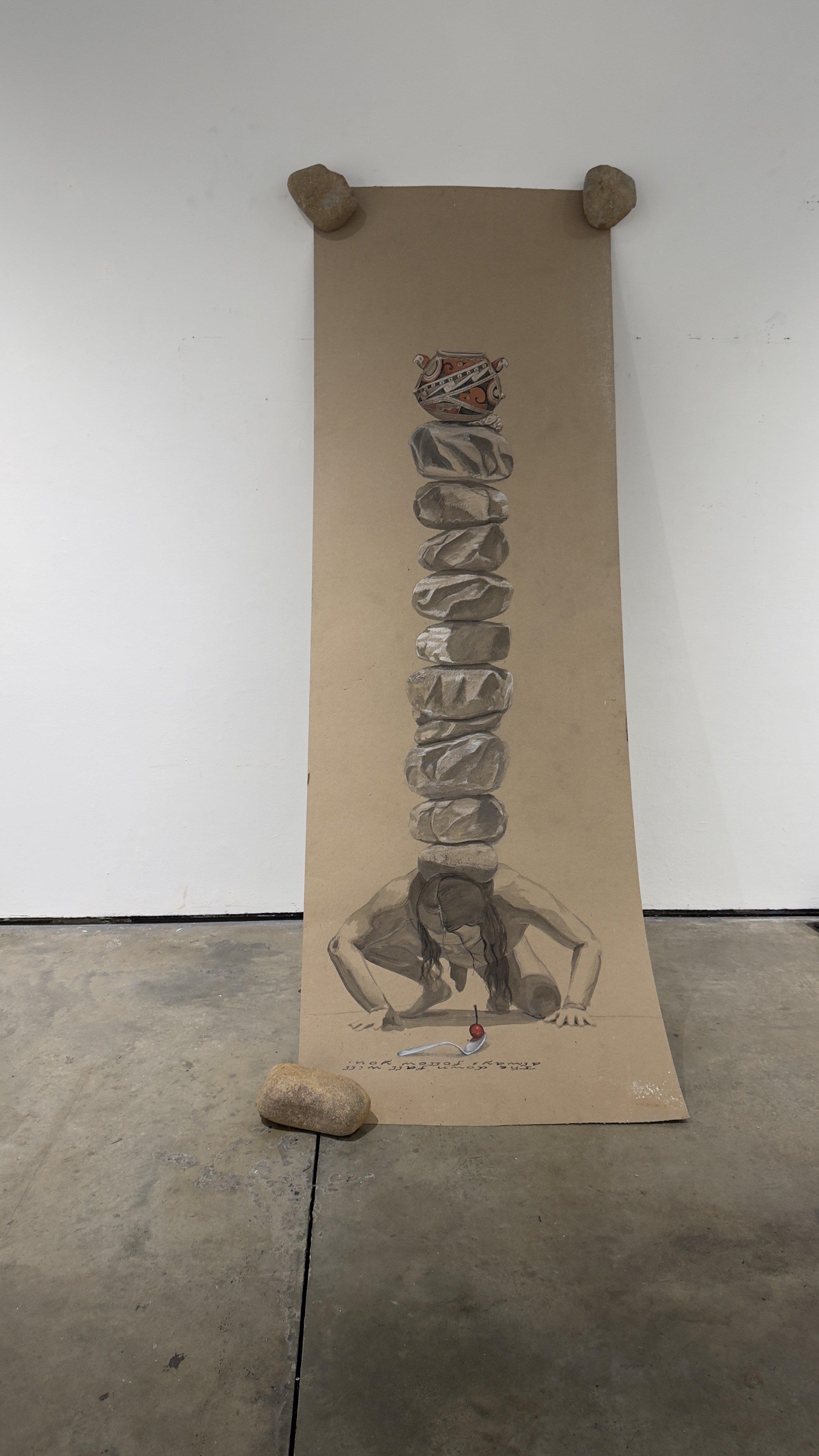
Figure 11: Inkpa Mani, The Down Fall Will Always Follow You, 2025, acrylic and oil on ram board and basalt stone, 10 × 3.5 feet (304.8 × 106.68 cm). Photo: courtesy the artist © Inkpa Mani

Figure 12: Inkpa Mani, Installation view of Anthropophagy: Exodus 20:12, 2025, acrylic and oil on ram board and basalt stone, 10 × 3.5 feet (304.8 × 106.68 cm). Photo: courtesy the artist © Inkpa Mani
IM: These self-portraits grapple explicitly with the complexities of my mixed heritage and tensions surrounding authenticity, representation, and cultural consumption. Intentionally uncomfortable, they incorporate unsettling materials—obsidian knives, pig hearts, rat poison—to represent internal struggle, ancestral trauma, and the anxiety around identity authenticity. Yale provided me with a protected space for this vulnerable introspection, enabling honesty without immediate external pressures. While unlikely to become traditional museum pieces, these works remain crucial for navigating and processing unresolved emotional and cultural tensions, making space for future artistic clarity.

Inkpa Mani
Inkpa Mani (he/him) honors the people, places, and spirits that shape his life in his painting practice. Working with acrylic, oil, and stone, he creates textured, abstract surfaces grounded in Indigenous aesthetics. Drawing from the landscapes and cultural traditions of the Great Plains and Northern Mexico, his work engages the spiritual and material legacies of his ancestors. Through surface, color, and geometry, Mani expands the possibilities of Indigenous art—resisting homogenous flattening, hegemony, and placing his voice within a long and evolving history of abstraction. He is an Indigenous Mexican-American painter, stone sculptor, and educator. Raised between Chihuahua, Mexico, and the Lake Traverse Reservation in Minnesota, he is of Tarahumara, Conchos, and Masea Mexica descent. His work draws from Indigenous abstraction and figuration to explore resistance to death, rematriation, and cultural continuity. Indigenous aesthetics shape his paintings and stone sculptures through material exploration, symbolic form, and cultural memory, carrying forward stories of survival, spirituality, and ancestral belonging.
Mani holds a BFA from the University of South Dakota, where he was an Oscar Howe Curatorial Fellow. His work has been exhibited at the Plains Art Museum, Akta Lakota Museum, Two Rivers Gallery, and All My Relations Gallery, and he has been commissioned for public art projects by the City of Minneapolis, Yale Divinity School, Williams College, and the State of North Dakota. Mani has also worked as a visual art educator in secondary and post-secondary institutions, supporting Native students and communities through culturally grounded arts education.

Between the Seams: In Conversation with Mar Figueroa
Mar Figueroa’s entrancing portraits are infused with Ecuadorian iconography and mysticism. Figueroa speaks with Lara Xenia about her aesthetic practice, botanical interests, and personal journey.

Figure 1: Mar Figueroa, Two Tongues, 2022, acrylic on canvas, 48 × 36 inches (121.92 × 91.44 cm). Photo: courtesy the artist © Mar Figueroa
Lara Xenia: Tell me about your career trajectory.
Mar Figueroa: I’ve been painting since I was a child, with the support of mentors from around the age of nine. I studied at the Rhode Island School of Design for undergrad, and after graduating, I moved back to Ecuador because I couldn’t afford to sustain a studio practice in the U.S. That limitation pushed me to explore digital tools, which expanded my creative possibilities and led to work with clients like The New York Times, Microsoft, Netflix...I spent several years in design and also discovered a genuine love for teaching. Today, I’ve shifted my focus back to painting, which led me to pursue my master’s at Yale.
LX: That sounds quite lucrative and fulfilling.
MF: Yes, it was, but eventually I chose to leave that behind and return to painting [laughter.] After receiving a notable distinction in the art world, I found myself sitting by the Greenpoint pier in New York, overwhelmed with emotion. Though I was honored, I realized my true passion was always painting. After a family loss, I used my savings to live abroad in Japan, Cuba, Spain, and other places. When the pandemic hit, I moved to Mexico to fully dive into my work. It became a quiet time of healing and reconnecting with both my studio practice and spirituality.
LX: That’s incredible and I’m also sorry for your loss. Painting yourself can be a vulnerable act, but it’s interesting that you feel a greater sense of agency in doing so. What’s the impetus behind that choice?
MF: The female nude has a long history in Western art, predominantly created through the male gaze, framed as an object of visual pleasure, a symbol or ideal rather than a fully autonomous subject. For me, rather than rejecting the female figure, instead, I see value in painting the body—after all, it is my own. This self-representation allows me to engage in a dialogue with the viewer where the gaze is reciprocal. The female body remains one of the most contested subjects in painting, never free from scrutiny.
Since my Pit Crit earlier this semester, I’ve been grappling with feedback challenging me to rethink my approach, and I’ve had honest conversations with professors about it.
LX: What is the Pit?
MF: The Pit is Yale’s main critique space where Painting/Printmaking students present twice during the program. Mine was soon after finals, so I worked nonstop through the holidays, fully focused but completely drained. Then came the critiques. They pushed me to confront my reliance on the female figure. I told a professor, “I’ve been so deconstructed, I’m a biological pudding inside a chrysalis.” That moment felt like a turning point. Now I’m leaning into the discomfort, rebuilding from this vulnerable, formless state, waiting to rupture into something new.

Figure 2: Studio view of Mar Figueroa’s Yale MFA studio. Photo: courtesy the artist © Mar Figueroa
LX: That's a unique idea—to sprout or flower out of something.
MF: This is what I'm currently obsessed with: fungi [shows image of fungus]. Under the right conditions, the “Veiled Lady” mushroom can shoot up in under an hour.
LX: How fun. I’m curious, has Shahzia Sikander’s works or figuration ever been of interest to you?
MF: She was just here in my studio last week! She really deconstructed my practice.

Figure 3: Shahzia Sikander, The Scroll, 1989–1990, vegetable color, dry pigment, watercolor, and tea on hand-prepared wasli paper, 63.88 × 13.5 inches (162.26 × 34.29 cm). Photo: courtesy the artist and Sean Kelly Gallery © Shahzia Sikander
LX: Wait, really? How random!
MF: I really look up to her. We both read a lot of poetry, and I told her how the words of Mary Oliver, Ada Limón, Joy Harjo, Adrienne Rich, and others linger in my studio. She offered an interesting suggestion: if I begin working beyond self-portraits, to channel the spirit of the women who inspire me rather than depict their actual likenesses. That resonated.
LX: How funny and yes, I suppose I thought about her early approach to archetypal depictions of women where she’d obstruct their heads, or render forms based on poetry. It looks like you’re already starting to deviate from figuration. From what I can gather, your interest in absence or anonymity seems to align more with Ana Mendieta’s agenda.
This self-representation allows me to engage in a dialogue with the viewer where the gaze is reciprocal. The female body remains one of the most contested subjects in painting, never free from scrutiny.
MF: Yes, definitely. Ana Mendieta is a pioneer for Latina artists like me, and her influence is foundational. I’m also inspired by Belkis Ayón and Francesca Woodman, who both worked with this poetic strategy of anonymity. That sense of the unseen or partially obscured appears in my own practice too.
In my paintings, figures inhabit domestic spaces where the presence of nature feels suspended, as if waiting to enter. This tension between presence and absence reflects my own background. I was raised in a Roman Catholic environment but my worldview was also shaped by Indigenous knowledge. That duality between what is visible and what is felt is something I return to again and again in my work.

Figure 4: Mar Figueroa, To Dance in the Dark, and Vanquish the Devouring Weeds, 2024, acrylic on canvas, 35.5 × 43.5 inches (90.17 × 110.49 cm). Photo: courtesy the artist © Mar Figueroa
I explore that cultural duality in Blessed Waters for the Soul and the Flesh. Using Catholic aesthetics, I painted a scene of a spiritual bath rooted in an Indigenous ritual, where the spirit is cleansed with herbal waters made by boiling plants known for their healing properties, like rosemary. In To Dance in the Dark, and Vanquish the Devouring Weeds, I deflect vines from the mouths of green figures. Iron gates like the ones on the windows of my childhood home keep them out. The domestic space becomes both a sanctuary and a shield.
At the center of the painting, I’m performing an egg cleansing, a ritual I grew up with where a raw egg is passed over the body to absorb spiritual disturbances. It’s a practice I return to in difficult moments. I’m inside my home, holding the egg and activating its spiritual force. I wanted the figure to feel grounded and powerful in that act.
LXM: I love the Indigenous knowledge you bring to your practice. Would you ever make a series centered around botany in the future?

Figure 5: “Veiled Lady” fungus (Phallus indusiatus). Photo: courtesy Wikipedia Commons
MF: I think a lot about how plants shaped my upbringing and carry ancestral knowledge. As an Andean woman, I was raised with deep respect for nature, a care and reciprocity that still guides me. Ecuador, inspired by Indigenous worldviews, was the first country to recognize nature’s rights in its constitution, affirming that nature has the right to exist, thrive, and regenerate. That perspective stays with me, especially in how I relate to plants, fungi, and overlooked life.
Though I also grew up in the concrete sprawl of Jersey City, I remained rooted in an Andean household. My grandmother, the matriarch, taught us that tending the earth was a form of reverence. We lived across from a notorious drug dealer, and crime surrounded us, but she defiantly grew her herbs. That quiet rebellion stayed with me. I’ve always been drawn to that place where domestic life and nature meet. A rebellious dandelion erupting from concrete is what my childhood felt like.
LX: That’s surreal. It sounds like you grew up in a household of powerful women.
MF: Yes, the women in my family led us through instability. They were also unapologetically feminine and taught me that caring for your image can be a form of dignity and resistance.
LX: That’s so relatable [laughter]. I’d be curious to know more about the moth tableau.

Figure 6: Mar Figueroa, All Night I Rose and Fell, My Thoughts Floating Light as Moths, 2024, acrylic on canvas, 35.5 × 23.5 inches (90.17 × 59.69 cm). Photo: courtesy the artist © Mar Figueroa
MF: This painting was directly inspired by Mary Oliver’s poem “Sleeping in the Forest.” I’ll read it to you:
I thought the earth
remembered me, she took me back so tenderly, arranging her dark skirts, her pockets full of lichens and seeds. I slept as never before, a stone on the riverbed, nothing between me and the white fire of the stars but my thoughts, and they floated light as moths among the branches of the perfect trees. All night I heard the small kingdoms breathing around me, the insects, and the birds who do their work in the darkness. All night I rose and fell, as if in water, grappling with a luminous doom. By morning I had vanished at least a dozen times into something better.
LX: So beautiful. The cropped, hovering eyes add another layer of intensity. The moth’s dewiness also conjures nature’s fecundity and the ants vaguely remind me of Dalí’s [laughs].
MF: Yes, I chose not to fully render the figure’s face, leaving space for the viewer to complete the image. Instead of absence, this space holds a Luna moth and ants, insects that animate the figure with their quiet significance. The moth suggests change and fragility, a presence attuned to the night. The ants evoke memory and the steady rhythm of work. By substituting parts of the face with these beings, I point to how identity emerges through fragments, gestures, and what surrounds us. We are shaped not only by what is visible, but by what moves through us, often unnoticed.
LX: What were you invoking in this serpentine work?

Figure 7: Mar Figueroa, Blessed Waters for the Soul and the Flesh, 2023, acrylic on canvas, 48 × 36 inches (121.92 × 91.44 cm). Photo: courtesy the artist © Mar Figueroa
MF: Ah, I was interested in making her a snake woman. I like to reclaim the history we’ve inherited as women, this ongoing association with snakes, whether it's being tempted by one or becoming something monstrous, like Medusa. To me, snakes aren’t symbols of shame, but of power and transformation. I have three snake tattoos.
LX: You know, “Mar” means “snake” in Farsi!
MF: I’ve heard that before! I’m fascinated by snakes, scorpions, and other small creatures considered dangerous. Their strength isn’t loud or obvious, it comes from within. They produce their own poison, carrying power inside their small bodies. That kind of internal defense really captivates me.

Figure 8: Mar Figueroa, Blessed Waters for the Soul and the Flesh (detail), 2023, acrylic on canvas, 48 × 36 inches (121.92 × 91.44 cm). Photo: courtesy the artist © Mar Figueroa
I’ve always been drawn to that place where domestic life and nature meet. A rebellious dandelion erupting from concrete is what my childhood felt like.
LX: Do the red droplets here signify blood at all?
MF: Yes, the red droplets signify blood, but in this painting they also hold space as nectar. The plant is Cantua buxifolia, known as the Flower of the Incas. My ancestors were buried with these flowers so their souls could drink from the nectar on their journey to the other side. For me, it speaks to both loss and offering—a circulation of spirit, of blood, of something returned to the earth. Blood disorders run in my family. I lost my sister to leukemia, so the presence of blood in my work carries a sacred, personal weight.
LX: Oh, I’m so sorry about your sister; it’s beautiful that you represent it that way. I’m really curious about your current exploration of oil paints right now in your recent series.

Figure 9: Mar Figueroa, Portrait as Daphne, Remembering Her Human Skin, 2025, oil on canvas, 60 × 48 inches (152.4 × 121.92 cm). Photo: courtesy the artist © Mar Figueroa
MF: These are actually my first oil paintings, and I’m drawn to how fluid the material feels, and how that fluidity seeps into the narrative itself. In this piece, [gesturing to the painting] I moved away from symbolic figuration and instead used the behavior of the paint on the surface to express emotional states.
The painting is a depiction of the emotional dialogue that happens in the process of making. There are several figures, each representing a different emotional mindset, and the fluidity between them shows how they soothe or interrupt one another. The central figure keeps painting through it all—through doubt, pain, care, and critique.

Figure 10: Mar Figueroa, Portrait as Daphne, Remembering Her Human Skin (detail), 2025, oil on canvas, 60 × 48 inches (152.4 × 121.92 cm). Photo: courtesy the artist © Mar Figueroa
LX: Wow, this work has a lot of psychological weight. I like how you included a strand of thread that weaves it altogether.
MF: Yes, those details quietly reflect my family’s influence. My grandmother was a seamstress who raised me while my mother worked at her restaurant. From a young age, she recognized my love for drawing and involved me in her practice. During summers, I stayed in Ecuador, where I was cared for by my other grandmother, a nurse. I’d accompany her as she cared for women after childbirth, and was fascinated by the way her hands moved as she removed sutures. Those gestures of mending and repair feel deeply embedded in me, and I see their hands in this work.

Figure 11: Mar Figueroa, Untitled, 2025, oil on canvas, 75 × 30 inches (190.5 × 76.2 cm). Photo: courtesy the artist © Mar Figueroa
In this piece, [points to the painting of a woman lying down] I began thinking about a more mythological self—sirens or mermaids, liminal beings who exist between land and sea. I wanted to experiment with how paint moves across the body, creating a sensation like waves rolling in and receding along the shoreline. One late night in the studio, I was feeling homesick. I had this vivid thought: what if I could swim all the way back to Ecuador, through the ocean and up the river that leads to my home, and arrive in time for the winter holidays? It’s also worth noting that all my paintings take place at night.
LX: Why is that? Also, do you consider yourself nocturnal?
MF: I’m absolutely nocturnal, I love the nighttime. Most days I work until 2:00 a.m, and sometimes even until 5:00 a.m. I really come alive in the quiet of the night, when everyone else is asleep and I can feel the charge of the day. Unfortunately, I don’t wake up with energy. I’ve tried painting in the morning, but it never flows. For me, there really is something magical about nighttime. I can feel stories begin to take shape.
LX: That’s amazing. As a final query: what’s something that you had in your childhood bedroom that you distinctly remember?
MF: That’s a good question. I immediately thought of my grandmother. We shared a bed, and so much of my childhood is wrapped up in that closeness. Growing up, space was limited in my home, so we shared a bed. I loved watching her pray. It wasn’t a typical American bedroom with posters, but had an old-lady aesthetic—that really influences my style and how I carry myself today. I’m very much “grandma” [laughter].

Mar Figueroa
Mar Figueroa (b. 1993, Guayaquil, Ecuador) is pursuing an MFA in Painting/Printmaking at the Yale School of Art, graduating in 2026. Her work explores the porous boundary between the domestic and natural worlds—thresholds where ants traverse, plants lean inward, and the spirit world remains embedded in the everyday. Drawing from Andean cosmologies, she paints the slow, unseen processes of transformation, where the self is shaped in reciprocity with nature. A Forbes “30 Under 30” honoree, MacDowell fellow and Hopper Prize recipient, she has taught at RISD and SVA, and will debut at the Smithsonian National Portrait Gallery this fall.

Mirror Phases: In Conversation with Yuwei Tu
Yuwei Tu makes stunning portraits from “crops of her own skin” and of individuals she knows. Tu speaks with Lara Xenia about her material process, experience of loss, and interest in Lacanian psychoanalysis.

Figure 1: Yuwei Tu, Self-Portrait of a Daughter, 2024, from the Wherever Your Mother’s Shadow Falls series, oil on ACM panel, 12 × 9 inches (30.48 × 22.86 cm). Photo: courtesy the artist © Yuwei Tu
Lara Xenia: Were you a hyper-observant child?
Yuwei Tu: Yes, I’d say I’ve always been very detail-oriented. Being in my studio probably says that.
LX: How did you end up at Yale?
YT: What a whirlwind. I studied Business at the University of Notre Dame, and worked in corporate fashion in New York for almost five years—I was crunching numbers on Excel all day. After a significant personal event, I realized life is too short and thought, “Let me just take a chance on myself” and pursue my love for art full-time.
LX: Are you technically a self-taught artist?
YT: I've always taken art classes here and there, but otherwise, yes.
LX: That’s incredibly impressive. I was really drawn to the tactility of your work and how exceptionally detailed everything is. What compelled you to deviate from your earlier hyperrealist style towards your current one?
YT: Yes, I think they are still extremely detailed, but not overly. When I arrived at Yale, I was so early in my art journey and was in a specific place of hyperrealism. When I started painting, I was very drawn to Chuck Close. Obviously not for his morals, but the person aside, it impacted me to see his paintings at The Broad when I was really young. That led me down a hyperrealist path. I thought to myself, “Okay, he's a person and I'm a person.” You don't need to be like—art's not like basketball, where if you're not a certain size, you can't do it. If he could do it, what does he have that I don’t? It’s just a matter of practice and determination [laughs].
In my current practice, I'm not interested in laying out a scene or having a character in the background and telling a narrative story. These works feel more like meditations, snapshots or little poems to me. I like that they remain very open in terms of associations and appreciate the quietude of them.
LX: Could you tell me a bit about your material process?
YT: I've been interested in working with seriality, so these lately have been the same size wood panels, 8 by 10 inches. I build up molding paste layer by layer, which lends itself to the flushiness and the organic edge of the surface. Then I sand it down. The thin layers of oil paint gives it that translucency, and allows the different colors to show.
LX: The viewing process feels meditative too because the scale adds an intimacy to them, since the size is almost comparable to a face. Do you consider scale a lot?
YT: I'm drawn to intimate scales for this series. It feels very subtle and quiet, but there’s also something super powerful about it not asserting itself.
LX: I particularly like this work because it looks uneven, almost like a nebula, fleshy or neuron-like.
YT: Exactly. I love existing in that space where it opens it up to: is it skin? Is it bodily? Is it topographical? Is it cosmic? Shifting between micro and macro. Is it the human body, or even some other living beings? I like existing in the space where it evades specificity and it’s always interesting to see what people get out of it. I feel like art is a mirror. It's a reflection of your experiences. These come from images of my own body and crops of my own skin. I was making a body of work before, and then I thought, “What if I cropped this part of my legs and zoomed in to make a more abstracted composition? An evolution of the painting before.” These were already pretty cropped, but not to this degree. I was not trying to set a scene or tell the narrative.
LX: The folds within this closed-off work are unique. What was the logic and story behind the netted one? [Points to work]
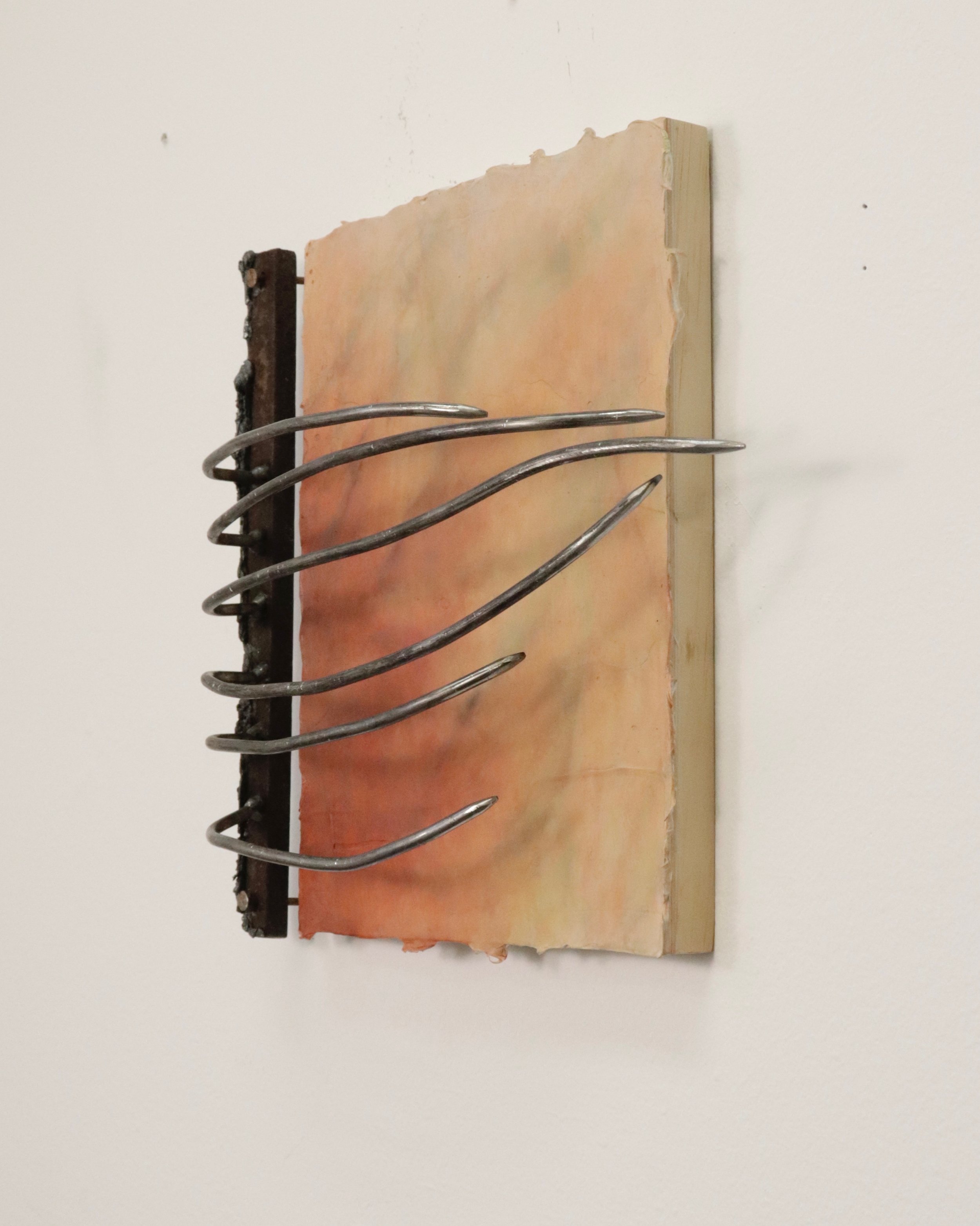
Figure 2: Yuwei Tu, In brace 2025, from the Skin series, oil on panel with steel frame, 10 × 8 inches × 0.75 inches (25.4 × 20.32 × 1.91 cm); overall: approximately 11 × 10 × 2 inches (27.94 × 25.4 × 5.08 cm). Photo: courtesy the artist © Yuwei Tu

Figure 3: Yuwei Tu, Wear, 2025, from the Skin series, oil on panel with steel frame, 10 x 8 × 0.75 inches (25.4 × 20.32 × 1.91 cm.); overall: approximately 11 × 9 × 1 inches (27.94 × 22.86 × 2.54 cm). Photo: courtesy the artist © Yuwei Tu
YT: Ah yes, the caging. I recently started going to the metal shop and welding framing devices that become integrated parts of the paintings. My favorite artist is Louise Bourgeois, so I think it was just a matter of time for the metal to manifest itself. I finally got over the mental block of being daunted by the “hot and sweaty” space of the shop itself and showed up. The lady who runs it is so wonderful and has shown me how to use the tools. I’ve been having fun with it. I expected the metals to be rigid, but I appreciate that like oil paint, it’s so malleable and you can form it to do whatever you want; you lay down the brush mark, you weld the joints together, and it comes together in front of you.
Figure 4: Louise Bourgeois, Crouching Spider [Maman], 2003. Courtesy Dia Beacon, Cheim & Read and Hauser & Wirth. Photo: Bill Jacobson Studio, New York © The Easton Foundation/Licensed by VAGA at Artists Rights Society (ARS), New York

Figure 5: Studio installation view of Yuwei Tu, Skin series, 2025. Photo: courtesy the artist © Yuwei Tu
LX: There’s a certain vulnerability to skin of any kind, whether it be animal skin or other flesh. Would you consider these works formally portraits?
I like existing in the space where it evades specificity and it’s always interesting to see what people get out of it. I feel like art is a mirror. It’s a reflection of your experiences. These come from images of my own body and crops of my own skin.
YT: I consider them all to be self-portraits because it’s quite literally an image of me, or an extension of my consciousness and experiences. For me, they feel disembodied, but embodied at once.
LX: I like their immediacy and that as a viewer, I had absolutely no idea what I was looking at. There's kind of a cognitive dissonance. It’s also important that you’re engaging in this type of self-reflective work as you’re grappling with so many melancholic emotions and life experiences. Could you tell me about this self-portrait on the ground?

Figure 6: Yuwei Tu, Mirror Phases, 2025, liquid latex, oil on yupo, wood glue, and paper pulp from old drawings, approximately 36 × 20 inches (91.44 × 50.8 cm). Photo: courtesy the artist © Yuwei Tu
YT: This work was a way for me to bring the paintings off the wall and as an interaction with objects and into the world. I used an acrylic medium, and built it on the floor with a palette knife using a liquid mix. Whether it’s through psychoanalysis, psychology, philosophy or Buddhism, I'm always interested in different understandings of how we get to know the self and each other. This work came about from reading Jacques Lacan’s “Mirror Stage” in class. It got me thinking about the self, and these broader metaphors of interiority, breaking down the nuance and complexity of how everything's a mirror of yourself. I love how there's no straightforward answer to dualities. I decided to make a series of daily self-portraits while observing myself in the mirror, seeing the formation and making these different skins.
LX: Why did you decide to make this a serial image?
YT: I guess in thinking about Lacan’s theory, there’s this theme of seriality at work. I was interested in how our ego is formed through identifying with our self-image in the mirror. It also ties back to the concept of meditations, since these were a series of daily self-portraits that I made by looking literally in the mirror. I made it for 15 days, so 15 sheets, and was just sheerly thinking about the observation of myself and how, even though I'm drawing the same subject, I appear to myself so differently each day. I think to really see yourself and know yourself, still feels so impossible. The person you know most intimately, from beginning to end, in and out, I'm still trying to bring out.
LX: It's like melted Asiago cheese [laughter].
YT: I like the air system and the shift between something really tender and beautiful, with something that’s a little bit repulsive and gnarly.
LX: What have you learned about yourself as you were making this specific series?
YT: It’s made me question how I like to approach things in life, and how that fits in my approach to my practice. This room for nuance and ambiguity is how I see a lot of interactions or relationships with different people in life.
LX: Can you tell me about your series Wherever Your Mother’s Shadow Falls?

Figure 7: Yuwei Tu, Wherever Your Mother’s Shadow Falls, from the Wherever Your Mother’s Shadow Falls series, 2024, oil on ACM panel, 14 × 11 inches (35.56 × 27.94 cm). Photo: courtesy the artist © Yuwei Tu
YT: Yes, that came from an Ocean Vuong poem. I'm obsessed with him; he’s my favorite writer, poet, and thinker. I made that painting partially inspired by his poetry and also in relation to my personal life, because my mom passed away in 2018 and that work is dedicated to her. That’s also why I think it influenced the whole shift to art in general. Life is too short; you can't take a single day for granted. My mother was in China, and a lot of my family is still there. It took me some time to process things. I was still working in fashion, but I think I took time to process, grieve, and record it…I had no semblance of what being an artist looks like. Looking back now, it was really terrifying, but it all worked out. For that show, I was considering grief and longing a lot, through my hands specifically, through the sense of touching and reaching out.
LX: Has your identity ever come into play in terms of how you view your works or to some extent, is it informed by it?
YT: I think you can't deny that it's inescapable because the work comes through me, and it's a reflection of me, and my background, my life, my race, my gender. It’s all inevitable, even if I'm not so intentionally or on the nose standing here saying, “I'm making work about being an Asian American woman.” Those elements of your gender and your race come through your work. In the context of viewing it, I think about what it means for an Asian woman to be making this type of work and how it would mean something very different for a white man to be making this. I definitely think about that and am always trying to be mindful, especially now in the art world. We see so much pandering of identity politics.
LX: I’ve recently been thinking a lot about Ann Anlin Cheng’s work and personally love her books Second Skin and Ornamentalism. They both fundamentally changed my perspective on the language used for describing how we even talk about skin and early architectural theory. Your work made me wonder if you ever subtly are confronting those ideas in your practice.
YT: Yes, I reference her writing often. I think my metalwork brings in that conversation with the decorative and the ornament. From Ornamentalism, we can think about how especially for an Asian woman, the way you present yourself and your skin and the surroundings that you appear in the decorative ornament all tie to your identity and how you're perceived. We talked about this in crit; my wonderful faculty member Anoka Fauci mentioned it. I’ve had this conversation with her a few times about this hierarchy, especially in Western art, of the decorative and ornament being art, philosophy, architecture, with it being seen as superfluous and excess and not fundamental to the structure and integrity of something and gendered as feminine. We discuss what that means. I'm not really trying to be saying, “This is good, this is bad,” but rather more so about probing “racing questions” and “Why do we think this way? Why do we see things this way?” What are these hierarchical structures of power and value systems that we've been brought to believe and live under?” These are the questions I prefer to raise.
Let me read you this poem by Vuong quickly. It’s called, “Someday I Love” by Ocean Vuong:
Ocean, don't be afraid. The end of the road is so far ahead it is already behind us. Don't worry. Your father is only your father until one of you forgets. Like how the spine won't remember its wings no matter how many times her knees kissed the pavement. Ocean, are you listening? The most beautiful part of your body is wherever your mother's shadow falls. Here's the house with childhood whittled down to a single red trip wire. Don't worry. Just call it horizon & you'll never reach it.
LX: Wow.
YT: That's a snippet of the poem, but the way he uses words is profound…he wrote a novel called On Earth We’re Briefly Gorgeous, which is his most well-known piece and the cover has a whole bodily component. I just found out that this cover photo was taken by one of my professors here, Sam Contis, whom I absolutely adore. I was taking a photography class last semester, and it turns out the image is hers. It felt especially serendipitous because I had already created a body of work inspired by Vuong for my application—only to later learn that the class before mine had read his poetry during the school-wide readings. There have been so many moments like this where everything just seems to align.
Figure 9: Ocean Vuong, On Earth We’re Briefly Gorgeous, 2024, featuring cover photograph by Sam Contis © Sam Contis
LX: Did you read a lot to cope at the time? Do you feel like you’re mentally channeling your mum in your practice and beyond?
YT: I'm struck by how writers and poets use their words. I hope the paintings serve as visual poems.
LX: That’s amazing that you helped someone see themself in a different light. Is this your friend?
YT: Yes, that is one of my best friends, Rilke Noel. I wanted to paint her in a way that was very stripped down and vulnerable, but not sexualized. I see her as my best friend, almost a sister.

Figure 11: Yuwei Tu, Sunday Morning with R, 2022, oil on ACM panel, 24 × 20 inches (60.96 × 50.8 cm). Photo: courtesy the artist © Yuwei Tu
LX: She appears very dignified here. How long do the hyperrealist works take?
YT: Months. I start off with very blocky layers, then apply them very thinly each time. I always say I sketch with the camera. It's important for me to find the composition through that.
I hope the paintings serve as visual poems.
LX: High Maintenance looks like a great show.
YT: Yeah that was during COVID; I didn't realize that at the time, but one of my classmates here, Amy Chasse downstairs, was actually in that group show with me before we both got into Yale. We had no clue. She’s great; we can have fun and not take ourselves so seriously.
LX: Yes, her carnival works are awesome. What’s this lily tableau about?

Figure 13: Yuwei Tu, Week-Old Lilies, 2024, from the Wherever Your Mother’s Shadow Falls series, oil on ACM panel, 20 × 16 inches (60.96 × 50.8 cm). Photo: courtesy the artist © Yuwei Tu
YT: I was pontificating about the passage of time, on the verge of life and death. My mom's name sounds really close to Lily in Chinese. I always think of her and how she loved flowers and associated lilies with her and mourning.
LX: And Already Behind Us?
YT: Yes. That watch was for her. The show is for her, and this was part of that series. There’s something about the pose and the back turn and interlocked hands. When I was in LA, I would wear it basically every day. It was funny because I think my dad had actually gifted her that watch and it stopped working the day after she passed. I kind of love that idea that time stopped. I could have taken it to a watch repair place and gotten it fixed and running, but I like the idea that time just stopped with her. I think it’s so poetic.
LX: That’s beautiful. So that’s you posing?

Figure 14: Yuwei Tu, Already Behind Us, from the Wherever Your Mother’s Shadow Falls series, 2024, oil on ACM panel, 20 × 16 inches (60.96 × 50.8 cm). Photo: courtesy the artist © Yuwei Tu
YT: Yes, I was thinking of the idea of turning away, and also the significance of denim jeans and moving to America. I was born and raised in China, then I moved to L.A. when I was 8, and my parents got divorced when I was really young.
LX: I see. To conclude, I also love this Joker painting. What's the story behind it, and why the Joker?

Figure 15: Yuwei Tu, Joker, 2024, from the Wherever Your Mother’s Shadow Falls series, oil on ACM panel, 14 × 11 inches (35.56 × 27.94 cm). Photo: courtesy the artist © Yuwei Tu
YT: My mom passed on April Fool's Day. It was such shocking news that I felt delirious for days. I remember receiving that news that morning and thinking, “Is the universe playing a prank on me right now?” We all have moments like that, even when they are so silly, like spilling coffee down your new shirt or something, or where you're thinking, “Are you kidding me?” I remember that day, I couldn’t help but say, “Wow, I can't believe it's April Fool's Day. It feels like the universe is just playing a prank on me.” Part of the process through grief is denial and disbelief. I wondered if someone was going to pinch me or if I was going to snap out of it.

Yuwei Tu
Using a layered process, Yuwei Tu (b. 1995, Sichuan, China) articulates the nuance and complexity of interiority through painting. Her work is informed by personal experiences and investigations in the construction of identities and relationships to create a visual language of the psyche. She is currently pursuing an MFA in Painting/Printmaking at Yale School of Art, class of 2026.